Rise 2021 – Stylish City Living
May 5, 2021
Text by Erika Ayn Finch and Lisa H. Speidel
Sky-High
When interior designer William Schroeder was given carte blanche in his client’s forty-eighth-floor pied-à-terre, he turned to French interior designer Jacques Grange for inspiration. Specifically, Grange’s design for the New York apartment of Giancarlo Giammetti of Valentino fame sparked Schroeder’s use of a warm bronze palette and lush layers of textures. “We didn’t make any architectural changes, so it was all about the finishes, furnishings, color, and light,” says Schroeder.
Schroeder’s personal style mixes the past with the present, evidenced by the ebonized-and-gilded-wood English Regency chaise paired with a Modern History mahogany sideboard in the home’s living area. Mahogany, gold, bronze, silk, and velvet make repeated appearances throughout the three-bedroom space. As one of the first interior designers to make his mark on One Dalton (the apartment was completed in December 2019), Schroeder says it was a rare opportunity to highlight elevated living both literally and figuratively. “Skyline views are unique for Boston,” he says. “The building gives you that sense of an urban lifestyle, but at the same time, the light is magical. It’s like living in a dream.”—Erika Ayn Finch
Project Team
Interior design: William Schroeder, W.R. Schroeder Interiors
Builder: Suffolk Construction
Photography: Michael J. Lee
Teatime
There’s an allure to the sky-high views and sights and sounds of the Seaport that comes with living at Twenty Two Liberty. But sometimes you crave quiet. The impetus behind this tricked-out tearoom was just that: to create a serene, secluded space within the larger living room. Designer Patrick Planeta evoked a Japanese sensibility to conjure a room that is contemplative in nature and thoughtful in execution. Note the side walls wrapped in hand-cut leather, the Bruno Moinard sofas with an almost origami-like shape, the heated leathered-stone floors, a TV concealed behind doors that open like a shoji screen, and—behold—a hidden bar that lifts with the touch of a remote. “The owners travel the world, and they wanted special moments,” explains Planeta. “If I were invited into this space, I would feel very special, like they were inviting me into an inner sanctuary.” —Lisa H Speidel
Project Team
Architecture and interior design: Patrick Planeta, Planeta Design Group
Architecture: AW-ARCH
Builder: Woodmeister Master Builders
Photography: Joshua McHugh
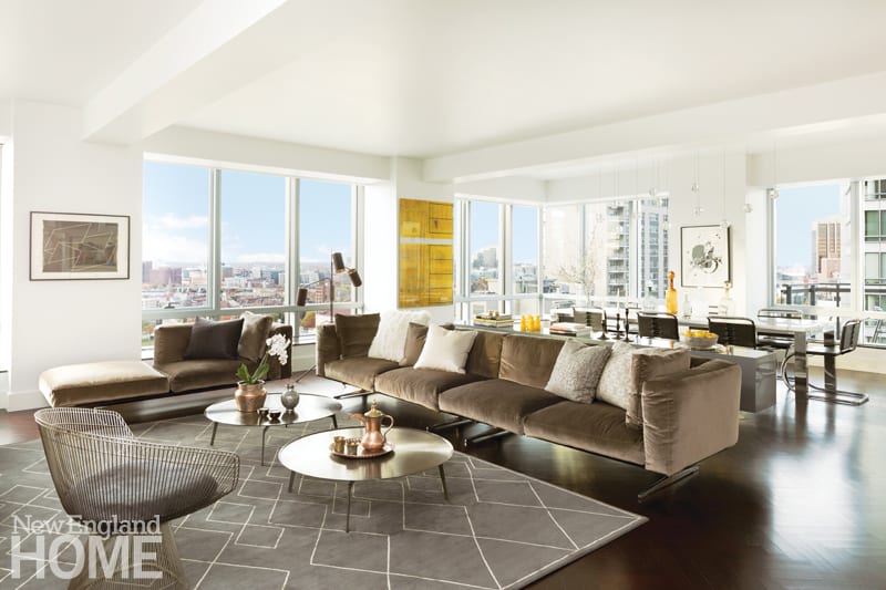
Airy and minimalist was the goal, and the low-slung furnishings do their part to let the cityscape—and artwork—shine. The sofa is from Flexform and the wire chair is vintage Warren Platner; a custom credenza by Stern McCafferty subtly separates the dining and living areas while stowing dinner-party essentials at arm’s reach.
Neutral Territory
The kids were grown, plus the art collection had expanded—an equation that signaled the main living area of this Ritz-Carlton residence was ripe for a refresh. Reenter Diane McCafferty of Stern McCafferty. Down came a divider, and in its place is an open living/dining room. To keep it light and airy—and celebrate the views—McCafferty kept the furnishings (some new, some custom, some vintage) low and chose pieces that appear to float, sans weighty bases. “The space is so simple and minimal,” notes the designer, “so we tried to focus on materials, from crushed velvet to polished metal to bleached-oak wood paneling.” The restrained, sophisticated palette, with lots of variation in tone and texture, provides a perfect backdrop for a growing gallery. —LHS
Project Team
Interior design: Diane McCafferty, Stern McCafferty Architecture + Interiors
Architecture: Stern McCafferty Architecture + Interiors
Builder: F.H. Perry Builder
Photograph: Samara Vise
Out of the Blue
Reenter a repeat client with a new South End townhouse—and a bold new color scheme. “The last bedroom I did for her was done in this incredible pale-pink blush,” remembers architect and interior designer Michele Kolb. This time around, “it was still all about using color,” she says, but the newly married client opted instead for deep indigo blue. The springboard was the two-tone indigo Tibetan wool carpet with a silk accent design in camel color from Material Culture. Then came the sueded-denim drapes, the custom-made plush velvet bed with a bronze-studded headboard, and the deep-blue Phillip Jeffries abaca grasscloth wallcovering. Two Mongolian fur cube ottomans at the foot of the bed provide textural variation, while an iconic fuchsia midcentury modern chair and a throw placed just-so in the same exuberant hue contrast the color scheme. It’s all perfectly primed for sweet dreams. —LHS
Project Team
Architecture and interior design: Michele Kolb, Kolb Architects
Photography: Michael J. Lee
Home Port
“We went through about eighty-five wallpapers before we landed on this one,” says designer Laura Keeler Pierce of the bold Osborne & Little Christian Lacroix Canopy paper; “We wanted something that was unexpected.” The statement-making tropical trellis wallcovering that features a slight metallic sheen set the stage for a Charlestown kitchen rehab that opened up the space while embracing both its urban and harborside location. Keeler Pierce chose Benjamin Moore’s Century Blue Muscari for some edge, and then introduced a round motif in the cabinetry and cane-back chairs to evoke a porthole design. “You can see the USS Constitution from the window,” notes Keeler Pierce, “so we wanted to infuse a little Charlestown into the space.”—LHS
Project Team
Interior design: Laura KeelerPierce, Keeler & Co.
Builder: Quality Construction Group
Cabinetry: Robert S Meserve Cabinetmakers
Photography: Sean Litchfield
Share
![NEH-Logo_Black[1] NEH-Logo_Black[1]](https://b2915716.smushcdn.com/2915716/wp-content/uploads/2022/08/NEH-Logo_Black1-300x162.jpg?lossy=1&strip=1&webp=1)






You must be logged in to post a comment.