An Updated Tudor-Style Home in Wellesley
November 21, 2016
A dramatic interior renovation fills a stately Boston-area Tudor with light and life.
Text by Debra Judge Silber Photography by Greg Premru and Eric Roth

Revival styles, by definition, are exercises in domestic fantasy—romanticized re-interpretations of the past. The 10,000-square-foot brick-and-stone Tudor in Wellesley, Massachusetts, built in 1930, was exactly that. “It was a grand house, very elegant and estate-like,” recalls architect Treffle LaFleche. Grandeur aside, however, romancing the past ignores an important fact: few of us would actually want to live there.
LaFleche’s clients knew this. They were enamored with the home’s elegance and distinctive character, but they also recognized that its dark, low-ceilinged interior did not fit their expectations of a modern home. So they called on LaFleche—along with interior designer Vivian Hedges, landscape architect Dan K. Gordon, and custom builder Sea-Dar Construction—to restyle the home in a way that married its romantic charm with an interior they could love.
To recast the home in a modern light, LaFleche followed what has become a popular playbook for architectural renovations: dramatically restyling the interior while leaving the street-facing facade intact. “People today have a lot of appreciation and nostalgia for traditional design and detailing on the outside, but there’s a strong trend to want a more contemporary space inside,” he explains.
The approach was particularly suited to this project, located in a neighborhood populated by early twentieth-century revivals, including Colonials and Victorians as well as Tudors. “The front of the house really wanted to remain sympathetic to the neighborhood and the original vocabulary of the style,” says LaFleche. His remodel preserved these outward-facing elements, including the home’s dominant chimney, slender multi-pane windows, and facade of stone, brick, and decorative half-timbering.
Preserving the exterior while almost completely reframing the interior was a challenge ably met by the building crew. “We had to cut the whole exterior wall loose on the first floor,” explains John Kruse, vice president and principal of Sea-Dar Construction. “We had the whole building shored up to get the steel in.”
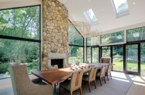
Past the paneled door, however, the medieval references fall away. Not all at once, but bit by bit, the few original spaces left intact—the living room, library, and dining room—give up the spotlight to a remodeled sunroom, spacious family room, and sparkling breakfast room where floor-to-ceiling glass walls are all that separate indoors from out.
The juxtaposition of traditional and more modern spaces was part of the plan. “We wanted to really open up the back of the house with this contemporary gesture of glass walls, but we wanted to do it in a way that allows the integration of the new and the old,” LaFleche says.
The approach results in an eclectic atmosphere that fits right in with the duality that’s so in vogue today. “Eclecticism used to get a bad rap,” LaFeche says. “We all used to think style had to be clear and pure, but we live in a complicated world where people can appreciate different styles coexisting.”
Weaving together past and present was New York–based interior designer Vivian Hedges. Hedges knew the clients well, having worked with them on previous projects, including a New York apartment and a half-dozen houses in Massachusetts. She brought a deep understanding of the family that helped pull the entire project together.
Hedges set the stage by selecting surface treatments that play up—or against—each room’s traditional bones. The former is illustrated in the restoration of the library’s paneled walls and ceiling; the latter, in the application of playfully geometric gold-leaf strips subdividing the floor of the front hall.
She then assessed, refreshed, and assigned each of the owners’ carefully curated furnishings to new roles on the new stage. Experience, combined with an open mind and creative eye, ensured that Hedges was never at a loss for a fresh use or look for a beloved piece. “I think each house has a spirit that tells you where things should go,” she says.
She engages liberally in re-upholstery and occasionally in reconstruction: for this project, she trimmed an L-shaped sofa down to loveseat-size to fit the son’s sitting area, for which she also designed a stainless-steel-trimmed workspace built into the gable wall.
The interior remodel provided both of the couple’s teenagers with suites that include a sitting area, dressing room, and full bath. The master bedroom features his-and-hers baths and dressing rooms. Above the bedrooms, under the sharply sloped roof of the attic, the design team created inviting retreats that include a contemporary wood-paneled office for the husband (accessed, if desired, via a ship’s ladder from the dressing room below) and a cozy media room where contemporary linear wall panels and built-in seating is offset by Moroccan-style lighting and a herd of pillows covered in African fabric.
Embracing the grounds as an extension of the interior spaces was a primary goal of landscape architect Dan K. Gordon, whose plan for the home would win a merit award from the Boston Society of Landscape Architects. Working around a few stately oaks worthy of preservation, Gordon designed a series of outdoor rooms, including a dining terrace and grilling area that steps down to a sports lawn, an infinity pool, and an open shelter that features a fireplace and changing area. Restrained plantings and linear hardscapes blur the boundaries between outdoor spaces, continuing the spatial ambiguity introduced by the house’s glass walls.
In the breakfast room, where steel columns create the illusion of a transparent room-within-a-room, the sensation of being outdoors is heightened. “When you sit at the table, you really feel as close to being outside as you can be without actually being outside,” says LaFleche.
At the same time, it’s the cozy, inward-looking spaces that evoke much of the charm in old New England homes like this one, something LaFleche acknowledged in his renovation of the two staircases. The main stairway, though rebuilt and updated, remains curled compactly within a tubular well at the front of the house; ascending them is an exercise in shelter and introspection. In contrast, the cramped switchback of the back stairs was reconfigured with open risers and suspended inside a steel-and-glass enclosure. Walking up those stairs, LaFleche says, is like treading air. “Both stairs do the same thing functionally, but they offer a completely different experience,” he says. “It’s one of those wonderful things in architecture that you get to play with.”
Architecture: Treffle LaFleche, LDa Architecture & Interiors
Interior Design: Vivian Hedges
Builder: Sea-Dar Construction
Landscape design: Dan K. Gordon
Share
![NEH-Logo_Black[1] NEH-Logo_Black[1]](https://www.nehomemag.com/wp-content/uploads/2022/08/NEH-Logo_Black1-300x162.jpg)


You must be logged in to post a comment.