Trends and Tastemakers 2016
June 20, 2016
Exceptional quality and style have always been de rigueur in New England design. Now the area’s home professionals see a new emphasis on individuality, comfort, and a true sense of place.
Text by Regina Cole

Can it be true that New England was once a design backwater? That architectural excitement happened elsewhere, while stodgy Brahmins made do with their grandparents’ houses and furniture, quietly proud of the threadbare rugs?
Like many stereotypes, there may have been a germ of truth to images like this. But, in fact, New Englanders are knowledgeable, sophisticated consumers of design, and that has always been so. Just consider that this was home to Samuel McIntire, Henry Hobson Richardson, and Walter Gropius, just to name three wildly diverse and majestically gifted architects whose design ideas still reverberate around the world. Here in the Northeast, homeowners adopted methods of energy conservation long before they became popular in other parts of the country. Quality has never gone out of style here, and the silliest fads (think inspirational phrases painted on walls, mason jars as wine glasses) never took hold the way they did in other parts of the country.
Bigger Is No Longer Better
Architect Donald Powers of Union Studio in Providence, Rhode Island, sees a renewed appreciation for quality over quantity that he believes is an expression of a larger philosophical shift. “I tend to think it’s mixed in with a sense of environmental responsibility. I see people who want smaller, better-designed houses,” he says. “They can afford bigger, but they want cozier homes with more detail. It’s not puritanical self-denial, but rather a desire for a house that’s right-sized for their life.
“Ten years ago, they would have said, ‘I also want a swimming pool and a terrace.’ Today, they want a wind turbine, they want really nice windows. What does not sell is stuff that’s generic.”
The desire for carefully crafted custom design extends beyond the yard, Powers says.
“I see a real hunger for a sense of place. After years of soulless subdivisions, people want real neighborhoods.”
Ramsay Gourd, whose architectural and interior design firm practices in Burlington and Manchester, Vermont, sees a similar desire for quality. “We have seen a movement away from mass consumption to almost austere minimalism, including sparsely furnished micro houses,” he says. “I see people looking for balance between comfort and beauty, with a social consciousness that is taking ownership of the past. We are involved with more restoration and remodel projects and, even in the renovation of older homes, clients are asking how they can repurpose elements and materials.”
The same desire to marry the old with the new inspires today’s best interior design, Gourd says. “Antiques and classic shapes with fresh textiles and bold colors combine a sense of the familiar with the unexpected.”
There has been a shift in the definition of modern, according to David Foley, principal in the Cambridge, Massachusetts, architectural firm Foley Fiore Architecture. “We thought it meant midcentury modernism, but a lot of people find themselves in 1980s and ’90s houses that don’t really fit the idea of modernism. A lot of those houses have big spaces devoid of character. People want warmth and interesting materials. We bring in reclaimed wood, steel, or zinc.
“Houses that date to the mid-twentieth century may have the look, but not the function wanted today,” he adds. “Those houses often had small, boxy rooms. To make the interior friendlier, we might move the kitchen from the far end into the center of the house; that opens it up and offers the layout that works for today.”
The Inside Scoop
Interior design today is trending toward the same mix of materials that architects see. Liz Stiving-Nichols, principal and senior designer of Martha’s Vineyard Interior Design, explains it this way: “We are mixing materials and finishes, such as rustic reclaimed wood with lacquered walls, mixing metal finishes (a trend that actually took me a minute to embrace), and combining hand-block-printed fabrics and wallcoverings with modern furnishings.”
She adds, “Always strive to find the balance and recognize when the scales are about to tip into the overdone or forced zone.”
Kathie Chrisicos, who has an interior design firm in Boston, believes that today’s wealth of information is a mixed blessing. “There are lots of design shows on TV, and the Internet is full of all sorts of stuff. It is too much information for many of us, and makes a design professional more valuable than ever,” she says.
The pace of development in Boston is “amazing,” she continues. “For homeowners, it underscores the continuing tension between what they want and what will affect the resale value of their home. People come to me with a hunger for customization; they want personal, but pulled-together spaces.
“But,” she adds emphatically, “There is a huge overuse of the word curated.”
Kitchen and bath designs are the first things to go out of style, says Jeff Osborne, who, with Amanda Hark, runs Boston’s Hark + Osborne Interior Design. “Our challenge is to design kitchens and baths that are handsome and will stand the test of time,” Osborne says. “We love mixing materials, but sticking to a classical, somewhat Old World palette.”
He likes the modern option of porcelain made to look like marble for showers and countertops. “Also,” he continues, “we reject the notion that good design must include recessed lighting in a grid pattern. We are using interesting, low-profile, surface-mount lighting with a modern or vintage look. It adds another layer of interest, as the light goes in all directions instead of just straight down.”
Builders bring to life what architects and designers dream up; they know trends better than most. Kevin Cradock of Boston’s Kevin Cradock Builders sees all sorts of mixes. “In a single kitchen, we may have cabinets in a couple of different colors; mixed materials such as paint, natural wood, and steel; and have some countertops in stone and others in wood,” he says. “We’ve also been blending traditional, contemporary, and modern elements in the same rooms.”
Gary Rousseau, principal and executive vice president of the Cumberland, Rhode Island, architectural millwork firm Herrick & White, sees several interesting trends. “We are getting a lot of demand for high-end finishes,” he says. “People are asking for high gloss and hand buffing, whether that’s on painted, veneered, or polished wood finishes.” Live-edge countertops are growing in popularity among his clients, he adds.
The live-edge table, first pioneered by George Nakashima in the 1970s, has trickled down to become a standard furniture feature. Now it is finding its way to built-ins. “Walnut is a prominent material,” Rousseau explains. “Often, clients want the live edge on their kitchen islands, but we are also doing them in bar areas.”
Decorative Details
Furniture and fabric design looks to traditional sources for inspiration, then applies a modern twist.
Jill Goldberg, proprietor of both Hudson Interior Designs and the Hudson Boston boutique, sees growing enthusiasm for ethnic-inspired fabrics with a modern take in the designs and colors. “I know, for me, I’m still attracted to an overall aesthetic of calm, luxurious fabrics with great texture, then popping them with a very graphic pattern on a pillow or paper. That is something I have loved using for years,” Goldberg says. “Wallpaper! Now everyone is jumping on the wallpaper train,” she adds. “I have loved using it for years, and we have great options today.” She points out that today’s wallpaper patterns, colors, and textures have moved the whole category light-years past the cabbage-rose papers of yore.
“Velvet is making a comeback,” announces Nancy Burr Zwiener, who, along with partner Richard Ott, operates DesignSourceCT in Hartford, Connecticut. “But it’s not a typical velvet: one does not have to worry about the ‘hand’ being disturbed and looking messy. These fabrics are wonderful on sectionals.
“Trims have changed,” she continues. “Brush fringe and tassels have been replaced by more beautiful and contemporary choices. A lot of wallpaper companies are doing textural papers like grasscloth, raffia, cork, and linen.
“As for furniture and accessory trends in southern New England, blue upholstery is in,” Zwiener says. “Navy is the best seller along with indigo and denim, with a pop of pink to accessorize.”
In lighting and bath fixtures and in drapery hardware, she sees a shift from heavy and ornate fixtures to more streamlined styles. “Nickel, chrome, and even acrylic are coming on strong.”
Charles Spada, the interior designer and antiques specialist who runs Charles Spada Interior Design and Charles Spada Antiques out of showrooms in the Boston Design Center, sees a correlation between the world of couture and the world of interior design.
“Once,” says Spada, “there was haute couture that trickled down to all fashion. The guiding principles were quality, elegance, originality, and beauty. Then it started to go the other way, and at the top level, clothing design was driven by what was happening on the street. Soon, everything looked like the street.
“Today,” he continues, “I see everyone go to High Point to buy the same thing. If there is one trend I want to see, it is a return to really good design, to creating elegance and refinement.” He and his peers, he believes, should be actively designing pieces for their clients, rather than simply choosing from what’s available, much of which he sees as derivative and uninspired.
Spada is encouraged, though, when he runs across the occasional project that he sees as truly inspired. “Not too long ago,” he relates, “I saw a New York loft with exposed pipes overhead that had beautiful French marble floors. It was sophisticated, original, and beautifully made.”
The Great Outdoors
The exterior of the home is getting the kind of design attention previously given only to the interior, says landscape architect Clara Couric Batchelor of CBA Landscape Architects in Cambridge. “We see beautiful outdoor furniture that looks as though it could belong in the living room,” she says. “Wicker-like all-season seating, exterior fabrics in great colors and patterns, and rugs make the outside more luxurious and comfortable, and fire pits and fireplaces extend the season. People love to entertain outdoors.”
Creating beautiful and functional outdoor spaces is not limited to suburban homes with big backyards, Batchelor says. “We see wonderful rooftop decks, as people are moving to urban areas. The most desirable condos are the ones that have exterior spaces, and homeowners are making the most of them with planters, fire pits, beautiful furniture, and lighting.”
Lighting is the newest focus of outside design. “Whether it’s uplit trees in suburban yards or sophisticated lighting on rooftop decks, people are becoming more aware of the importance of good lighting,” Batchelor says. “However,” she adds, “it is easy to go overboard and make the house look like a hotel.”
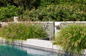
Batchelor also sees a trend toward renewed appreciation for the craft of stone-wall building. “Stone walls, beautifully crafted, can be traditional or modern. They define the landscape and tie it to the architecture.”
Form Meets Function
Back indoors, the biggest design trend of the past few decades has been the role the kitchen plays in the home. Once a drab workspace at the periphery of the house, it is now as much living space as any room. Pierre Matta, designer and co-owner of Newton Kitchens & Design, talks about how today’s design trends play out in this most important room.
“People want to clean up, to have sleeker lines,” he says. “A lot of them would create a really contemporary kitchen, but they know it would be at odds with the rest of the house. So, within a traditional house, they make a more modern kitchen.”
Matta achieves this transitional look by replacing three-piece crown molding with simpler cove molding, using slab doors instead of paneled cabinet doors, and creating toe kicks instead of furniture bases on the cabinetry. “People want wood cabinets, but they want the kitchen to be lighter,” he says. “We use high-gloss lacquered finishes on the upper cabinets because they reflect light and make the room brighter.”
People with a more urban sensibility take the modern look a step further, Matta says. “In the lofts downtown, people want glass and metal instead of wood. They are looking for an ultra contemporary and sleek look. Everything is flush.”
Tech Talk
Electronics have moved to center stage; in only a few years, they have become an indispensable element of the modern home. “This is an exciting time for home automation,” says Gerard Lynch, whose System 7 Technology Design is located in the Boston Design Center. “When I first got into this industry fifteen years ago, it was expensive, proprietary, quirky, and needed lots of servicing. Now, open standards have brought us more affordable and more reliable products, and homeowners are no longer beholden to any single installer.”
Among the big changes Lynch sees is that sound and video have changed to cell-phone-operated automation. “No one even has DVD players anymore,” he says.
Lynch sees lighting as the area growing in all directions. “People are putting in LED fixtures, not just LED replacement bulbs. There are now so many ways to dim, and to change the hue and color of the lighting. People want beautiful lighting at the same time they want energy efficiency.”
Control over lighting extends beyond artificial light, Lynch adds. “There is a growing demand for motorized shading, which is also becoming much more affordable.”
With a wide variety of new materials, carefully considered lighting, an emphasis on quality, and an organic, all-encompassing approach to design, New England’s design professionals strive to help their clients create homes that are not only beautifully designed and well crafted, but make an individual, personal statement. In short, New Englanders know the difference between a fad and a trend, and we look forward while continuing to honor the storied past. •
Share
![NEH-Logo_Black[1] NEH-Logo_Black[1]](https://b2915716.smushcdn.com/2915716/wp-content/uploads/2022/08/NEH-Logo_Black1-300x162.jpg?lossy=1&strip=1&webp=1)




You must be logged in to post a comment.