Tour a Contemporary Home that Connects Indoors and Out
February 20, 2024
ZeroEnergy Design puts a contemporary spin on a classic 1960s split-level home.
Text by Alyssa Bird Photography by Nat Rea

As an architect, the ability to pivot is key. Case in point: what started as a renovation and expansion of a family’s 1960s split-level residence in Belmont, Massachusetts, evolved into a complete rebuild halfway through the project.
“The clients have three kids and parents who stay for extended periods, so the existing 2,660-square-foot house wasn’t meeting their needs,” explains architect Matt Genaze of ZeroEnergy Design. The home—which sits on a sloping site overlooking a Mass Audubon sanctuary—had undergone multiple renovations over the years, with two bifurcated wings, one containing the garage and the other the main house.
The initial two-phase plan included reimagining the garage wing to encompass a primary suite, an office, and an in-law suite with a kitchenette, and then renovating the other wing while the family lived in the addition. However, the clients were so thrilled with the newly constructed addition that they decided to raze the main wing and start fresh in order to maintain consistency and make the home as efficient as possible (it’s fully electric and is outfitted with solar panels). “The result is more contemporary than the original, with an open plan, higher ceilings, and large windows and sliding doors,” says the architect.
“There’s nothing left of the existing house other than the design motives it forced us into,” continues Genaze, who retained the split-level concept and a similar footprint, with two wings connected by the main entry. The back of the home, where the in-law suite and the family room are located, sits a half-story below the front. The kitchen, living, and dining areas, in addition to the garage, comprise the front of the structure. If the kids are playing downstairs, they are still within earshot of the parents on the main level, but the space can also be closed off via a sliding glass door so noise doesn’t travel.
“It’s important to find the right balance of openness and connection while providing degrees of separation and privacy,” says Genaze. “We’ve created areas that can be used in different ways depending on the family’s needs.”
The materials palette of the 7,000-square-foot, six-bedroom house was kept minimal, featuring natural and black-stained cedar siding and fiber cement panels on the exterior, and white oak, steel, and slate inside. “There’s a slim margin of error in modern designs,” says Nick Falkoff of Auburndale Builders. “It’s critical to get the lines just right because there’s no trim to cover up errors.”
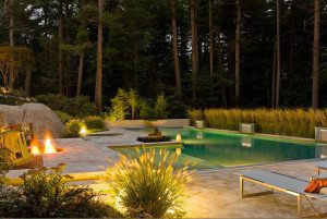
In addition to a clean, contemporary concept, a connection to the outdoors was a priority for the clients, so both the front and rear rooms have easy access to terraces. Genaze collaborated with landscape architect Peter White of ZEN Associates to ensure the site and structure complement one another.
“The goal was to break down the barrier between inside and out,” says White. “We took advantage of the views of the conservation area in the back and planted evergreens in the front to provide screening from the street, which is about four feet above the front yard. The evergreens are punctuated by flowering deciduous shrubs and grasses for year-round interest.”
In the end, says Genaze, “My hope is that the new design’s light, views, and airiness has a transformative impact on the family.”
Project Team
Architecture and interior design: ZeroEnergy Design
Builder: Auburndale Builders
Landscape design: ZEN Associates
Share
![NEH-Logo_Black[1] NEH-Logo_Black[1]](https://b2915716.smushcdn.com/2915716/wp-content/uploads/2022/08/NEH-Logo_Black1-300x162.jpg?lossy=1&strip=1&webp=1)



You must be logged in to post a comment.