Good Gracious
July 8, 2014
A design duo gives a young family’s house the sort of refined elegance that never goes out of style.
Text by Dan Shaw Photography by John Gruen Produced by Stacy Kunstel
When the clients called interior designers Gary Chase and John Roch, they had just purchased a 10,000-square-foot spec house on a picturesque site overlooking a reservoir in Fairfield County. They loved the Arts and Crafts–style residence, but they needed assistance to make it their dream home. Now, two years later, visitors are greeted in the double-height foyer—de rigueur in today’s fine homes and a familiar challenge for these designers. “There is so much Sheetrock in new construction, which is why we like to use wallpaper,” explains Chase. The designers chose the graphic Moss Trellis print from Cole & Son, the venerable English wallpaper company, but in a contemporary palette of silver, blue, and white. “We wanted to play on the idea of traditional style with a modern color sense, which became the theme of the house,” Chase says.
The clients wanted the residence to be gracious, genteel, and family friendly. “We wanted every room to be welcoming and to be used,” says the wife. The designers satisfied these requirements by layering comfortable furniture in no-nonsense fabrics with antiques and first-rate reproductions or custom pieces. “Antiques really complement the crispness of a new house,” says Chase, pointing to the gigantic early-twentieth-century lantern in the foyer and the William and Mary chest used as a coffee table in the living room. “They take the edge off.”
The dining room illustrates the way Chase and Roch braided various elements to create a space that is fresh but familiar, elegant yet easygoing. “It’s formal without the standard crystal chandelier and polished wood table,” says Roch. Instead, there is a custom round walnut table by New England Historical Connection in Wilton, which was inspired by one the designers found in a book on the history of English furniture. “We like to do custom dining tables so the proportions are exactly right for the room,” says Roch.
The designers chose an antique Dutch brass chandelier to hang from the pale-blue ceiling that lightens the mood. The antique William and Mary–style chairs are upholstered in a sophisticated, subdued cotton damask from Rogers & Goffigon.
Like many young couples, the clients didn’t have a set of fine china for entertaining, so the designers simultaneously solved two problems by putting together a collection of classic Blue Willow china from eBay; the colorful dishes, displayed on the hutch, provide graphic punch to the room and can also be used for dinner parties. “It’s a vintage pattern that they can continue to collect,” says Roch. “And it isn’t fragile, so it’s great for family dinners, too.”
The living room has the same well-bred spirit and foundational elements as the dining room—silvery gray walls, cream-colored trim, and sisal carpet. The club chairs wear a traditional English floral from Brunschwig & Fils that’s undeniably chic in black, white, and gray. The classic vignettes that flank the fireplace—porcelain lamps and jade horses on demilune tables in front of mirrors with frames of inlaid wood in a Greek key pattern—will stand the test of time. “We don’t like to be trendy,” says Chase. “We believe that clients should invest in good furniture and objects. If they feel like updating in the future, they can change fabrics or wallpaper without having to start from scratch.”
The designers’ measured approach is evident in the kitchen and billiard room, where they chose furnishings that would complement the architectural elements. In front of the handsome stone fireplace wall in the kitchen, they placed an antique French farmhouse table surrounded by high-quality reproduction Windsor chairs. An early-twentieth-century landscape painting flanked by custom tole sconces complement the colors of the stone. For the paneled billiard room, the designers chose a camel-colored felt for the table that’s as unconventional as it is understated. The bold cotton-and-linen floral fabric on the armchairs is zippy without being out of sync with the soothing ambience. “Everything is calm, nothing is startling,” says Chase.
The master suite represents the designers’ knack for giving suburban homes a touch of urbane glamour appropriate for a sylvan setting. They papered the walls in a Cole & Son wisteria pattern with white blooms and camel-toned leaves on a soft-green background. In the sitting area, a pair of Louis XVI–style chairs upholstered in lavender linen flank a love seat in a Rogers & Goffigon stripe that was also used for the custom headboard. “It’s a very comfortable room,” says the wife. “In fact, in the evening, it’s where the kids like to hang out.”
With their trademark restraint, the designers opted for linen damask shades instead of curtains, which might have made the large bedroom too grand. They purchased heirloom-quality pieces, like the Chinese lacquer end table with mother-of-pearl inlays that holds family photos. And they hung eighteenth-century French bird prints in both the bedroom and adjacent bath as a refined country leitmotif. “John and Gary’s approach is so classic,” says the wife. “We can tweak it with accessories if we feel like trying something trendy, but we wanted a backdrop that would seem ageless.”
The master bath, too, was conceived to be timeless. Chase and Roch designed his-and-hers marble-topped vanities—separated by a stall shower—as if they were fine pieces of furniture. They painted them, as well as the paneled dado, in a shade of green that matches the wallpaper in the bedroom. “We installed checkerboard limestone floors that offer subtle contrast as well as a sense of luxury,” says Roch.
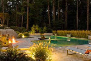
Every decorating choice was informed by the views of the reservoir. After the swimming pool was put in, the owners called in the landscape design firm of Susan Robinson & Associates. “It was a wetlands restoration project,” says Robinson, who planted a meadow with appropriate native plants and ecological cisterns underneath to catch storm-water runoff that can be reused for irrigation. “The idea was to make it look natural, with a mowed path for strolling, as well as environmentally sound,” she says.
Both the landscape and house were designed to get better with age. “That’s the enduring secret of traditional style,” says Roch. •
Interior design: John Roch and Gary Chase, Roch & Chase Interiors
Landscape design: Susan Robinson & Associates
Share
![NEH-Logo_Black[1] NEH-Logo_Black[1]](https://b2915716.smushcdn.com/2915716/wp-content/uploads/2022/08/NEH-Logo_Black1-300x162.jpg?lossy=1&strip=1&webp=1)







You must be logged in to post a comment.