Fifty Shades of Gray
December 29, 2014
That serene hue, along with black, white, and the very occasional shot of color, brings an elegant masculinity to a Boston apartment.
Text by Dan Shaw Photography by Bruce Buck Produced by Kyle Hoepner


Dream clients with dream apartments don’t come along every day, which is why designer Eric Roseff can barely contain his enthusiasm about his renovation and decoration of a 2,700-square-foot condominium overlooking the Boston Common in the Ritz Carlton.
The newly divorced client, who works in private equity, had always lived in nineteenth-century houses, and he was ready to embrace a contemporary aesthetic for his new bachelor life. “But I liked having distinct living and dining rooms and a separate kitchen, and this was the only unit in Boston I could find that had that on one level,” he says. “I wanted something that was modern, but not that far removed from a traditional plan.”
Roseff was excited that his client had guts and imagination. “He is one of those people who can envision spatial planning and proportions,” says the designer. “He challenged and pushed me. He gave me the chance to do things I’d never done before.”
They decided that the entire apartment would be black, white, and gray, establishing a leitmotif that creates a seamless segue from room to room while giving each space an individual look and personality. “Eric has a phenomenal sense of color and texture. He was able to use so many materials without the apartment feeling disjointed,” the owner says.
The small, windowless foyer sets the mood, following Frank Lloyd Wright’s principle that compressed entrances should precede open spaces. The jet-black Venetian plaster walls have a reflective quality that makes them seem to sparkle in combination with the polished nickel fixtures, a console table with a sub-lime shagreen top, a vintage Venini chandelier, and a Roseff-designed floor made of three types of marble. “It arrived like a puzzle—all cut and numbered,” says Roseff. “It has an Escher-like feel and lets you know you are walking into someplace exciting.”
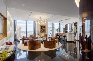
Indeed, entering the living room is momentous. And it’s more than the breathtaking twenty-third-floor views of the Common. “The room has grand proportions, and I used back-to-back sofas to create distinct seating areas,” says Roseff.
Matching abstract-patterned carpets tie together the two spaces—one primarily for watching TV and the other for cocktails and conversation. A soffit around the room hides lights that cast a glow on the ceiling and taupey-gray walls, as well as highlight an art collection that includes nineteenth- and twentieth-century paintings.
That soffit was one of many challenges for the team at S&H Construction. “There was almost no space between the structural concrete ceiling and the plaster ceiling,” notes Eileen Leister, S&H’s project superintendent. “So we built shallow, wide soffits around the perimeter of the room and across the center, to house downlights and uplights. It’s almost like a very spare coffered ceiling.”
In the darker, jazzier dining room, provocative black-and-silver grasscloth walls have a subtle shimmer that adds elegant drama to a space used primarily for nighttime entertaining. Sculptural—and, most important, comfortable—chairs of walnut and polished nickel surround a pedestal table. Hanging from the reflective Venetian plaster ceiling, a custom David Weeks light fixture looks like a fine-art mobile.
The eat-in kitchen is as imaginative as it is functional. Roseff used both stainless-steel and painted-wood cabinets paired with snow-white quartz countertops. The backsplash is a showstopper: two-inch squares of marble turned in all different directions create a random but syncopated effect. The microwave is recessed into the wall because the client wanted the room to have clean lines, and Roseff designed an industrial-strength range hood that doesn’t vent outside but has multiple filters. “You can cook fish here without smelling up the apartment,” he says. “It wasn’t inexpensive, but it was well worth it.”
The client’s favorite room is his study, with walls covered in a bluish-gray grasscloth that’s the same color as the mohair sofa. “You’ll notice I don’t have a desk here,” he says. “I have an office four blocks down the street if I need to do work. The study is about reading, relaxing, listening to music, and watching movies.”
For film nights, Roseff installed blackout shades behind the textured curtains of teal and coppery brown. “The room was a chance to bring in some pattern with everything tone on tone,” he says.
The master bedroom is appropriately serene, with a winged headboard serving as Roseff’s ingenious way of camouflaging unsightly air returns without blocking them. “It’s like being welcomed with open arms,” says the client about the bed. “It’s a great way to end the day.”
The mohair curtains—which Roseff says are “almost like a sweater”—allow light to filter in while providing privacy, and recessed blackout shades come down at night. “It’s like sleeping in a cocoon—it’s very cozy,” says the owner.
The master bathroom may well be the unit’s most stunning space. “It’s the crowning glory for me,” says Roseff, explaining how much effort went into its construction. The owner asked if the walls could be made of marble slabs. “He wanted to see as little grout as possible,” says Roseff. “We wrapped the room in eighteen slabs fifty-four inches wide and perfectly book-matched.” The same striped marble, cut into strips and laid in a herringbone pattern, covers the floor.
As the owner notes: “It’s mitered beautifully, and every wall comes across as a solid piece of marble.”
Such perfection required almost Herculean efforts on the part of the people from both S&H and Cumar Marble and Granite. “You can imagine getting those gigantic pieces of stone up in the elevator,” says S&H project manager Sarah Lawson, with a laugh. The installation process, which took some six weeks, required exacting craftsmanship. “It was a challenge,” Lawson concedes, “but in the end it’s quite beautiful.”
Roseff appreciates that his client keeps the apartment immaculate. “People sometimes ask if anybody really lives here, but it’s kept neat because there is a place for everything,” he says. And it’s his client’s commitment to craft, artistry, and aesthetics that made the project personally and professionally rewarding for Roseff. “He was very special,” says Roseff. “He brought my game out.” •
Interior design: Eric Roseff, Eric Roseff Designs
Builder: S&H Construction
Share
![NEH-Logo_Black[1] NEH-Logo_Black[1]](https://b2915716.smushcdn.com/2915716/wp-content/uploads/2022/08/NEH-Logo_Black1-300x162.jpg?lossy=1&strip=1&webp=1)







You must be logged in to post a comment.