Design in Depth: Four Statements at Kips Bay
June 13, 2012
By Stacy Kunstel
The annual Kips Bay Decorator Show House closes on Thursday. If you haven’t had a chance to visit, here are the four trends I found most interesting during my tour. Did you go? What did you think?
Green
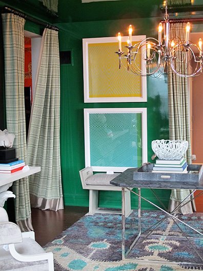
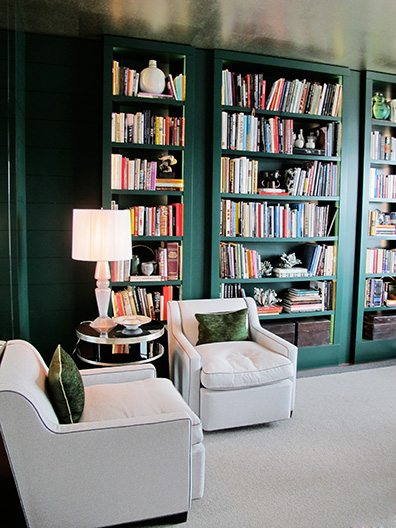
The color green seemed to be on the walls of most of the rooms, ranging from chartreuse to moss to emerald. In Thom Filicia‘s space the lacquered walls seemed to play green to blue-green (more on high gloss later). Jamie Drake chose a deep green for the bookcases of his space, lightening the room with a reflective silver ceiling.
Prismatic Forms
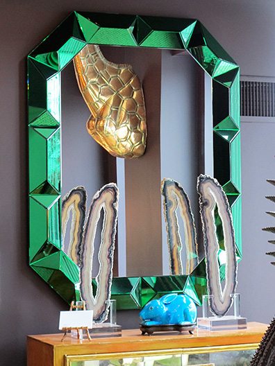
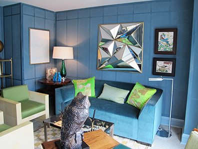
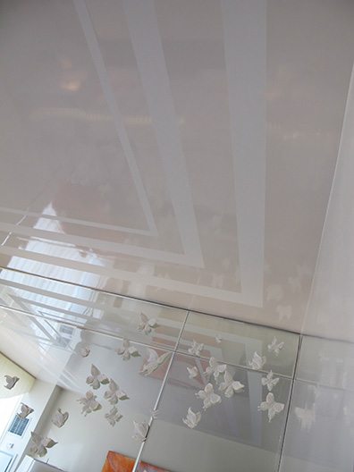
Both Thom Filicia’s and Brian del Toro‘s rooms sported these fragmented mirrors. The mirrors end up reflecting the light in so many different directions and take a normally flat surface and pump it up into a three-dimensional level.
Lifesize Art
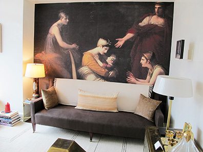
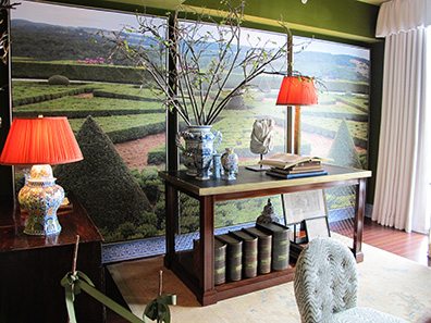
It wasn’t just that the art was oversize–we’ve seen that in past KB houses. It was that we were meant to feel we were part of the scene. Raji Radhakrishnan allowed us to sit among the women in artwork by Pierre-Paul Prud’hon in her room while Charlotte Moss put us in the garden in hers.
Gloss
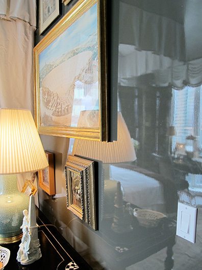
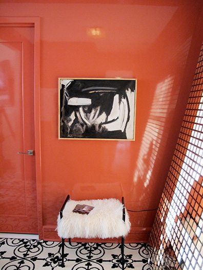
More than once I marveled at the paint finishes on the walls of rooms, particularly the one by Alexa Hampton, who chose the most enigmatic color in the highest gloss. Charles Pavarini used the same treatment in a perfect coral and even put it in white on the ceiling.
Share
![NEH-Logo_Black[1] NEH-Logo_Black[1]](https://b2915716.smushcdn.com/2915716/wp-content/uploads/2022/08/NEH-Logo_Black1-300x162.jpg?lossy=1&strip=1&webp=1)

You must be logged in to post a comment.