Design in Depth: Designer Showhouse of Westchester
May 18, 2011
By Stacy Kunstel
As I’m sure you’re aware, New England Home has a Connecticut edition that we produce four times a year. Like our bimonthly New England Home magazine, the Connecticut issue features never-before-seen projects by top Connecticut-based design professionals.
A few weeks ago, Kyle Hoepner and I were invited to tour the Designer Showhouse of Westchester. Being a county in New York state, this isn’t something that we’d cover in the pages of New England Home’s Connecticut because, as a rule, it must be in Connecticut and have been completed by a Connecticut-based designer. That said, we’d still like to share with you a few of the rooms completed by some of our favorite Connecticut designers.
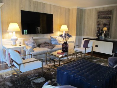
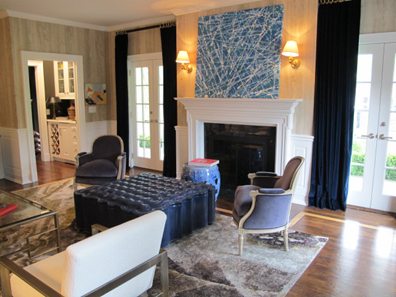
In the living room, Healing Barsanti chose bold blocks of blue paired with sleek furnishings and walls papered to look like wood paneling.
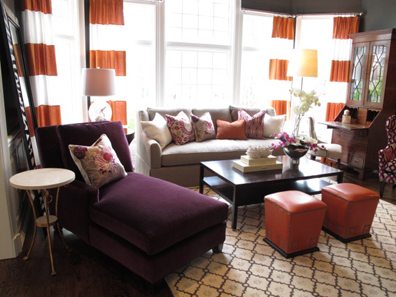
Orange and magenta accents set off warm gray walls and a mix of new and antique furniture in the family room by Safavieh.
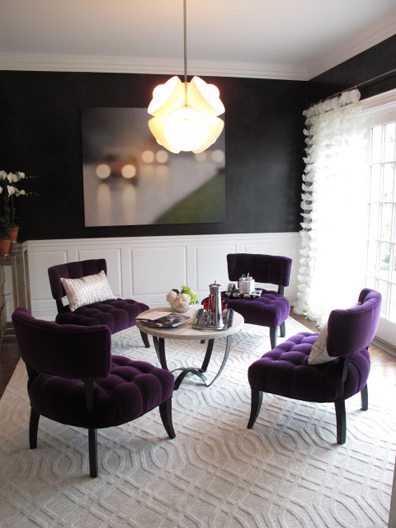
Inspired by Hollywood glamour, interior designer Carey Karlan boldly chose to cover cocktail room walls in black waxed Venetian plaster. Confetti-style drapery panels, modern lighting and artwork, and lushly covered chairs make a sexy statement.
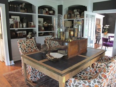
A fluttering of leaves covers the slipcover fabric over the dining chairs, giving movement to this accessories-laden room. Giant terracotta pots flank a high-backed settee and the leather covered wingback chairs whimsically recall moose antlers in their shape. Design by Lillian August.
Gray Venetian plaster walls lend such a beautiful backdrop to the white cabinetry and limestone-carved range hood in this kitchen by Klaffs. Nickel hardware and lighting give it just enough bling factor.

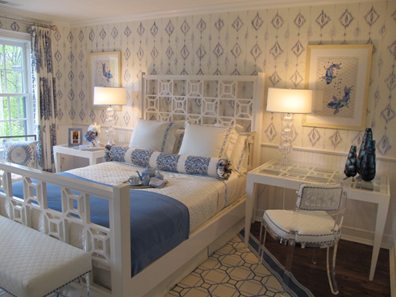
Gorgeous hand-stenciled walls give this cottagey blue-and-white bedroom its memorable look. A custom rug and more contemporary furnishings–painted white, of course–keep it sophisticated. Design by Catherine Cleare.
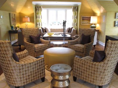
Yes, that is Venetian plaster again on the walls that we’re seeing in the great room by The Wakefield Design Group, but it’s unlike any color or pattern we’ve ever encountered. The gorgeous warmth and texture unifies a long room with three separate seating areas. Do check out the artwork when you visit–they’ve chosen some compelling pieces.
These blooms will be just as fresh as they were the week the showhouse opened because they are the couture silk designs of Diane James, the premiere creator of silk flower arrangements.

Share
![NEH-Logo_Black[1] NEH-Logo_Black[1]](https://b2915716.smushcdn.com/2915716/wp-content/uploads/2022/08/NEH-Logo_Black1-300x162.jpg?lossy=1&strip=1&webp=1)


You must be logged in to post a comment.