Double Vision: Hollywood Glam Comes to Brookline
December 26, 2013
Text by Maria LaPiana Photography by Michael J. Lee
An affinity for glamour paired with the reality of young children inspired a savvy client and her simpatico designer to create a Brookline home that satisfies on both levels.
The homeowner loves retro glam—the scene-stealing kind you see in the movies, the kind that lights up a set and makes leading ladies swoon. The designer admits to an obsession with Greystone Mansion in Beverly Hills. The palatial 1920s estate has been featured in more than sixty films, whenever a script calls for opulence of the grandest kind.
With such inclinations, lots of drama was not unexpected when the two conspired to reinvent a historic Brookline home.
There was a wrinkle in the silk charmeuse, however: twin toddlers. Boys.
“One day we were discussing materials,” remembers Kristine Mullaney, principal of the Boston interiors firm that bears her name. “My client pointed to her boys, who were jumping on a bed, and she said, ‘Just look at them.’ That was all. And at that moment, I knew the children were going to be an important part of the project, that they would drive many of the decisions we would make.”
Working together closely, Mullaney and her client spun wonderful ideas that would make the house more open, modern, and glamorous, but above all, more livable. At turns, they were reined in by the builder, Joe Proia of Proia Construction in Walpole, Massachusetts. It was he who told them what was feasible—and what wasn’t.
In the end, very little was left untouched, but it was the first floor that underwent a gutting and complete renovation. A cramped and dated breezeway with ancient French paneling was demolished to make way for a dramatic opening act: a wide-open foyer with a black-and-white tiled floor inspired by one at Greystone. “I knew my client would love the floor concept,” says Mullaney. “However, I advised her against using marble, since this is the main thruway in a highly trafficked family home. I led her to a tile called Lino from Ann Sacks. It’s extremely durable and almost has a traction to it because of the linen texture.”
Floor-to-ceiling cabinets act as smart as they look, hiding all manner of twin trappings such as coats, backpacks, and sports equipment. A long deacon’s bench sits opposite the original staircase, which was lovingly restored. A new marble top was fabricated for an antique cabinet, while another custom piece was painted Tiffany blue.
Not happy with the existing floor plan, they flipped the house, turning the old dining room into a spacious, wipe-down kitchen with soapstone counters and durable ceramic floor tiles. The open arrangement and a black-on-white palette bring notes of simplicity and order to the space while echoing the foyer.
What was the kitchen became an elegant dining room, where glamour reigns. There are no sensible co-stars here, only A-list celebrities. Says Mullaney, “The client told me this was the one room that was going to be roped off, so anything goes. She had in mind something ‘almost Parisian,’ something over the top.”
The rich aubergine walls create warmth and intimacy. Industrial cabinets the designer saw in San Francisco inspired the built-ins, housing the homeowner’s extensive collection of vintage place settings. The silver-gilded ceiling boasts a dramatic medallion designed to showcase a sparkling chandelier.
A custom carpet of wool and silk grounds an antique dining table that was transformed by black and silver paint. The chairs were covered in velvet to match the walls and accented with nail-head trim. A classic, colorful Warhol hangs over the mantel.
The living room was designed for comfort and kids, with a sectional upholstered in a soft sea foam, drapes in favorite shades of blue, and a wool Stark carpet that will stand the test of time.
Throughout the home there’s a sense of anticipation, suspenseful plot turns that delight. “A lot of people are afraid of color, and although the homeowner wasn’t going to make a huge commitment, she did so in the dining room and bathrooms,” says Mullaney. “You don’t always see that.”
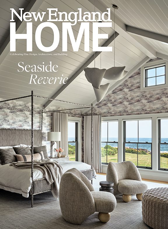
And the master bedroom, stunning in gray, cream, and lavender, was furnished to hold up to traffic—especially boys jumping on the bed. •
Share
![NEH-Logo_Black[1] NEH-Logo_Black[1]](https://b2915716.smushcdn.com/2915716/wp-content/uploads/2022/08/NEH-Logo_Black1-300x162.jpg?lossy=1&strip=1&webp=1)


You must be logged in to post a comment.