Master of Understatement
July 8, 2014
This classic Fairfield County beauty keeps an unassuming countenance, but never skimps on luxury or style.
Text by Susan Kleinman Photography by Exterior photography by Jane Beiles, Interior photography by Michael Partenio Produced by Stacy Kunstel
This classic Fairfield County beauty keeps an unassuming countenance, but never skimps on luxury or style.
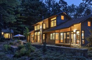
Less than an hour’s commute from New York City, Fairfield County is home to some of Wall Street’s biggest movers, shakers, and market-makers. But nestled as it is in the southwest corner of Connecticut, the region still retains the influence of Yankee modesty and understatement. And nowhere is that intersection between high finance and low profile more readily apparent than in this home designed by architect Sean O’Kane and interior designer Julie Nightingale.
The house, newly constructed by Fox Hill Builders, replaced the previous dwelling, a 4,000-square-foot 1960s colonial on the same two-acre lot. The owners planned just to renovate the existing home, until they learned that redoing a low-ceilinged older structure to the extent they required would cost just as much, take just as long, and never be quite as perfect as a brand-new house.
At 12,000 square feet, the new residence is grand, to be sure, but it hardly suffers from delusions of grandeur or haughtiness. “One of the first things we told the architect was that we didn’t want our home to be flashy,” says the wife. And while she and her husband were looking for enough space to entertain his large extended family and host her weekly Bible-study group and the couple’s frequent parties and dinners (not to mention three active teenagers and two energetic black Labs), they insisted that the profile be kept low and the exterior of the house unassuming.
To honor those wishes—and to site the house perfectly on its level, south-facing property—O’Kane configured the floor plan as a T, with only the shortest side of that shape visible from the road. A gabled roof and a series of dormers make the facade appear more modest, and while the stone chimney and wood clapboard siding are of the highest quality, they are humble in origin, the sort frequently seen on sensible New England buildings.
The landscaping that surrounds the house, too, was designed to be beautiful but not boastful. “We kept the front of the house simple,” says landscape architect Tim Paterson of Highland Design. “It’s only the family and their guests who see the fullness of the garden in the back when they pass through the gates.”
Even that full garden reflects the axiom “less is more,” with simple plantings that don’t require a phalanx of gardeners to keep them healthy. Materials also reflect the home’s location midway between New York and New England. “Heat can be a problem for hydrangeas near New York,” says Paterson, “but because this house is just a mile or so from the coast, the air stays cooler; it’s very similar to the weather on Nantucket.” Hence the fluffy blue masses, so often associated with the Massachusetts island.
Inside the house, the New England aesthetic continues, with lots of traditional millwork and plenty of classic blue-and-white. Ethnic textiles add cosmopolitan New York flair. Oh, and there’s an additional influence: Paris.
“I had been to Paris with some friends, and loved the look of the antique furniture sold in the flea markets,” says the wife. “Julie and I analyzed the cost of making a trip over there to source things ourselves, rather than buying them from dealers here in the U.S.”
Sounding like the sensible, born-and-bred New Englander she is, she adds, “It really wasn’t more expensive.” So the two women packed their bags and headed across the Atlantic, where they spent three whirlwind days scouring the Clignancourt market for one-of-a-kind finds with the help of Nightingale’s brother, an antiques dealer in the City of Light.
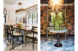
The trip paid off not only financially, but also aesthetically, yielding some of the homeowners’ favorite objects in the house: a set of fourteen dining chairs still wearing their original century-old leather, a pair of demilune tables that grace the foyer, and a garden gate now used as a coffee table in the living room.
Throughout the house, several new lighting fixtures by Niermann Weeks have a rich patina that works well with the older pieces, while simple, contemporary upholstery and drapery fabrics keep the space looking young and fresh.
To create the perfect backdrop for these standout furnishings, Nightingale chose simple materials and neutral fabrics. She used soft jute rugs on the floors to keep things casual and dog-friendly, kept art on the wall to a minimum, and painted most of the rooms in muted tones. The few exceptions to that pale palette include the dining room, in which she installed a gorgeous botanical wallpaper, and a teenage boy’s room painted Farrow & Ball’s dark Drawing Room Blue, “because boys really like the whole cave thing,” she says with a chuckle.
Their mother, on the other hand, prefers airy, open spaces, and she has that in the much paler blue master bedroom, in her open kitchen designed by Sabine Godden, and indeed throughout the house, thanks to nine-and-a-half-foot ceilings in the public rooms and eight-and-a-half-foot ceilings in the bedrooms. Large windows at the front of the house let in lots of southern sun, and the east-west orientation of the longer part of the T ensures that every room gets light throughout the day.
The sun is important here not just for appearance and mood; it’s also responsible for heating and cooling the house through a geothermal HVAC system so effective that even in the bitter-cold winter of 2014, the house never had to fall back on its gas-powered backup heat. The system occupies much of the basement, but there was room left over for more-fanciful additions—including a golf room and a wine cellar.
Gas-free heating and indoor golf? Call it “Yankee efficiency meets Big-Apple elegance.” You could also call it the very best of Fairfield County. •
Architecture: Sean O’Kane
Interior design: Julie Nightingale, Nightingale Design
Builder: Fox Hill Builders
Landscape design: Tim Paterson, Highland Design
Share
![NEH-Logo_Black[1] NEH-Logo_Black[1]](https://b2915716.smushcdn.com/2915716/wp-content/uploads/2022/08/NEH-Logo_Black1-300x162.jpg?lossy=1&strip=1&webp=1)






You must be logged in to post a comment.