Winging It
February 21, 2011
Text by Louis Postel
Is taste a moral issue? You might think so, given the outcry from a handful of designers over Boston’s spanking-new, $500 million Art of the Americas Wing at the Museum of Fine Arts. According to the anti-Wing designers, the new addition is a lost opportunity, an unexceptional box interchangeable with upscale malls, hotel lobbies and corporate headquarters anywhere in the world. They say Guy Lowell, who master-planned the 1907 MFA, would have croaked had he foreseen that such an anonymous structure would someday force itself upon his neoclassic palazzo. While we can certainly understand this position, we sympathize equally with the pro-Wing camp’s insistence that it’s time to abandon the musty, pseudo-aristocratic palazzo fantasy and move on.
One anti-Winger recalls how, as a young girl habitually late for her art class, she scampered along the MFA’s palatial 500 feet of freezing, windblown granite facing Huntington Avenue. Up the marble steps to John Singer Sargent’s luminous rotunda she sped. There she found herself entranced, marveling at how she had been transformed from a shivering waif in Boston’s February dusk to an Italian princess! It was magic.
No such magic was in store in the MFA’s new wing for our princess waif, now an architect. She complains that the stairs leading to the new galleries brought her to a tight landing, where she was met by an inauspicious set of fire doors and the steely jaws of a freight elevator—a major affront to her design sensibilities. “Creating a welcoming transition from one space to another is an essential part of the design vocabulary,” she explains.
Taking the other side, Jeff Stein, currently on sabbatical from his position as Dean of Architecture at the Boston Architectural College, heartily approves of the transitions and treatments of space in the new wing: “It’s not like the usual faceless, darkened galleries with stuff in them. I enjoy its scale—how it allows for many different views.”
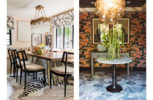
The MFA controversy got us thinking: what makes for a great transition in the home? How do designers pull off the challenge of orchestrating transitions—from room to room, outside to inside, public to private—that are warm, welcoming and rational?
After an arduous decade turning around a spy satellite company, Carey Erdman made his own transition five years ago, switching to a career as an interior designer. Guests who visit the roof deck of his South End home are amazed at what they find—a lush container garden Erdman created that makes the roof “like a whole extra floor.” In his clients’ homes, he often uses botanicals to mark transitions. “We can alter the perceived depth of a space by placing dark, coarse plants in the foreground and fine-textured, lighter plants on the far side of the room,” he says. As another example: “We can signal a change of purpose or energy in a space with botanicals, as well: grouping lush, tropical plants around a soaking tub for a spa-like, private feeling, or bright, blooming plants in a breakfast gazebo to provide a sense of fresh energy as you start your day.”
Designer Wendy Valliere has offices in Stowe, Vermont, and on Nantucket, but she also spends quite a bit of time working in Europe. “We just did a large apartment on Boulevard St.-Germain in Paris, and now we’re totally restoring a Georgian castle on 1,000 acres outside London,” she relates. Valliere shares her own trick for creating a welcoming transition: “I love to introduce a home with a ‘view corridor’—that is to say, a clear visual trajectory from the front door to a significant feature: a beautiful outdoor space, a grand staircase, a fantastic fireplace. Colors and textures work best when they move quietly from room to room, all the while propelled by a common thread (such as an animal print, crewel, a wild shade of green) that harmonizes with the feel of the entire home.”
Sandy Lawton, a builder and architect with ArroDesign, is part of an avant-garde group that’s using tough fabric instead of hard-to-recycle rigid plywood forms for pouring concrete. One fabric-formed house Lawton is working on with his students—he’s also a teacher at Yestermorrow Design/Build School in Warren, Vermont—is uniquely curvaceous and inviting. What stands out is the transition from outside to in, marked by the front-door casing. Lawton and his students imprinted a Baroque-patterned, burnt-out velvet into the fabric form itself, leaving behind a pattern as welcoming as concrete has ever been.
Good transitions are all about color and lighting, says PRISM Award–winning designer Michael Cebula, of Newburyport, Massachusetts. “In terms of color, repetition of key hues creates an atmosphere of comfort and calm,” he notes. “A color-scheme evolution can maintain a feeling of continuity by featuring the same colors in different aspects. For example, if a foyer were painted in an earthy red tone, an adjacent room could present that same red in a printed fabric or decorative accent piece. This technique ensures harmony between the studies, while allowing them to be part of a larger progressive plan.” Lighting choices, he adds, “should sustain a level of relevance to each other, not only in style, but also in degree of brightness. A steady, soft light makes differences less jarring and eases one into a new design environment.”
Concord, Massachusetts–based designer Kristin Drohan cites French doors as an essential element of her design vocabulary. “They’re a relatively inexpensive way to communicate a transition, and they feel luxurious,” says the designer. “Recently, I added double French doors inside a master bedroom to define the sitting area from the sleeping. The doors also served as one extra threshold this mother of four little girls could use to escape the household mayhem. On another project, we installed French doors in a wide upstairs hallway. Doing this in a hall feels quite grand and again diminishes noise. I regularly install French doors at an entrance to a finished basement.”
IFDA Rising Star Rebecca Wilson of Needham, Massachusetts, starts with first impressions: “When I’m designing the entryway, I keep in mind how it will set the tone for the rest of the home. It should be warm and welcoming, and to create that mood I imagine what a guest would need in the space: adequate lighting, a good-quality rug to absorb moisture and spare the floors, an umbrella stand, a place to sit and take off wet or snowy boots, a surface to put a purse or gloves when removing coats and a mirror to check hair and makeup. When transitioning from the first to the second floor I look for ways to draw the eye up: an art series along the stairway wall, a piece of furniture, a painting or a pretty mirror at the top of the stairs. This gives the sense of being carried along from one level to the other.”
Indeed, that very tactic comes into play as one transitions from floor to floor in the MFA by way of the original building’s Grand Staircase. There, the eye is drawn up by Sargent’s murals: Orestes and Hercules, Science and Philosophy unveiling Truth. Admittedly, that’s a tough act to follow for the unassuming fire doors and freight elevator that await at the top of the new wing’s stairway. But at the MFA, as in the world of design in general, there’s room for every taste.
Share
![NEH-Logo_Black[1] NEH-Logo_Black[1]](https://b2915716.smushcdn.com/2915716/wp-content/uploads/2022/08/NEH-Logo_Black1-300x162.jpg?lossy=1&strip=1&webp=1)
