What I Learned at the Kips Bay Decorator Show House Part 1
May 29, 2015
By Stacy Kunstel
I’ve been going to the Kips Bay Decorator Show House in New York for about the past five years. Over the years there have been favorite rooms, but overall, this particular one is my favorite house.
Why? There was a cohesiveness to the rooms from space-to-space and nary a statement-making eyesore in sight. The rooms were lovely, well accessorized, complete and tastefully done. Here’s the first part of what I learned from them.
Mark Sikes
Likely the most Instagrammed room in the house I felt that I already had a feel for this one even before entering. It’s worth seeing in the flesh though.
The Takeaway: Stripes + gingham + prints look marvelous together when they share a basic color. I can’t wait to try it with something like boring beige or blue. Mark’s own collection of blue and white vases was a marvelous counterpoint to the red too.
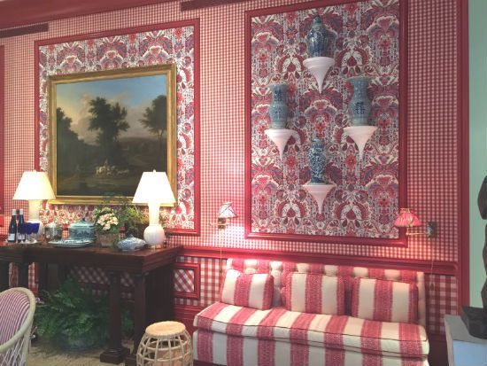
Interior design by Mark Sikes
All photography by Stacy Kunstel
Alessandra Branca
I knew this Roman maven would have a red theme, but the femininity and softness sang such a pleasant reverie. It was such a complement to Mark Sikes’s room that you could have thought they had collaborated, but alas they say it isn’t so.
The Takeaway: Art adds character. The room is stunning. The fabrics and antiques covetable, but Alessandra’s choice in art makes the room unforgettable to me. The Marie Antoinette portrait photograph by Robert Polidori above the fireplace haunts me like an obsession, and on the same wall are the red swirls of Veronique Gambier. I returned to the room before leaving and was still completely captivated.

Alexandra Branca

Tilton Fenwick
If Kips Bay gives you a room you do it, even if it’s a little back stair and not the shining star of the house. Just like they did a few years back at the Southampton Showhouse when they were given a basement, Tilton Fenwick (Anne Maxwell Foster and Suysel dePedro Cunningham), made freakin’ margaritas out of the lemons and limes they were given, throwing in some extra tequila in the form of the most gorgeous rug, wallpaper (their own design), art, and appropriate accessories. I have a feeling there’s a dining room or living room ending happening here in a few years.
The Takeaway-This room makes me feel the same way a Wes Anderson movie set does. It’s instantly stimulating—I feel alive and intelligent—and at the same time it’s so cozy as if I’m recalling it from my childhood with great fondness. Mix with confidence and fearlessness for continued success.

Tilton Fenwick

Charles Pavarini
I wish they had listed the painter for this room as that person should be mentioned as well. You can’t tell it from this photo, but in the final layer of the five-layer painting process on the walls ten pounds of powdered eye shadow were added to the paint. The walls, while appearing like a strie, seem to exude texture and depth. Paired with the roughness of one of the most unusual fireplaces I’ve seen, it works.
The Takeaway: Blue and white live forever even when they are presented in a most contemporary way. This look would still be fantastic in the stateroom of my yacht (dreaming).

David Phoenix
You had me at plaid upholstered walls. I would laze about like a cat in this room and request breakfast in bed at eleven and take calls like Diana Vreeland until someone finally forced me to go to the office. Silver leaf ceiling with wool tartan walls? Yes. Exquisite linens? Of course.
The Takeaway: Good taste never dies; you just don’t always know where it’s going to turn up. When it’s good it’s also never stuffy or snobby or inaccessible. This is good taste.

David Phoenix
Yes! There are more rooms to come! Check this space in a few weeks!
Share
![NEH-Logo_Black[1] NEH-Logo_Black[1]](https://b2915716.smushcdn.com/2915716/wp-content/uploads/2022/08/NEH-Logo_Black1-300x162.jpg?lossy=1&strip=1&webp=1)
