Upside-Down Perfection
August 24, 2015
For a prolific Martha’s Vineyard architect, pulling off a challenging design concept for an Edgartown house is all in a day’s work.
Text by Stacy Kunstel Photography by Michael Partenio Produced by Stacy Kunstel

Even after designing nearly 200 houses on Martha’s Vineyard, including every house on this street overlooking South Beach outside Edgartown, architect Patrick Ahearn will tell you it takes practice to make perfect.
Over the years, some of the best architects have been foiled in attempting to create what’s known as an upside-down house, where the main living and entertaining areas appear on the second floor, the better to take advantage of the views.
A typical outcome is a first level full of throw-away rooms or dead-ends—laundry, mudroom, guest quarters, and forgotten spaces—and an exterior that resembles a roadside motel, with architectural oddities resulting from trying to encase multiple stairwells or provide larger living spaces above the smaller base.
Ahearn brought his considerable experience to bear in designing this upside-down house that makes the most of its location and serves as a reflection of its owners’ lifestyle.
Combining two major architectural elements—a pair of steeply pitched, broad gables for the front and back of the house and stout gambrels acting like bookends to the north and south views—Ahearn gave the home a substantial base while maximizing the square footage in the rooms that needed it the most: those with a view that stretches across miles of Atlantic Ocean.
“Everything is chunky about the house,” says the architect. “It sits on a fieldstone podium and there’s a promenade of large columns that gives the exterior more weight. It’s all about how to create circulation patterns that aren’t evident on the exterior of the house or that overpower the architecture on the exterior. It’s a very tailored house.”
The property’s layout is substantial as well. A large, rectangular pool sits between house and beach with pergolas anchoring each end, and the backyard holds multiple outdoor entertaining spaces, including a dining area and outdoor kitchen and fireplace. Just over the fence that separates the main house from the guesthouse (an attenuated version of the former) lie an herb garden, cutting garden, and bocce court, all within earshot of the crashing waves.
As Martha’s Vineyard–perfect as the exterior’s weathered shingles and white trim look, the interior is as sophisticated as you’ll find in any home on-island or beyond. Taking their cues from the layering of beadboard and trim inside and the weight of the architecture outside, Andrea Georgopolis and Kellye O’Kelly of Colorado-based Slifer Designs set about creating spaces that draw attention to the architecture with a palette taken directly from the sea.
Vineyard-goers know greens, grays, and muddled blues would be the color of the water most days. Georgopolis, having grown up near Boston, was quite familiar with it. Throughout the home, greens of varying shades dominate the color scheme without overwhelming it. Muted tones lie in the background, allowing blues, patterns, and textures to pop when need be.
To make the house circulate in a more conventional fashion, Ahearn gave the space an auspicious entry, lessening the prominence of the staircase and allowing the emphasis to be on the view through the small family room to French doors that lead to the pool.
He also set the interior architectural tone with beadboard applied to the ceiling, layering the trimwork with a heavier hand than what appears on the more open second floor.
Shapely lamps on a rough wood-front console in the entryway niche and an undulating tortoise-shell mirror introduce texture and scale to Georgopolis and O’Kelly’s design. It plays through to the family room, where the designers placed a geometric rug of bold blues under cerused-wicker chairs in blue fabrics.
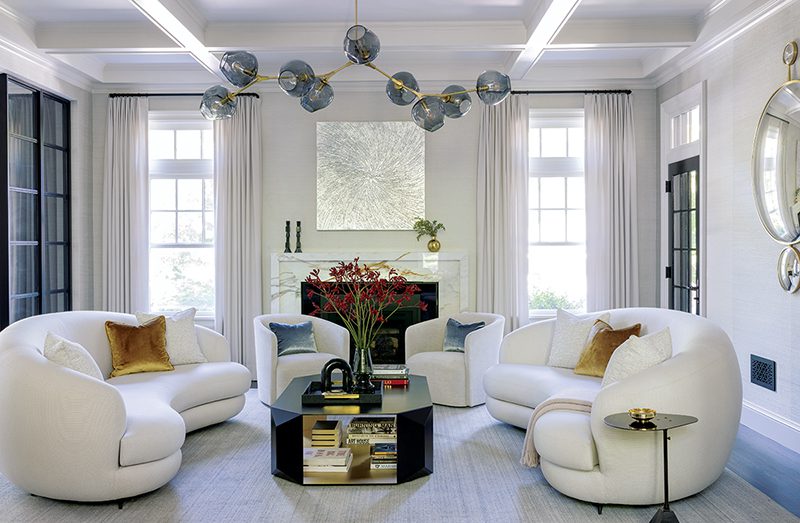
Right above the family room, the living room spans the space between two fireplaces and has an exterior deck that runs the length of the house. “The homeowners gravitate toward more muted tones,” says Georgopolis. “We added blasts of blue in the living room, but there are also links to the greens we used throughout the house in the sofa and accents.”
The boat painting above the mantel, from Eisenhauer Gallery in Edgartown, helped solidify the color palette. “The painting fit the niche within one inch,” says Georgopolis of their luck.
A chaise longue—the family dog’s favorite perch—divides the main living area from a secondary seating area that backs up to the opposite fireplace.
As with the architecture, tailoring in terms of the interiors was also key. “We did not slipcover furniture,” says Georgopolis. “These are not loose, messy people. They wanted comfort and livability, but everything is more finished, more refined than your typical beach house.”
The home’s palette developed from the decision not to have a white kitchen. Says Georgopolis, “The kitchen was really the springboard for the green tones and driftwood texture.”
The wire-brushed cabinets and range hood and a sandstone-topped island that sits on a painted green base act as a background to the dramatic art that is the backsplash above the range. Georgopolis and the homeowners commissioned artist Kara Taylor, who has a gallery on the island, to complete a painted mural of a tree on canvas that was then covered in glass and trimmed in tile.
The kitchen fills one of the gambrel ends, the multiple ceiling angles creating detailed nooks and open cabinets. Across the ceiling, reclaimed beams run from the front of the house to the back and are repeated in the adjacent dining room, office, living room, and master bedroom in the opposite gambrel.
The dining area lies between the kitchen and living room, a see-through fireplace acting as a room divider. The dining room also sits in the crosshairs between the wife’s office and the ocean view.
“The dining room sort of floats,” says Georgopolis. “It’s open to kitchen and office. You can raise and lower the Jonathan Browning light fixture on a pulley. It’s raised when the family’s not eating so the wife can see the water from her office.”
To define the office area from the other beamed spaces on the second floor and to create contrast in the architecture, Georgopolis and O’Kelly painted the beadboard ceiling a mossy green. The splash of color cozies the space, showing off the paneling and built-in cabinet details. The desk’s green glass pulls recall seaglass and the driftwood tones of the kitchen.
“That green is part of the accent color from the kitchen,” says Georgopolis. “If that space had been all white, we’d have lost the detail that showcases Patrick’s design.”
“The architecture and Andrea and Kellye’s design are a more modern interpretation of the New England vernacular,” says Ahearn. “The cabinetry is a more modern look, while the woodwork is more traditional with the beadboard and high paneling.”
The designers also painted the beadboard ceiling in the master suite, but this time in a yellowish-beige. The organic-looking rug in its soft pattern completes a khaki, green, and beige oasis. Cabinetry in the master bath combines painted elements with natural-wood vanities in a dark stain. The walnut stain was continued in the entirety of the walk-in closet to match a chest from the wife’s mother.
“The closet was supposed to be white,” says Georgopolis, “but the walnut added a rich, contrasting element to the bedroom. Instead of that chest jumping out at you, it now fits perfectly.”
Perfection, indeed, defines this home, from the grand scheme to the smallest details. •
Architecture: Patrick Ahearn, Patrick Ahearn Architect
Interior design: Andrea Georgopolis and -Kellye O’Kelly, Slifer Designs
Builder: Peter Rosbeck, Rosbeck Builders
Landscape design: Dan K. Gordon Landscape Architects
Share
![NEH-Logo_Black[1] NEH-Logo_Black[1]](https://b2915716.smushcdn.com/2915716/wp-content/uploads/2022/08/NEH-Logo_Black1-300x162.jpg?lossy=1&strip=1&webp=1)







You must be logged in to post a comment.