Twin Set
March 3, 2016
A pair of cottages on one Cape Cod lot share more than just their good looks. They also share a sense of welcome that guarantees happy memories.
Text by Maria LaPiana Photography by Eric Roth Produced by Karin Lidbeck Brent
The two Cape Cod homes are fundamentally the same. They were designed and constructed with the same mission—fulfilling a Rhode Island couple’s wish to create a family compound. The houses, with nearly identical footprints, sit side-by-side, facades facing one another, front doors mere feet apart, sharing porches, walkways, and lawns on a lakeside lot just shy of two acres.
Still, there are enough subtle differences between the two to create what one of the home’s architects describes as “a dialogue of sorts . . . a reflection.” The pair are in sync, not lockstep.
And that’s just what the matriarch in this story had in mind.
Her family had been vacationing on the Cape for years, and she remembers the pure enjoyment of childhood summers, sharing a house with siblings and cousins. “We called it a camp,” she says. “It became a family gathering place that was very important to us.”
Her own children spent summers in her family’s “little house” on the Cape, but now they were grown and had children of their own. She was determined to keep the tradition alive.
She and her husband started honing their vision when they purchased the lakeside lot next door to their own summer place; she imagined “three mini houses” for their three children—the oldest, who visits often with his wife and two children, and two others who come less frequently.
She reached out to Lyman Perry, a prominent Nantucket-based architect whose work she loved. Perry had designed noteworthy luxury commercial and residential projects for thirty years, and had been inducted into the New England Design Hall of Fame. But he was thinking of retiring. So he called on a Newport, Rhode Island-based colleague, Paul Weber, to collaborate on the project.
The men knew full well that three residences on the same lot were out of the question, and even two would be a challenge. Still, the wife insisted on togetherness and privacy. So the architects refined her basic concept, and drew up plans for the two dwellings that sit on the property today.
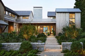
The way the buildings are sited made all the difference. They’re close enough to share common rooms and just far enough apart to create a compelling visual pathway that frames the water view, a natural focal point. “It’s actually a fun, inventive approach,” says Weber, “because when you walk between them, you can go right or left or to the lake directly ahead.”
The design does more than work within the parameters of the property, says Perry. “It enhances your experience with the site.”
Both credit landscape architect Al Abrahamson with maximizing the concept. “He was thoughtful
in his approach to the unusual situation,” says Weber. Abrahamson designed the plantings and the hardscape, including the all-important space between the two buildings. A brick walkway with pergola helps define the area that both divides and connects the houses.
The couple insisted on using builders they knew and admired: Rogers & Marney, of Osterville, Massachusetts. The homes are in keeping with the vernacular architecture of the Cape, with their white-cedar shingles, white trim, and a strong indoor/outdoor connection. “In the larger context they are Capes, with more massing,” explains Weber. There are covered porches at every turn; out back they step off onto a wide lawn leading down to the lake. The floor plans are open, allowing for flexible traffic patterns. Both homes have three bedrooms and three baths, and a separate den (the one in the main house is semicircular).
The doors to both houses are a vivid red, just one bright idea attributed to Providence, Rhode Island, interior designer Barbara Lazarus. The couple had worked with Lazarus in the past and knew they wanted her in at the start of the project. Together they chose many of the interior finishes and artfully combined the furnishings. “There was a budget,” says Lazarus, “so they’re a mix of brand new—from catalogs, from Restoration Hardware, Crate and Barrel—and older pieces, even some from the wife’s mother’s house.”
The decor in the main house has a more traditional look than that of the guesthouse, but both have a relaxed feel. Lazarus, who believes that “second homes should have some whimsy,” made sure of that. “I love the little wet bar in lacquered navy blue in the cottage,” she says by way of example. “It’s just so fun.”
But comfort trumps all. “I wanted washable surfaces, fabrics you can touch. These had to be welcoming houses,” Lazarus says. From the broad stripes in the living room upholstery of the main house to the bright pink-and-green palette on the porches, Lazarus saw to it that “everything was as natural as possible. And as tough as possible.” Just another challenge handled well by the team that worked on this unusual project.
Says Weber, “We had to do two houses that had to work in unique ways on a fairly compact site. We wanted to give both buildings their own sense of identity. They had to share a connection but be different.”
The owners say the strategy worked: siblings and guests share spaces comfortably and enjoy being together, but they have privacy when they want it.
And of the overall experience of working with two architects, the wife says simply. “I liked the idea from day one. They both really understood how I felt about family.” •
Architecture: Lyman Perry and Paul Weber
Builder: Rogers & Marney
Interior design: Barbara Lazarus
Landscape design: Alan Abrahamson
Share
![NEH-Logo_Black[1] NEH-Logo_Black[1]](https://b2915716.smushcdn.com/2915716/wp-content/uploads/2022/08/NEH-Logo_Black1-300x162.jpg?lossy=1&strip=1&webp=1)



You must be logged in to post a comment.