Triple Play
February 10, 2012
Text by Paula Bodah Photography by Peter Vanderwarker
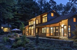
When the owners of this set of tiny cabins head to their retreat, they really get away from it all. The compound is a classic New England camp, tucked into the woods on an island in a New Hampshire lake. The three buildings—one for gathering, one for sleeping and one for guests who spend the night—amount to a combined 2,330 square feet. There’s no heat and no air-conditioning. And because the camp is accessible only by boat, the homeowners have to carry in whatever provisions they’ll need for their stay.
Yes, they’re roughing it all right, but roughing it in style, thanks to the Boston firm of Albert, Righter & Tittmann Architects. Indeed, these miniature cabins are little gems of architectural genius, unfussy in the way of rustic log houses, but visually striking and imbued with a contemporary sensibility.
The buildings, all variations on the same theme, start as simple rectangles clad in unassuming gray-stained vertical board siding. Look up, though, and a series of asymmetrical, angled rooflines jut up and fold back, making the tiny houses resemble large-scale origami projects. “We’ve been playing with rooflines in our office for many years,” says architect John Tittmann. “Just because you have a very simple rectangular plan doesn’t mean the roof has to be simple and rectangular.”
Tittmann says the rooflines, which he calls “prismatic,” reflect a long tradition in American architecture. “Even going back to Colonial houses, the roofs on old saltboxes aren’t always where you expect them to be,” he says. “And in the Shingle style, roofs were often manipulated for dramatic effect. This follows that, though perhaps in a more geometric way.”
The main cabin is just one room deep and holds a seating area that’s separated from the dining area and kitchen by a double-sided fireplace built of brick and studded with rough-cut granite stones. “The stone looks random,” Tittmann notes, “but it was actually carefully orchestrated. Each stone was drawn first, and the stonemason followed the drawings. It’s meant to reflect the landscape there in the foothills of the White Mountains.”
Once the chimney pierces the ceiling it becomes all brick. “From outside you see this precise, orderly brick chimney,” Tittmann says, “so you’re pleasantly surprised when you step inside and see an unruly stone chimney that feels like the mountains.”
It’s hard to say what’s most striking about the interior of the main cabin: the soaring ceiling with its twisting, turning planes that seem to extend up into the sky or the fact that both ceiling and walls have been left unfinished. The exposed fir framing, beyond being appropriately rustic and visually appealing, has the added advantage of doubling as bookcases in the sitting area.
Oversize sliding glass doors stretch along the water-facing walls of the sitting area and enhance the feeling of being smack in the middle of nature. Square windows installed high above the glass doors and a line of clerestory windows on the wooded side bathe the cabin in additional soft, dappled light.
For practical reasons, the kitchen has a bit more finish work, with drawers and cabinets faced in matching fir and adorned with simple pulls of oil-rubbed bronze.
Practicality, too, dictated that the sleeping quarters be tucked away in their own cabins. The standalone sleeping areas offer peace and quiet when night owls stay up and talk into the wee hours or early risers enjoy breakfast at the crack of dawn. The larger sleeping cabin—all of 1,000 square feet—holds a master bedroom with views of the lake and woods through windows on three walls, another bedroom and a sizable bathroom with wood-paneled walls and a simple wooden vanity. A gray-stained deck joins the main cabin and sleeping cabin, while the 330-square-foot guest cabin is visually linked to the other two by the canted expanses of its roof.
Tittmann gives his clients credit for their role in creating this place that he calls “very remote and sort of magical.” Adds the architect: “Anytime you have a striking design, there’s probably a striking client.”
Project Team
Architecture: John Tittmann and John Barron Clancy, Albert, Righter & Tittmann Architects
Builder: Kevin McBournie, KMAC Builders
Share
![NEH-Logo_Black[1] NEH-Logo_Black[1]](https://b2915716.smushcdn.com/2915716/wp-content/uploads/2022/08/NEH-Logo_Black1-300x162.jpg?lossy=1&strip=1&webp=1)






You must be logged in to post a comment.