Tree-House Effect
August 19, 2014
Cape-like, but oh, so modern, this unusual home responds to the hilly woods in Truro with unexpected horizontal notes.
Text by Maria LaPiana Photography by Brian Vanden Brink
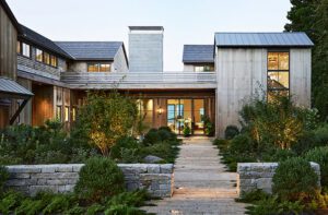
You can’t help but do a double take—the Outer Cape house is a study in contrasts. It looks traditional, even vernacular,
in its use of weathered shingles, but it feels decidedly modern. Although inspired by the hilly woodlands that surround it, the rather succinct house is clearly of the ocean as well.
Ask architect John DaSilva to sum it up and he’ll tell you that this Truro hills home has a “rustic contemporary design that is ordinary enough to be familiar, but unique enough to be special in this location.”
A lot of thought went into the project, says DaSilva, a principal in the integrated architecture and construction firm of Polhemus Savery DaSilva Architects Builders, in Chatham, Massachusetts. While he was the self-described “creative thinker,” he credits his firm with the overall design.
His clients already owned the house next door, but decided they wanted another for visiting family and friends. “Both the existing house and this house, completed two summers ago, are sort of eclectic,” says DaSilva. “They’re contemporary homes, but not strictly modernist.”
Relatively small in scale at just under 2,500 square feet, the house was designed with an “upside-down” plan that places the common living spaces on the second floor and the bedrooms below. It’s just one of many ways the site informed the design. Situated well inland, the property is on one of the highest points of the Cape. “It looks into a valley, and there are views of both the bay and ocean. They’re distant views,” says DaSilva, but the clients wanted to maximize them. “When you’re up on this high ground, above the trees, you really feel like you’re on top of the world,” he adds. “The connection to the land, sea, and sky is nearly magical.”
An unfussy landscape plan underlines the link between the natural and built environments, thanks to landscape architect Michael Bushey of Adorn Enterprises of Easton, Massachusetts.
In addition to being “upended,” the house was built from the inside out, if you will, with a sort of telescoping effect. The open-plan heart of the house comprises the kitchen, dining area, TV room, and a statement staircase (more on that later). Slightly narrower extensions, holding the living room and a screened-in porch, jut out at both ends.
Because the second-floor footprint is larger than that of the first and cantilevers over it, the architect devised a bracketed design that satisfies on many levels. Whimsical “waves” that are actually part of the structure appear to support it. “The bracket and cutout scenario is a form that I like very much,” says DaSilva. “There’s an ambiguity about it. They’re both brackets and segments of the wall of the house.”
Along with the roof’s pitch and overhangs, the brackets direct attention side-to-side, giving the house a horizontal feel even as it parallels a tall ridge. “The brackets are a naturalistic form,” says DaSilva. ”You could give them multiple meanings: waves, tree branches, leaves…so as a symbolic image, they work to make this both a seaside and a hilltop home.”
Uninterrupted rows of picture windows celebrate the all-important views, so much so that DaSilva says he had to throttle back a bit to give the clients some wall space inside. “With no walls, there are no places to hang pictures or stack draperies,” he says. “You also lose structure, so you have to add more support, which is more expensive.”
On the inside, architectural details were kept to a minimum—for the most part. The exception is the wide, open staircase with multiple, gradual landings.
“Stairs, by their nature, have a lot of detail because they have a lot of small parts,” says DaSilva. “When you have an upside-down house, the stairs are even more important than usual. They become the principal circulation route.”
This staircase was designed to be savored. It’s modern, with oak handrails and stainless-steel horizontal bars. But the painted newel posts—tall, dynamic, and curvaceous—steal the show. “They’re funky, but not outrageous,” says DaSilva. “We wanted something unique. Having a whimsical component is very important to me as a designer. I’m very serious about doing work that doesn’t take itself too seriously.” •
Share
![NEH-Logo_Black[1] NEH-Logo_Black[1]](https://b2915716.smushcdn.com/2915716/wp-content/uploads/2022/08/NEH-Logo_Black1-300x162.jpg?lossy=1&strip=1&webp=1)



You must be logged in to post a comment.