Traditional Redefined in Newton
March 10, 2017
A suburban Boston home on a less-than-perfect site demonstrates the power of possibility and the value of collaboration.
Text by Debra Judge Silber Photography by Greg Premru Produced by Kyle Hoepner

Its the challenges, they say, that drive architectural design to the next level. And there were at least two challenges facing architect Paul MacNeely when he set out to create this new home in the Boston suburb of Newton. First, the hilltop site chosen by his clients is in the National Register of Historic Districts. Second, the property sloped sharply in two directions—not a welcome attribute for the future home of a family that craved wide-open outdoor spaces for sports.
MacNeely responded with a plan for a 9,000-square-foot dwelling that not only embraced those challenges as opportunities, but opened up creative possibilities for other members of the project team.
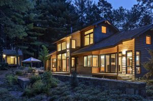
Hoping to avoid a struggle over removing the existing structure—a converted barn of dubious architectural merit—MacNeely approached the local historic authority with renderings of a house laden with traditional forms: oversize gables, a solid front porch, and multiple bay windows. But he also tweaked the massing, adding modern, asymmetric elements, including bold, flat-roof dormers. “What I didn’t want to do is build a period piece,” he says. “I wanted it to say that it was part of the neighborhood, but I also wanted it to say that it was built in the present.” He posited that the new structure enhanced the historic neighborhood more than the old building did. The authority members agreed and approved razing the old structure.
MacNeely’s design incorporated one other critical element: the peculiar topography of its lot. Rather than level the site, the architect turned the negative into a positive and nestled the house into the sloping ground. “We basically used the house as a retaining wall, slicing it into the grade,” he explains. “The house does more than sit on the site; it extends out and holds it together as one piece.”
He also situated the new building closer to the street to line it up with neighboring homes and open up the lot in the rear to make plenty of room for family fun.
The variable grade presented landscape architect Matthew Cunningham with multiple opportunities to create distinct, memorable spaces that advance the relationship between the house and its site. In addition to setting aside 5,000 square feet for a backyard playing field, Cunningham surrounded the house with a multitude of outdoor experiences. A promontory overlooking the playing field is equipped with a marshmallow griller and log stools; a stone terrace offers comfortable seating within view of a second grassy area for volleyball or badminton. From this terrace, stone steps lead past a neat kitchen garden to a smaller patio near the playing field. An alternative route steps down the hill in a series of broad, grassy treads held back by decades-old granite curbstones found on the property—one example of the reclaimed materials that frequently play a starring role in Cunningham’s designs.
The plantings are nearly all native and provide a seasonal show from the brightly colored sedum filling the green roof outside the master bedroom to the native grasses hugging the curved driveway. “This house is designed for a very strong relationship between the indoors and outdoors, not just physically but visually,” Cunningham says.
Inside the front door, the house invites exploration in multiple directions: to the right, into the casually traditional living room; to the left, where bright purple chairs surround a table built for twelve, or up the unapologetically contemporary staircase to the bedroom level. But what’s most compelling is the pull of light from the screened porch immediately ahead. Move toward it, and a bright, contemporary family room and open kitchen reveal themselves to the left. The ceilings in both rooms stop short of the windows that make up most of the back walls, creating an opening to the second level and allowing light to filter between floors. “It’s a house that has a transparency to it,” MacNeely explains.
This transparency was top-of-mind for interior designer Jennifer Palumbo as she worked on the atmosphere of “approachable casualness” her clients sought. A longtime friend of the wife, Palumbo says, “She’s extraordinarily thoughtful about how her family lives and how they want to experience their home.” Here, Palumbo says, “she really wanted a light, peaceful environment. She didn’t want too much to look at.”
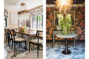
So the designer kept the spaces bright and simple, unifying rooms with pops of color in the upholstery and wall art. Blue rises to the surface in the living room, purple in the dining room, and green in the family room, where Noomi swivel chairs in Sandra Jordan Honeydew Alpaca fabric delight Palumbo as much as her client. “The color adds so much emphasis, and they make me smile because I know my client’s favorite color is green,” she says.
Her client’s favorite perch may well be her study, tucked above the pantry between the two main floors. The sloped site enabled MacNeely to situate the garage four feet below the main level, hiding it from view and making room above it for this intermediate level, which also holds a guest suite and laundry room. While the husband enjoys the solitude of his study behind the living room, the wife’s lets her attend to business and remain connected to what’s going on elsewhere. “It’s like a glass treehouse,” Palumbo says.
Beneath this perch is the pantry, or what kitchen designer Donna Venegas calls the “dirty kitchen.” This hidden space keeps many of the workaday tools of a family kitchen—coffee maker, microwave, toaster—out of sight. “Our biggest challenge was to design a kitchen in a completely open floor plan that doesn’t look like a kitchen,” Venegas explains. From the adjacent family room, the range top and custom zinc hood are the only visible appliances. Venegas was involved nearly from the beginning of the project, and it shows. “When you collaborate early in the planning phase, you’re working with opportunities rather than constraints,” she says.
Such collaboration—and meticulous planning—are what make homes like this come together. “This was one of the most highly designed homes I’ve built,” says Charlie Gadbois of Marlborough, Massachusetts-based Wellen Construction. He takes as an example that staircase in the entry hall. The balusters called for a precise pairing of white oak and steel; the linear cladding, by design, turns the corner into the living room and returns on the other side. A minor miscalculation would throw the entire design off. But not on this project that celebrates challenges as opportunities. “All of the details were worked out in advance,” Gadbois says. “There was nothing left unresolved.” •
Architecture: Paul MacNeely, Eck MacNeely Architects
Interior design: Jennifer Palumbo
Builder: Charlie Gadbois, Wellen Construction
Landscape design: Matthew Cunningham, Matthew Cunningham Landscape Design
Share
![NEH-Logo_Black[1] NEH-Logo_Black[1]](https://b2915716.smushcdn.com/2915716/wp-content/uploads/2022/08/NEH-Logo_Black1-300x162.jpg?lossy=1&strip=1&webp=1)






You must be logged in to post a comment.