Traditional Design Meets Modern Sensibility
February 7, 2019
Text by Bob Curley Photography by Michael Partenio Produced by Stacy Kunstel
Philip A. Gulotta Jr. aims to create what he calls “warm, personal, and real homes that are designed to reflect the lives of the people who live in them.”
It’s a task that became at once more intuitive and more daunting when the house was his own, and the “people” were himself and his husband, Richard Upton.
As a designer with clients in Fairfield County, New York City, and the Hamptons, Gulotta’s renovation of the modern Greenwich home the couple purchased in 2016 seemingly was right in his professional wheelhouse. The clean lines of the house, designed back in 1978 by Paul Marchese Design Associates of Greenwich and Rubinstein & Scialla Architects of Livingston, New Jersey, offered a neutral palette for Gulotta’s aesthetic, which blends traditional designs with modern sensibility. And obviously there would be no quibbling with the clients over the mix of new and vintage furnishings, wall coverings, and other features.
Plus, Gulotta had a strong vision about what he wanted. “The overall goal was to create a design that is a true reflection of who I am as a designer while respecting the architecture of the house,” he says.
Within that simple mission statement, however, lay a couple of significant challenges, starting with the condition of the property. The house, says Gulotta, had been neglected for more than a decade. “The exterior was in poor condition, the yard was overgrown, and the place looked abandoned and sad,” he recalls. Inside, the decor hadn’t fared much better. “It was cold, dark, and dated.” Still, the designer saw the possibilities. “When I saw it, I knew it had the potential to be a spectacular home. The bones were great. It just needed a lot of love and attention.”
Eight weeks of that attention would end up being devoted just to the front entrance. “The doors were in horrible condition, with dry rot and warped wood,” Gulotta says. “It would have been much easier to replace them, but because they were custom made and so unique, my objective was to restore them.” That meant stripping, hand-sanding, and refinishing—a laborious exercise in color-matching the stain on three different types of wood between the doors, mullions, and saddle.
He also recognized that, while the redesign was primarily to please himself and Richard, the finished project would have a large audience of critics. “I absolutely felt extra pressure because I’m an interior designer,” he says. “The house is not only a reflection of my personal style, but it gives me the opportunity to -showcase my abilities in both interior design and architecture.”
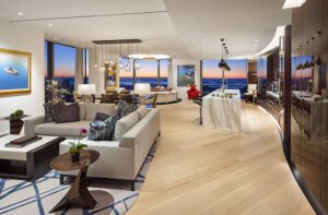
Gulotta began by playing to the home’s location, a hilltop site that ushers in natural light from three and sometimes four sides. He enhanced the indoor-outdoor interplay by painting walls and ceilings white, installing light wood floors, and keeping window treatments simple. A double-height spiral staircase, the strongest design feature of the original home, was retained and restored.
The crisp and clean interior created a gallery-like space showcasing not only the designer’s skill in effortlessly mixing vintage, midcentury modern, and custom furniture, but also his extensive collection of abstract and fine art, photography, and mixed media.
“I like using bold colors and patterns in smaller applications like pillows, accessories, and art,” he explains. “I have always been drawn to furs, skins, horn, and animal prints because of nature’s organic qualities. They add texture and warmth. It creates a great juxtaposition with the bold colors and modern and midcentury furniture.”
Little surprise, then, that one of his favorite spots is his walk-in closet. “I love Schumacher’s iconic leopard print and was so excited to use it in my master bedroom closet,” he says. “I covered everything in it. I used it on the walls and ceiling and even the back of the door, the Roman shades, and upholstery. The only things not covered in it is the cabinetry—which I lacquered in a matching color, of course—and the area rug. The room is magical; I could live in there.”
Every room has a distinctive design profile, sometimes built around a prominent architectural feature, other times around a favorite furnishing. In the living room, for example, the focal point is a richly textured, floor-to-ceiling slate fireplace, which Gulotta topped with a mantel lacquered in his favorite color, a vibrant orange. Furniture coverings in the room are more restrained—chocolate brown velvet for the sofa, navy leather on a chair—but the coffee table is a custom Lucite piece, and the art and accessories stand out with bolder colors. Sisal and more animal skins serve to soften the room.
Gulotta designed the master bedroom around the custom headboard covered in Italian cut velvet in shades of chocolate, taupe, and cream. “The fabric is wool and silk; it feels amazing,” he says. Other seductive textures include a pair of cork lamps.
Depth is provided by wallpaper patterned after Andy Warhol’s famous Rorschach inkblot test. “The wallpaper and headboard give the room the masculinity I was looking for,” says Gulotta. His affection for modern and organic materials is fully realized, at last, in a Lucite bench upholstered in mink.
Small spaces in the house, too, get plenty of design attention, including an area by the staircase where visitors are welcomed with a strategically situated, 1960s-era Italian settee and an English channel-back armchair with hand-carved wood trim. “From this vantage point you get a 360-degree experience of the house,” notes Gulotta.
The designer also was not shy about asserting his vision in secondary rooms, like a powder room with walls, ceiling, and a door covered in gold and cream graphic paper. “I think small rooms should have big personalities,” he says. “They should be like jewelry boxes.”
Approached through fresh landscaping and a redesigned driveway and entry, the painstakingly restored double doors now lead into a home with ample room to entertain, hunker down, or throw open the shades and let the sunlight stream in—in short, a house where “good architecture and interior design go hand in hand,” Gulotta says.
It’s a mix that pleases even the harshest critics—the designer and his spouse.
“We couldn’t be any happier living here,” he says. “It suits our lifestyle—perfectly.”
Project Team
Interior design: Philip A. Gulotta Jr.
Contractor and cabinetmaker: Miroslaw Wandzel, Wandzel ConstructionProject Team
Share
![NEH-Logo_Black[1] NEH-Logo_Black[1]](https://b2915716.smushcdn.com/2915716/wp-content/uploads/2022/08/NEH-Logo_Black1-300x162.jpg?lossy=1&strip=1&webp=1)



You must be logged in to post a comment.