Thom Filicia Updates a New Canaan Home
April 5, 2023
A cunning remodel gives a sporty New Canaan clan room to spread out and spaces that promote togetherness.
Text by Fred Albert Photography by Jane Beiles

The onslaught starts in the early morning hours and has been known to last until well after supper. Cascades of kids charge through Kaitlyn and Rob Lowe’s New Canaan property, trailing duffel bags loaded with hockey equipment, tennis rackets, or swim gear as they make a beeline for the backyard or race into the basement locker room to get ready for the next activity.
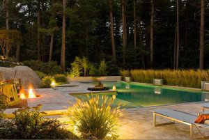
After moving from an Upper West Side apartment where son Rogan was literally living in the closet and a trip to the park was a major ordeal, having nearly two acres to spread out was a game changer for this sporty family of six—even if the 1928 house that came with it inspired nothing but indifference.
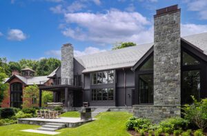
Fortunately, Rob, an investment banker, and Kaitlyn, an actor, had a secret weapon up their sleeve. New York interior designer Thom Filicia had been a friend of Rob’s since childhood and was willing to take on the home’s transformation, alongside Connecticut architect Rob Sanders. The latter added a new great room, expanded the bedrooms, and improved the home’s flow, which had been compromised by a pair of ungainly modular additions. (“Essentially two double-wides on top of each other,” Sanders explains with a shudder.)
Filicia was tasked with updating the interiors and making them feel more cohesive without obliterating the home’s quirkiness. “It was about tightening up the materials and tightening up the aesthetic,” says the designer, who installed prefinished white-oak floors throughout and painted all the interior doors a pale blue, creating a clean, crisp backdrop for a collection of unpretentious contemporary furnishings.
Sanders removed a bathroom to create a new front entry that aligns better with the home’s approach, while Filicia filled the resulting foyer with a dramatic ebonized-wood wallcovering, a grasscloth ceiling, a Sputnik-style pendant, and a console table loaded with personal effects. “I love making rooms like that a little more dramatic, because you’re only in them for a short amount of time, and you want them to be memorable,” the designer says.
Around the corner, an array of family mementoes adorns the wall above the sofa in the living room, where watercolor hues and plush seating inspire relaxation. “This is their ‘slow’ living room,” Filicia says, distinguishing it from the ‘fast’ family room on the other side of the foyer, where friends gather to play pool or crowd onto the sectional for sporting events. “I know the Lowes, and I know how they live,” Filicia says. “If you’re in that room with less than six people, then the power’s out!”
Moving a staircase opened up the kitchen, which was still hampered by a pair of pesky support columns. Sanders integrated the posts into a floating L-shaped cabinet; the adjacent table, flanked by two benches, is the home’s sole dining area. “This was one of the best decisions we made,” says Kaitlyn, who rarely used the old dining room. “We can actually squeeze about eighteen people around this table, so that became the center of every gathering.”
The test of a good interior, Filicia says, is creating something specific to the people who live there. “If you didn’t know Rob, Kaitlyn, or the kids, and you went through this house without them here, you would walk away with a really strong sense of who they are.”
Project Team
Architecture: Rob Sanders Architects
Interior design: Thom Filicia
Builder: Vita Design Group
Landscape design: Wesley Stout Associates
Share
![NEH-Logo_Black[1] NEH-Logo_Black[1]](https://b2915716.smushcdn.com/2915716/wp-content/uploads/2022/08/NEH-Logo_Black1-300x162.jpg?lossy=1&strip=1&webp=1)


You must be logged in to post a comment.