Theatrical Sweep
August 29, 2012
Text by Regina Cole Photography by Michael J. Lee
Frank and Nancy Selldorff were thinking straight. When they first came to Doreve Nicholaeff to talk about designing a new house on Cape Cod, they weren’t considering curves, despite the fact that the Osterville-based architect uses them to great effect.
“We love modern design, clean, graceful lines, with a European influence,” Nancy says of the couple’s aesthetic. Beyond that, they were focused only on creating a vacation home that maximizes the views from a stunning perch on a bluff high above a harbor with glimpses of the ocean in all directions. They wanted to make the most of their enviable 500 feet of waterfront while making sure their house would suit its traditional neighborhood.
“When we began, Frank was cost conscious,” Nicholaeff says. “Curves are always more expensive, so we began with an angled design.”
But as Nicholaeff took the couple to look at a few of her other projects, Frank began to change his mind. “The more he saw, the more often he said, ‘Why can’t we do a curve like that?’ ” the architect recounts.
Thus was born the largest curving wall Nicholaeff has designed to date. The Selldorffs’ new getaway boasts 129 feet of glass wall arcing clear from the garage at one end of the house to the pool terrace at the opposite end. The entire rear elevation of the house is one, long convex curve. “Before this, the biggest arc we built into a home was about half this length,” Nicholaeff says.
The shape provides more than drama; it also extends the view. While a straight wall limits sightlines to what is directly ahead, a curve presents an additional range of vision.
All this drama—in both the architecture and in the panorama beyond that sweeping glass wall—hides coyly behind a front door as sweetly at home on Cape Cod as any shingled cottage. While the back of the house is modern, sleek and clean, the front entry presents a shingled, picturesque face. Dormers and columns flank an arched door. To either side, flowerbeds bloom with bee balm, Shasta daisies, pinks, rugosa roses and other old-fashioned perennial favorites of the Cape Cod landscape. The traditional front facade faces a small lane populated with a few rambling old summerhouses. “Our challenges included the integration of the interior and exterior of the house with its walls of glass,” says Nicholaeff about her design, which had to be addressed within the complication of stringent zoning limitations.
“I tried to create a ‘front to back’ house, taking my cues from the landscape,” she explains. “The house nods to vernacular Cape Cod building tradition with white cedar shingle walls and a red cedar shingle roof. On the railing, we installed stainless steel rails and cables that evoke boats.”
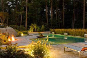
The swimming pool and pool house on the west side of the house follow the ridgeline level with the street and parallel to the lot’s long harbor frontage, where the long, narrow lot falls down thirty feet to the edge of the water. A mahogany-floored terrace covered with a beadboard ceiling gazes across the swimming pool deck to the neoclassical pool house and pergola. The terrace flows out of the kitchen, a boon to adults preparing meals while children play.
On top of the bluff, the back of the house rises three levels for views of the boats in the busy harbor. Partially hidden among native trees, three stories of large mahogany-framed windows provide the best views of all: out, but not in. Despite the vast fenestration and the decks that follow the curve of the rear elevation, this side of the house is surprisingly private thanks to the maple, oak and pine camouflage.
Nicholaeff describes the house as “A bow and arrow—a long rectangular form in tension.” Tension, that is, in the positive sense of thrilling and dramatic. “We needed southern light, but the view is north,” Nicholaeff says. “That already put the house into tension. I knew we’d have to use clerestory lighting. The center of the house gets light via the south-facing entry and from the south- and west-facing kitchen. Light can be indirect, but very effective.”
When it came to the interior, Nancy says, “We knew we wanted it informal, easy,” to match the couple’s preferences for simplicity and modernity. “For example, we have just one eating area, no separate dining room.”
The kitchen, its adjoining dining area and the living room curve into each other on pale English sycamore flooring. The Bulthaup kitchen blends natural woods with stainless steel and horizontal glass wall paneling for a sleek, theatrical look. An appropriately comfortable and modern decor created by Karen Quinn of Cornwall, Connecticut, furnishes rooms radiating from round stairs located just off the house’s center with clean-lined furniture against a quiet palette that lets the external environment take center stage. Upstairs, each bedroom nestles into the arc and faces the view. Here too, furniture adheres to the contemporary theme, and the color scheme stays neutral with the occasional shot of blues that echo the sky and water.
Despite the light and airy decor, the house stays away from a summer-only feel for a getaway that suits any season. “We use the house in winter, too,” Nancy says. “We come on weekends and, when we can, for school vacations.”
Nancy and Frank move slowly as they decorate their sanctuary; they lived without a chandelier for three years before they found the right one. “They love certain details,” Nicholaeff says. “And they are willing to forgo other details for a bold move.”
Their vacation home is certainly a bold move, but its boldness is a private joy. To the neighbors, it lives comfortably by the side of the road as a new Shingle-style house. To sailors, the house is barely glimpsed among trees. To its owners, however, it is a wish fulfilled: modern and clean, with graceful lines and sophisticated style.
Project Team
Architecture: Doreve Nicholaeff, Nicholaeff Architecture + Design
Interior design: Karen Quinn
Builders: C.H. Newton Builders and Sea-Dar Construction
Landscape designer: Landworks
Share
![NEH-Logo_Black[1] NEH-Logo_Black[1]](https://b2915716.smushcdn.com/2915716/wp-content/uploads/2022/08/NEH-Logo_Black1-300x162.jpg?lossy=1&strip=1&webp=1)



You must be logged in to post a comment.