Team Spirit
October 28, 2014
Text by Robert Kiener Photography by Greg Premru
When a squad of dedicated pros collaborate this closely, it’s no wonder the result is a home that fulfills its owners’ every desire.
It’s not a word that Boston-based architect Treff LaFleche uses casually, but it’s how he describes the Weston, Massachusetts, home that his staff and a like-minded team of collaborators created. “I think something is sublime when it is so beautifully considered and made that it appears effortless in its use and operation,” says LaFleche, a co-founder of LDa Architecture & Interiors.
The owners of the 6,000-square-foot house apparently agree; they’ve told LaFleche that hardly a day goes by that they don’t discover some new delight in their one-year-old home. It could be the way the breakfast-nook windows perfectly frame the view of the woodlands outside. Or the way the home’s signature staircase seems to float in space. Or it could be a small detail, like the simple elegance of the bronze and hand-stitched-leather pull on the door of the husband’s home office.
The compliments are especially meaningful to the architects, designers, builder, landscape architect, and contractors who teamed up on this two-story, Shingle-style, five-bedroom house. “That’s because the owners were also an integral part of the collaborative effort that produced this home,” says builder Jim Youngblood. “They were in this from the beginning and encouraged us to push ourselves to create something special.”
Because the project was a team effort from almost day one, “the process was very efficient,” says LDa’s John Day. “Everyone pitched in and had the chance to comment. Also, because we were building a house from scratch, we had the freedom to come up with solutions to the way the clients live and tailor their space—and make it respond—to their needs.”
The owners wanted an elegant (but not “stuffy”) home that nestled into the landscape, took advantage of the lot’s wooded views, and let in lots of light. They also wanted an open floor plan, and they wanted their home to feel both intimate and expansive. Finally, they asked for an environment that celebrated craft.
Says LaFleche, “They were very involved and cared about ideas, craft, and process.” That’s evident in one of the home’s most striking features, the open staircase of iron and oak that is visible from most of the rooms. In one of their frequent meetings, the owners and their team discussed the project, pitching in with ideas, concerns, and solutions.
The open floor plan, large windows, and a long, somewhat narrow footprint that lets the line shine through front to back help fill the house with light. Nine-foot ceilings help open the views to the outside.
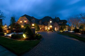
The more traditional front of the house blends in with the neighborhood’s New England vernacular, while the back is more dramatic. It is largely wrapped in glass, and the tower-like section that contains the stairway is topped by a striking copper-clad roof.
Landscape designer Stephanie Hubbard took advantage of the lot’s gradual slope to design differently landscaped spaces. “There’s a more designed entry-garden ‘room’ in front of the house,” she explains. “As you work your way around the house and get closer to the woods, the landscaping becomes freer, more natural.”
Retaining walls are clad in split-faced New England bluestone. “The stone’s clean-lined, architectural pattern works well with both the house and the surroundings,” says Hubbard.
The interior palette takes its cue from the outdoors and features deep greens, golds, cranberries, and other earthy New England shades. Bluestone forms the family room fireplace, and most floors are of custom-finished, stained oak. “A lot of the material is what you’d expect in a New England home, but in an unexpected finish,” explains Day. For example, the rift and quartered oak floors, which could be found in a nineteenth-century house, were cerused to bring out the grain and finished with oil and wax.
The dining room is an elegant solution to the owners’ request that the home be both intimate and spacious. With its pocket doors open, it feels connected to the rest of the house. Closed doors turn the room into a self-contained dining area. “We didn’t want to close off the light too much when the doors were closed, so we designed oak pocket doors built around antique Chinese screens,” says LaFleche.
The living room has a more layered, traditional look that gives it the feel of a parlor for a surprising nod to the past. The kitchen, centered around a dramatic island of granite and walnut, fits seamlessly into the open floor plan. A butler’s pantry and coffee bar hide inside a custom-built, furniture-like cabinet.
Almost every vantage point in the house offers drop-dead vistas of the woodlands and conservation land outside. Inside, the views are just as intriguing, with dramatic features like the floating staircase, the granite kitchen island, and the beamed ceiling in the family room that catch the eye.
And there are surprises throughout the home. In the family room, for example, a big-screen TV above the fireplace is disguised by a motorized bronze panel that opens at the touch of a button. In the dining room, the custom-made table seats twenty but can also be split into two smaller, square tables for more-intimate seating.
It’s clear that every room, every square inch, of this house was designed with attention to detail and purpose. “Most of us have to fit our lives into the houses we have,” says Day. “These owners took the opportunity to have a home that responds to their needs.”
In most cases, the phrase “designed by committee” is meant to be an insult. In this collaborative success, it’s a badge of honor. •
Architecture and interior design: Treff LaFleche and John Day, LDa Architecture & Interiors
Landscape design: Stephanie Hubbard, SiteCreative Landscape Architecture
Builder: Jim Youngblood, Youngblood Builders
Millwork: Herrick & White
Share
![NEH-Logo_Black[1] NEH-Logo_Black[1]](https://b2915716.smushcdn.com/2915716/wp-content/uploads/2022/08/NEH-Logo_Black1-300x162.jpg?lossy=1&strip=1&webp=1)




You must be logged in to post a comment.