Spectacular Kitchens and Baths
August 29, 2013
Kitchens and baths with plenty of style prove that the most functional rooms in the house have taken a big step beyond their utilitarian pasts.
Text by Paula M. Bodah
Less is More
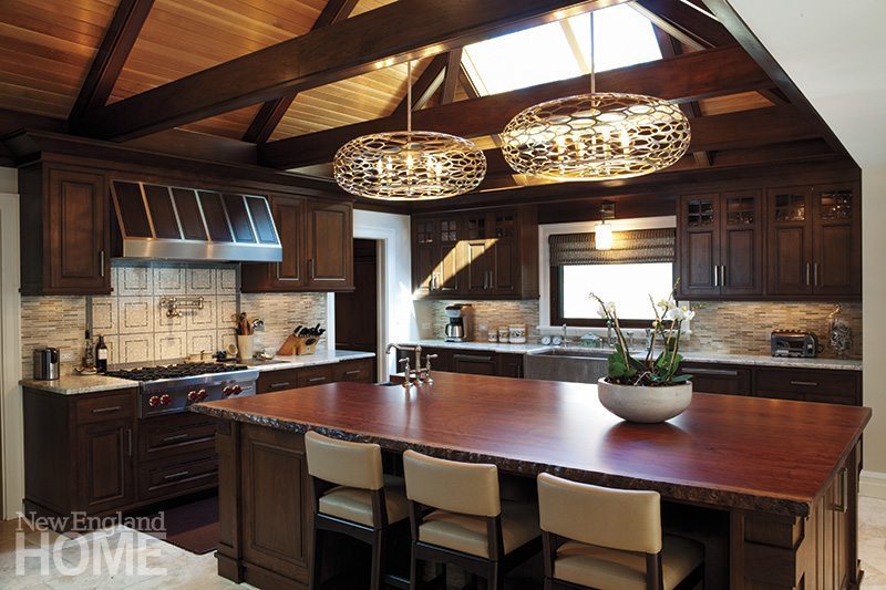
The double-height ceiling in this kitchen was a bit too much of good thing. Responding to his clients’ desire for a more intimate space, architect John MacDonald used black walnut trusses and white oak in-filling for the illusion of lower ceilings. Additional warmth comes from the walnut cabinets and a bubinga island top, while limestone floors, white granite counters and backsplashes set with pale stone lighten things up. Natural light spills in from a new skylight above the window. MacDonald added other warm touches, including walnut panel accents in the stainless-steel range hood and a copper-lined farmer’s sink. Architecture: John MacDonald, Morehouse MacDonald & Associates
Builder: The Lagasse Group
Millwork: Herrick & White
—Photography by Sam Gray
Go With the Flow
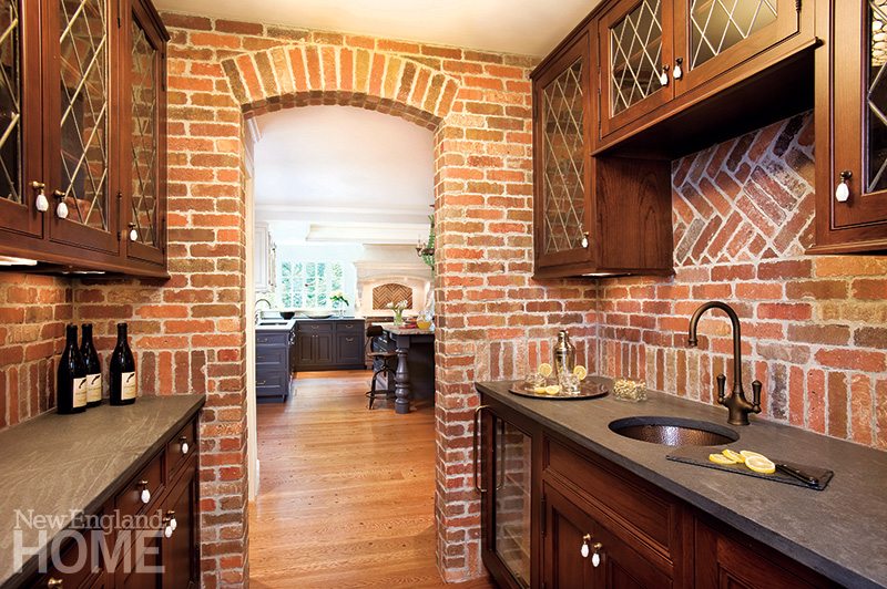
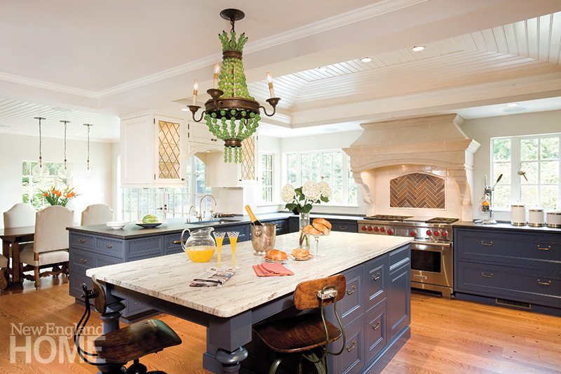
The original small, brick-walled kitchen probably suited this home perfectly when it was built in the 1930s, but today’s families crave more space and far more light. The transformation by architect John Meyer and designer Laura Meyer included raising the ceiling (and giving it architectural detail), knocking out walls and reconfiguring the space for seamless flow from the pantry through the cooking area to the casual dining area. Blue lower cabinets create a pleasing contrast with bright white walls and ceilings. And those bricks? The homeowners hated to part with them entirely, given their history as part of Boston’s historic Old North Church. The design duo made clever use of them as an accent behind the stove and to give the pantry, above, an extra dose of character.
Architecture and interior design: Meyer & Meyer Architecture and Interiors
Interior decorating: Kate Maloney
Builder: Martin Deane, Kells Construction
Cabinetry: Jim Simko, Weston Kitchens
—Photography by Shelley Harrison
Forever Young


Karen Swanson envisioned a youthful, contemporary look for the kitchen in her own 1850s sea captain’s house. The butler’s pantry, above, eases the transition from traditional to relaxed with its multi-colored Harlequin wallpaper, walnut countertops and gold metallic ceiling paint. The serene kitchen belies the challenges Swanson faced, including the non-functioning three-story brick chimney that intruded on the space. The designer plastered over the brick then covered it with wallpaper to create an anchor for the island. Vivid decorative accents and stainless-steel appliances ramp up the energy level in the room, which took first place for medium kitchens in the 2013 National Kitchen and Bath Association’s annual kitchen design contest.
Interior design: Karen Swanson, New England Design Works
—Photography by Evan White
Now and Zen


Stephanie Horowitz and Ben Uyeda stayed true to the modernist roots of the 1950 home when they renovated this bath. The goal: to expand and reconfigure without giving up the spare, utilitarian feel of the original room. Reclaiming an unused closet in the next room enabled the duo to add the soaking tub. They tucked the toilet behind the shower to shield it from view when the bathroom door is open. Harsh yellow walls and vanity counters gave way to soft white, and tile in a warm, neutral palette laid in a contiguous pattern sets a modern tone. A clever peg-board system in the medicine cabinet holds hair dryers, toothbrushes and other bathroom necessities for minimum clutter. The result: a serene oasis with a Zen-like feel.
Architecture: Stephanie Horowitz and Ben Uyeda, ZeroEnergy Design
Builder: S+H Construction
—Photography by Eric Roth
Wakeup Call


Everyday activities like the morning shower and getting dressed for work take on a sense of adventure in this master bath and dressing area, thanks to the ingenuity of the architects and their daring clients. The contemporary space treats the separate elements—the sleek tub, the glass shower cube, the freestanding vanity and, most notably, the egg-shaped standalone closet—as sculptural pieces. By paring away nonessential walls, the architects opened a clear view from the bedroom door to the back of the bathroom, where the tub sits positioned to take in the view of garden and woodlands. There’s nothing timid about this space, including the color scheme, where natural finishes in calming hues of gray, sand and white serve as a backdrop to bold splashes of purple.
Architecture: Kyle Sheffield and Douglas Dick, LDa Architecture & Interiors
Builder: Gilman Guidelli & Bellow
Cabinetmaer: Olive Square Kitchens
—Photography by Michael J. Lee, styling assistance by Angela DeSiata Stevenson
Glass Act

The owner of this urban condominium envisioned a bright, cheerful space, despite the fact that her interior bathroom gets no natural light. Architect Jonathan Cutler obliged by covering the walls with gleaming glass Ann Sacks bricks in white and two shades of aqua. Outside the shower, mirrored upper walls (one hiding a medicine cabinet for plenty of additional storage) reflect light in every direction. Opposite the blizzard-white Caesarstone vanity Cutler installed a matching counter, lit by vertical incandescent tubes at either end, so the homeowner can stand close to the mirror to put on her makeup. Finally, the floor’s tiny iridescent glass blocks guarantee a sense of light even underfoot.
Architecture and interior design: Jonathan Cutler; Builder: R.L. Smith Construction
—Photography by Eric Roth
Share
![NEH-Logo_Black[1] NEH-Logo_Black[1]](https://b2915716.smushcdn.com/2915716/wp-content/uploads/2022/08/NEH-Logo_Black1-300x162.jpg?lossy=1&strip=1&webp=1)
