Special Focus: New England Kitchens and Baths
September 16, 2019
Text by Debra Spark
Function and form make a beautiful marriage in these five spaces by New England designers.
 Midcentury Revival
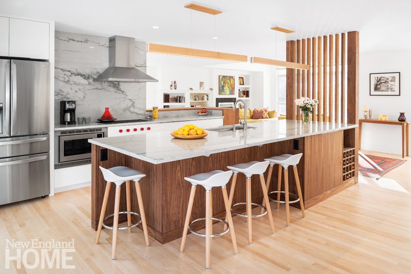
The owners envisioned a bright, open floor plan, but they also wanted to respect the pedigree of the 1950s home they had just bought. Architects Chris Brown and Lauren Davis gutted and rearranged the kitchen, sunroom, and part of a dining room, opening up walls to usher in the light. Then they introduced space-defining elements; a slatted wall at one end of the kitchen island separates the space from the entry hall, while the raised countertop that serves as bar area separates the kitchen from the dining area. The rich walnut of the island, cabinet perimeters, and some countertops contrasts with white cabinetry for a warm but crisp look. A linear walnut pendant above the island reinforces the clean lines of the space. The husband satisfies his passion for bread making in a special nook that holds a second oven and a cookbook shelf. Nearby, two banks of pullout drawers keep clutter out of the kitchen. Of the husband’s weekly (sometimes daily) efforts, Davis says, “I have tried it, and it is delicious.”
CREDITS
Architecture: Chris Brown and Lauren Davis, Brown + Davis Design
Builder: Sweeney Design Build
Photography: Ryan Bent
 Coastal Vibe
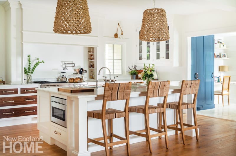
Designer Laura Gall has vacationed on Nantucket for years, so when she decided to build a hilltop house with views of Casco Bay in Cumberland Foreside, Maine, she wanted, she says, “to bring elements I experienced there to Maine.” She married this inclination with modern impulses in a light and airy kitchen with nine-foot-high ceilings and walls painted white. She added a sense of warmth in the form of oak floors and walnut drawer faces, and introduced texture with woven pendant lights and island stools. Collaborating with senior designer Jodi Geran at the Christopher Peacock showroom in Boston, Gall customized Peacock’s Refectory cabinetry. The line is inspired by English prep school dining halls and features deep moldings and hefty hardware, like the polished nickel latches and hinges of the dining room’s walnut hutch that recalls old-fashioned freezers. All the components—white walls, dark wood, woven elements, and substantial hardware—come together to satisfy Gall’s plan to keep her kitchen coastal without being what she calls “overly beachy.”
CREDITS
Interior design: Laura Gall, Spaces by LLG
Kitchen design: Jodi Geran, Christopher Peacock
Photography: Megan Booth
 Resort Chic
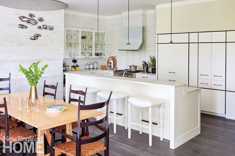
When the owners of a condo at Canyon Ranch in Lenox, Massachusetts, were looking for an interior designer, they turned to a man who has already spent years designing for the renowned luxury wellness spa: William Caligari. His soup-to-nuts approach had him weighing in on everything from the condo’s partition plan to its silverware for a space that manages to be simultaneously classic, contemporary, and edgy. The kitchen incorporates a nook of traditional cabinetry (glass panel above, flat panel with polished chrome pulls below) and a more modern wall of flat white panels that hide a refrigerator and slim pull-out pantries, all outlined by black reveals. The walls were treated to layers of plaster abraded to reveal the hues below. “The effect is like birch bark,” says Caligari. Black reappears in the tapered, Shaker-inspired dining chairs from local talent Peter Murkett of New England Modern. The simple bent plane of a white glass range hood and the drama of the futuristic Mercury Suspension Lamp from Artemide offer additional high-impact design moments.
CREDITS
Architecture: Robert E. Harrison, Berkshire Design
Interior design: William Caligari, William Caligari Interiors
Photography: John Gruen and Anna Molvik
 Dramatic Effect
Longstanding clients asked architect Ruth Bennett and interior designer Gerald Pomeroy to renovate their Lexington, Massachusetts, home, making space for a luxurious new master bathroom. “Because the couple are extremely well-traveled, and respond well to color, texture, and form, I wanted to do something slightly exotic in nature,” says Pomeroy. His starting point was iridescent glass mosaic tiles for the walls and—laid in a wheel pattern—on the floor. The bathroom is “classic in general terms,” says Pomeroy, “but the tiles drove me to pick unique forms and unusual lighting.” He also incorporated additional reflective elements, such as the hammered crystal chandelier and the shiny metal stool that sits by the tub. The slipper tub floats before a wide window dressed in a roman shade of shimmery raw silk. Architect Bennett designed the double-sink vanity with diamond detailing on the trim and cabinet doors.
CREDITS
Architecture: Ruth Bennett, RBA Architecture
Interior design: Gerald Pomeroy, Gerald Pomeroy Interiors
Builder: Preston Lemanski, Lemanski Construction Company
Photography: Eric Roth
 Hotel Luxe
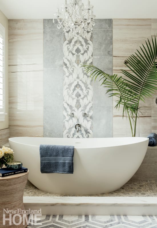
“There is a blessing in every situation that can be a bummer,” says designer Christa O’Leary. Her new master bath is one such blessing. In 2015, she and her husband had to gut their house in Hingham, Massachusetts, thanks to that winter’s heavy snowfall and subsequent ice dams that damaged their roof, allowing water to pour into their home. The silver lining: O’Leary could redo the place based on insights gained in six years of living there. She took inspiration for her master bathroom from stays she enjoyed at luxury hotels over the years. The slipper tub is inside the shower, like a similar set up in the Fairmont Miramar Hotel in Santa Monica, California, while the idea for the intricate tile work—a small hexagon pattern under the tub and a larger hexagon for the overall floor—came from a Kimpton hotel in North Carolina. An inset of blue-gray tiles behind the tub evokes the flow of water. His-and-hers sinks round out the space, with O’Leary’s husband’s navy vanity opposite her white Ritz Carlton-inspired vanity.
CREDITS
Interior design: Christa O’Leary
Builder: Sean Cutting, Cutting Edge Homes
Photography: Michael J. Lee
[WPSM_COLORBOX id=73546]
Share
![NEH-Logo_Black[1] NEH-Logo_Black[1]](https://b2915716.smushcdn.com/2915716/wp-content/uploads/2022/08/NEH-Logo_Black1-300x162.jpg?lossy=1&strip=1&webp=1)
 Midcentury Revival
 Coastal Vibe
 Resort Chic
 Dramatic Effect




You must be logged in to post a comment.