Special Focus: Landscape Design 2018
February 10, 2018
Five properties, each with its own unique challenges, show that New England’s landscape design professionals are an ingenious lot.
Text by Paula M. Bodah
Linear Progress
Natural meadow and a forest of hemlock, oak, and birch make up much of the five acres that surround this contemporary dwelling in Lincoln, Massachusetts. The homeowners wanted the landscaping nearer the house to have a similar natural feel. It was also important, however, that it partner well with architect Jacob Lilley’s modern design. Landscape architect Kimberly Mercurio’s plan combines simple, linear elements with plant materials that emphasize native species. The low granite wall and the walkway from the driveway to the front entrance are softened with low-maintenance ferns, grasses, and winterberry that offer visual and textural interest all year. Other linear elements include a cable railing enclosing a terrace composed of alternating strips of bluestone slabs and peastone gravel. Another terrace has a Japanese garden-like feel with its bluestone walkways accented with narrow strips of grass and a corner arrangement of rocks that invites contemplation. A striking “fence” of corten steel columns, which will darken over time, is a sculptural presence and a modern foil for a traditional stone wall that sits nearby. The columns, spaced just five inches apart, also stand as a gentle way to keep the homeowners’ dogs from straying.
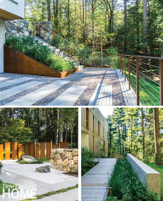
Landscape design: Kimberly Mercurio Landscape Architecture
Landscape construction: Anderson Landscape Construction
House architecture: Jacob Lilley Architects
House builder: Kistler & Knapp Builders
Photography: Michael Conway
Right Neighborly
What makes a good neighbor? The people who live near this Beacon Hill garden probably would say its owners qualify. When a developer’s plans for a five-story contemporary stucco building fell through, the site became a 1,500-square-foot eyesore, “literally a hole, six or seven feet below grade,” says landscape architect Lynne Giesecke of Studio 2112 Landscape Architecture. The couple in the condo overlooking the space decided to improve the view—and by extension, the whole neighborhood. They bought the lot and turned it into a gem of a pocket garden. It’s all so pretty, with its iron gates crafted by sculptor Rich Duca, brick-and-granite walkways and terraces, and lush plantings, you’d be forgiven for not recognizing the effort behind—and below—what you see. Masses of lightweight geofoam blocks brought the land up to grade, and a concrete exterior wall of the condo building was veneered with brick. Cleverly placed fencing and plantings create a series of outdoor rooms. And of course, the diminutive greenhouse tucked into a corner is a crowning touch. The owners enjoy relaxing and entertaining in their garden. And the neighbors love their improved view.
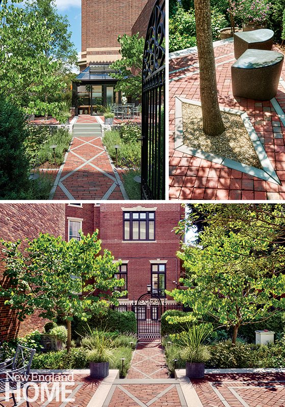
Landscape design: Studio 2112 Landscape Architecture
General contractor: Michael S. Coffin Landscape Construction
Greenhouse design: Capone Architecture
Greenhouse builder: Solar Innovations
Photography: Millicent Harvey
Hillside Haven
John Tittmann and J.B. Clancy, of Albert, Righter & Tittmann Architects, had in mind an ancient Greek temple when they envisioned this Vermont home and its landscape. While the front of the house has a welcoming farmhouse look, the rear elevation takes what Tittmann calls a “temple form,” with a long, column-studded veranda. Sitting substantially above grade, the house looks out over a sloping meadow of grass and wildflowers and wide views of forested hills beyond. Landscape designer Jonathan Keep worked with the architects on siting the house. “Typically, you’d place a house on a hill parallel to the contour line,” he says. “But we pushed one side out, which saved a wonderful down-valley view from the narrow side and gave the broad rear side the mountain views.” A terrace of lawn extends from the veranda, ending at a tiered gabion wall. A gabion wall—essentially a series of wire baskets filled with stone—results in a sturdy wall without mortar, Keep explains. A similar wall also borders the raised swimming pool and its surround of Goshen stone. The landscape plan is simple, really, yet undeniably striking. It’s easy to imagine the owners reveling in the magnificent mountain and meadow views.
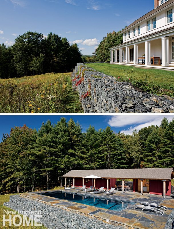
Landscape design: Jonathan Keep
Landscape construction: Bergeron’s Lawn Service & Landscaping
House architecture: Albert, Righter & Tittmann Architects
House builder: Domus
Photography: Robert Benson
A Higher Calling
Perched five stories above the streets of Boston’s Back Bay neighborhood, this roof deck—actually three distinct spaces spread out over nearly 2,000 square feet—had the potential to be an urban treasure. For landscape architect Jon Pate the main difficulty was working around the mechanicals. Dryer vents, condensers, and the other not-so-attractive accoutrement of modern living dotted the roof. “We needed something that would take your eye off the utilities but allow air flow,” Pate explains. He and sculptor Jacob Kulin collaborated to create panels of high-grade aluminum with an intriguing asymmetric honeycomb lattice pattern. Behind each aluminum panel, an acrylic sheet with a cut pattern offers both additional screening and the opportunity for ambience-enhancing lighting effects. A plan by lighting designer Sergio Mazon, with controls by South Shore Audio Video, lets the homeowners create effects to match any mood or occasion. Adding to the challenge: everything from the panels and lighting to the plants selected by garden designer Mark Corbin to the extra-heavy furniture Pate chose had to be hoisted by crane. A Herculean task, to be sure, but a group effort that yielded spectacular results.
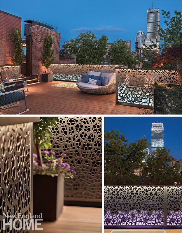
Landscape design: Pate Landscape Architecture
Garden design: Mark Corbin, South End Gardens
Builder: Jackson’s General Carpentry
Fencing sculptor: Jacob Kulin, Kulin Modern
Lighting design: Sergio Mazon, Mazon Lighting Design
Photography: Anthony Crisafulli
Pond Perfect
The couple who call this southern Vermont property home had always loved the large pond that previous owners had dug decades earlier. Unfortunately, the homeowner relates, “We had a really hot, dry summer, and the pond died. It got shallow and weedy and not very pleasant.” She and her husband had the pond drained, scraped clean, and refilled. “But then it was just sort of a round hole that looked like an excavation site,” she says. As they were contemplating adding some plantings, they came across a New York Times article about Julie Moir Messervy and reached out to her. When it comes to manmade ponds, says Moir Messervy, “you have to understand how ponds work in nature.” To look natural, this one needed softening and a more organic plan for laying out the rocks around it. Working with excavator Thaddeus Guild, she sculpted the land around the pond, creating more natural contours and moving the existing rocks to fashion steps into the pond and a diving rock that looks like nature itself deposited there. “There’s nothing I like better than setting stones!” Moir Messervy says. Project manager Erica Bowman’s low-maintenance plant choices range from grasses to trees to -colorful perennials for year-round -interest.
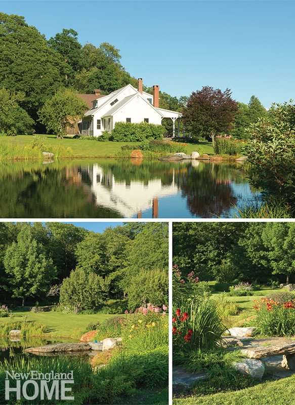
Landscape design and installation: Julie Moir Messervy Design Studio
Excavation and masonry: Thaddeus Guild, TMG Enterprises
Photography: Susan Teare
Share
![NEH-Logo_Black[1] NEH-Logo_Black[1]](https://b2915716.smushcdn.com/2915716/wp-content/uploads/2022/08/NEH-Logo_Black1-300x162.jpg?lossy=1&strip=1&webp=1)





You must be logged in to post a comment.