Special Focus: Kitchens and Baths from the September – October Issue
September 20, 2016
Style and function are equal partners in these beautifully designed kitchens and baths.
A Chef’s Dream
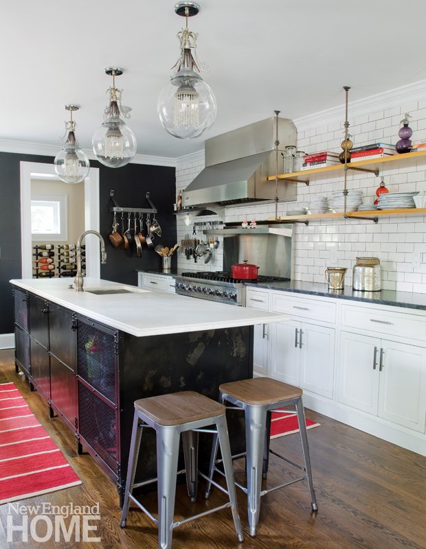
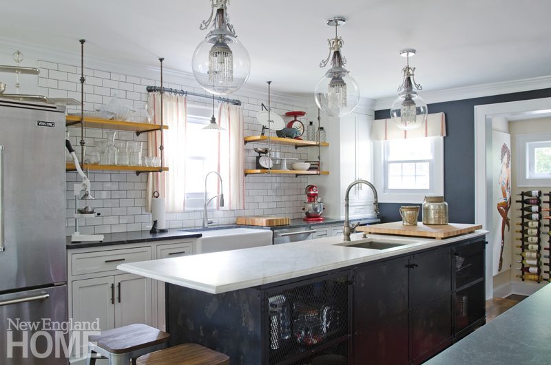
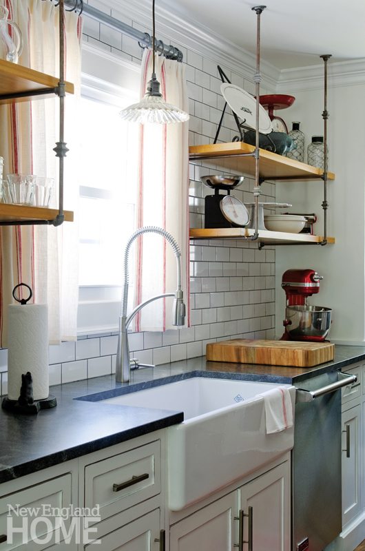
Billy Grant was a bit like the cobbler whose children go barefoot. The award-winning chef owns a handful of popular Connecticut restaurants and a catering business, yet his own home kitchen was woefully inadequate, according to designer Kellie Burke. His 1920s West Hartford home, in a style Burke calls “cottage Tudor,” had many rooms, and all of them were small. “It felt like a little dollhouse,” Burke says. She took down walls in the kitchen, dining room, a bathroom, pantry, and mudroom to create a space any chef would love. Open distressed-wood shelves supported by antique iron fencing keep equipment in easy reach and suit the European farmhouse look Grant wanted. The metal cabinet island is inspired by industrial baking racks, while the white subway tile walls recall the classic working restaurant kitchens in which Grant honed his craft. Metal barstools at one end of the marble-topped island offer a spot for friends to keep the chef company while he cooks. The industrial and European farmhouse tones blend beautifully at the dining end of the space, where the sun shines through cafe curtains made of French linen kitchen towels onto a reclaimed-wood table and metal chairs.
—Paula M. Bodah
Designer: Kellie Burke, Kellie Burke Interiors
Builder: Michael Delissio Jr., Sunrise Homes
Photography: James R. Salomon
Serving Up Style
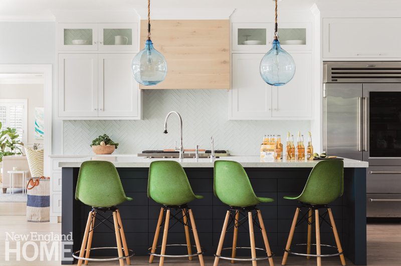
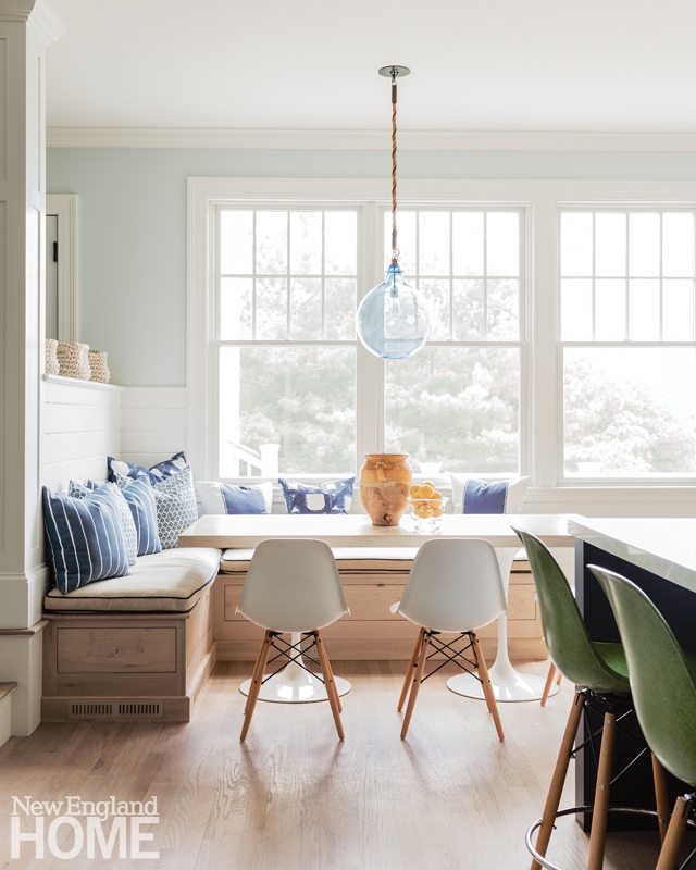
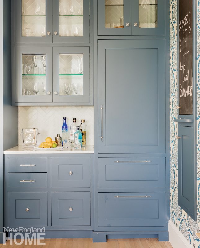
E very young family yearns for a welcoming kitchen. Unfortunately, this new abode in Manchester-by-the-Sea, Massachusetts, had one that “lacked style and seemed awkward,” designer Kathy Marshall recalls. She remedied the situation with a new breakfast area that holds a custom tulip-legged table and an L-shaped banquette with under-seat storage. New cabinets sport a wider-than-traditional rail and a small bead accent. “Subtle nuances make a room special,” the designer says. Between the cabinets, Marshall nestled a pale wood vent. The base of the quartz-topped island is painted Farrow & Ball’s striking Stiffkey Blue. “It looks like it’s paneled in V-groove, but with a push, the facade gives way to reveal more storage,” says Marshall. The Sub-Zero-Wolf Pro 48 refrigerator wears an attention-getting glass door, while another fridge in the dreamy-blue bar area remains hidden, allowing glassware to hold the stage. Marshall cleverly backed the glass-front cabinets with herringbone tile. The nearby blackboard is mounted on a narrow wall Marshall added to gives the bar greater presence. Final touch? The red oak floor was painstakingly refinished for a pleasing beachy look.
—Megan Fulweiler
Kitchen and interior designer: Kathy Marshall, Kathy Marshall Design
Builder: Covenant Construction
Photography: Michael J. Lee
Let There Be Light
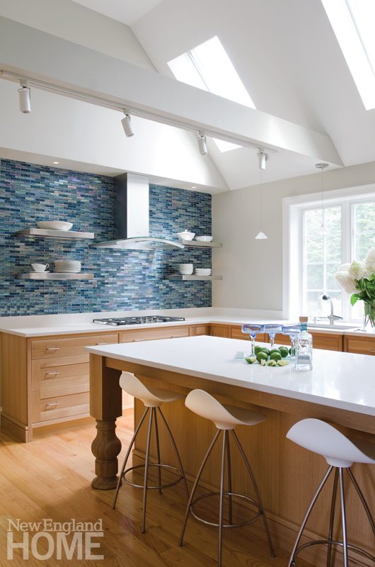
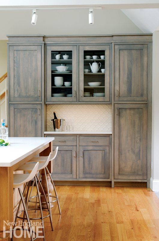
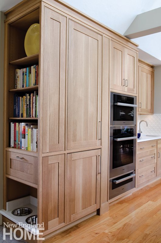
An architect husband and his wife envisioned a kitchen with a Scandinavian aesthetic to accommodate their passion for cooking. But with an overload of cherry and knotty pine, their Orleans, Massachusetts, kitchen was gloomy despite its skylights. “The room felt dark and weighted down, even on sunny days,” says designer Mark Haddad, who completely transformed the space with a light palette and elegant materials. Adhering to the original footprint, the designer swapped out yesterday’s cabinets in favor of two variations of Pennville craftsman-style including white oak (in a natural finish) and maple (with a semi-transparent stain). The cabinets provide abundant storage but with a cleaner profile. Hadadd also used the cabinets to create a pantry wall, which he deftly extended to hide the previously visible mud room and to hold extras, such as a second Julien UrbanEdge sink with a Blanco Meridian faucet, and a feeding station for the dog. The wood beams clad in snowy drywall conceal wiring for functional lighting. And no appliance is left homeless, so the ColorQuartz Fiji White counters remain clutter-free. The counters and the cobalt-blue tile of the backsplash beautifully reference the owners’ beach town location. —M.F.
Designer: Mark Haddad, Haddad Hakansson Design Studio
Builder: Daniel Elliot, Elliot Fine Carpentry and Remodeling
Photography: James R. Salomon
Luxury Aloft
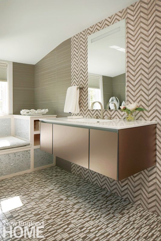
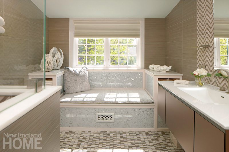
Nature abhors a vacuum—and so do homeowners. Charged with transforming an unfinished Wellesley, Massachusetts, attic into usable space, interior designer Heidi Pribell fashioned an office, a guest room, and a dazzling bath. “I love mixing patterns and textures. For me, it’s like music with lots of beats and rhythms,” she says. To that end, Pribell clad the walls in a mocha-colored Porcelanosa tile, as she explains, “overlayed with light sgraffito bone color.” The zigzag marble wall tile she chose to back the bronzy glass-faced vanity from Robern (wall mounted to visually expand the compact bath’s dimensions) captures shades of both mocha and bone. The artful mocha stone floor is flecked with black for an added touch of intrigue. All in all, it’s a heady composition that continues right into the steam shower where yet another graphic pattern is on display. Pribell also devised an ingenious window seat where visitors can grab a few minutes of relaxation. The designer covered the structure in a translucent plastic-like film from Lumigraf and dressed the seat in a white and silvery voided velvet from Romo. A frosted faux-fur pillow injects an extra note of glam. —M.F.
Designer: Heidi Pribell, Heidi Pribell Interiors
Builder: Victor Cormier
Photography: Jeffrey Dodge Rogers
Stress Reliever
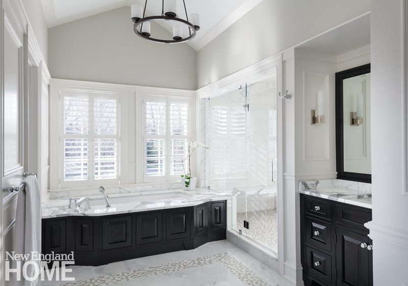
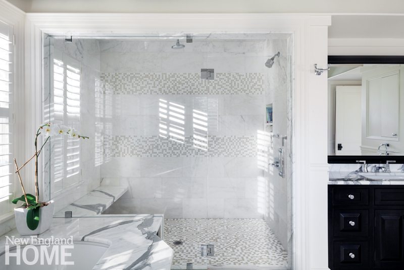
The large Shingle-style gambrel home designed by architect Patrick Ahearn for his Weston, Massachusetts, clients allowed plenty of room for an enticing master suite. So rather than a mere bath to accompany the owners’ sleeping quarters, Ahearn stepped it up, designing a serene oasis with a sophisticated tone. “Our aim was to fill the room with light for the feel of a day spa,” he says. The soaring ceiling gives volume to the bath and sets the stage for the integrated tub and spacious shower. A frameless glass wall between the two seems barely a separation, but with its cleverly frosted bands, the wall aids privacy nonetheless. Sun streams in through the PVC window shutters (no need to worry about splashes), illuminating the soft gray-and-white theme and soothing the senses. The contrast of the dark mahogany vanity and tub surround with the muted marble adds interest to the picture without jarring the harmonious tempo. And it’s no accident that at first glance, the marble tiled floor appears to ripple toward the tub like an incoming tide. What better design ploy, after all, for a room where water reigns? —M.F.
Architect: Patrick Ahearn
Designer: Andrew J. Paraskos
Builder: Marc Kaplan, Sanford Custom Builders
Photography: Greg Premru
Share
![NEH-Logo_Black[1] NEH-Logo_Black[1]](https://b2915716.smushcdn.com/2915716/wp-content/uploads/2022/08/NEH-Logo_Black1-300x162.jpg?lossy=1&strip=1&webp=1)





You must be logged in to post a comment.