Special Focus: Kitchen & Bath Design Connecticut 2018
July 27, 2018
Connecticut kitchens and baths take their design cues from far and wide.
Text by Debra Judge Silber
Inner Space
When Denise Davies’s clients, a German CEO and his American wife, relocated from Boston, they bought a Westport center-hall colonial—a traditional home squarely at odds with their modern sensibilities. It’s a design dilemma Davies is increasingly familiar with. “The next generation is moving from cities to the suburbs, and even though they’re living in a center-hall colonial, they don’t want grandmother’s curtains anymore,” she says. And this house was “tchotchked-up to the max,” Davies adds. “There were moldings everywhere.” Modernizing the interior, and the kitchen specifically, meant removing those moldings in favor of clean returns around the kitchen’s new Marvin casements and designing custom cabinetry that would hold its own in an opened-up floorplan. Davies achieved this with a standout refrigerator/cabinet wall on one side and matte gray base cabinets topped with pietra cardosa on the other. Between the two, a marble-topped island and two oversize pendants from Artemis take center stage. White oak shelving on both sides of a simple box that conceals the range ventilation adds an organic element and provides a platform for lively displays. “They wanted a clean, modern aesthetic but didn’t want it to be boring,” Davies says. She made sure it wasn’t.
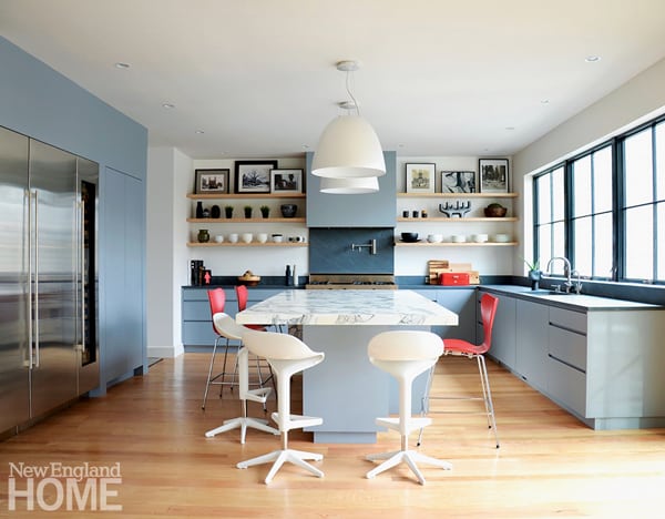
Kitchen design: Denise Davies, D2 Interieurs
Builder: Marek Bil, Old World Construction
Photography: Denise Davies
Nurturing Nature
Designer Leslie Dunn’s Rowayton home sits beside a picturesque estuary, so it’s not surprising that her remodel focused on opening the house—and its disjointed galley kitchen—to the view. Working with Scarsdale, New York, architect Leonard Brandes, Dunn opened the kitchen to the living room and called in colleague Karen Berkemeyer to work some space-planning magic. Berkemeyer found room for everything in perimeter cabinets by Wood-Mode that feature flush-panel inset doors and a smart black-painted finish. “It’s so handsome,” Dunn says of the color that anchors the bright white subway tile on the exterior walls. References to the home’s beachy surroundings are subtle: hardware mimics boat cleats, rugged barn beams recall driftwood, and blue window frames pair up with the watery expanses they outline. The true attention-grabber, though, is the island—big, bold, and white. “I didn’t want a little baby island,” says Dunn, who believes in using big moves to enlarge small spaces. Stools line up on two sides of the broad marble top designed more for communication than cooking. “I want the conversation always flowing,” she explains. Not hard, in a kitchen where there’s so much to talk about.
Architectural design: Leonard Brandes, Leonard Brandes Architect
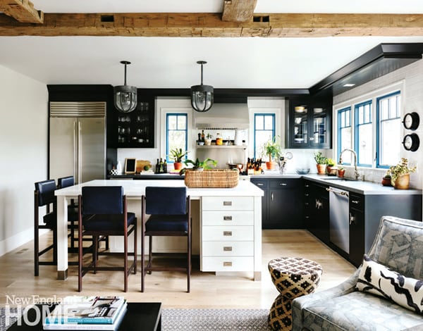
Interior design: Leslie Dunn, Dunn Designs
Kitchen design: Karen Berkemeyer, Karen Berkemeyer Home
Builder: S&W Building Remodeling
Photography: Tim Lenz
Location, Location
A kitchen with a “sense of place” evokes a specific location; a designer with a sense of place ensures that the kitchen has a dedicated spot for every necessary item. And so when Greenwich designer Sarah Blank’s clients downsized, she made sure their new kitchen not only transported them to the Normandy countryside they loved, but packed along every necessary accoutrement. Exposed brick, aged beams, and a zinc-topped island set a rustic stage upon which curtained cabinet doors and an iron fireback—brought from France by the owner and set in a niche above the cooktop—add a Gallic touch. Unseen are the rollouts, custom dividers, and dedicated storage areas Blank worked into the mix. “I inventory everything; that way we can lay out every drawer and every cabinet,” she explains. Stored prettily in plain sight are the homeowner’s majolica collection and her supply of gourmet olive oils arranged wine-bottle fashion in the adjoining pantry. The cabbage-green of the majolica is reflected in the hand-painted tile backsplash that Blank assembled from an assortment of samples at Solar Antique Tiles in New York. “We had about ten of them on the table, and I just started pulling out colors. It was like playing checkers.” In this case, a win-win.
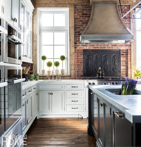
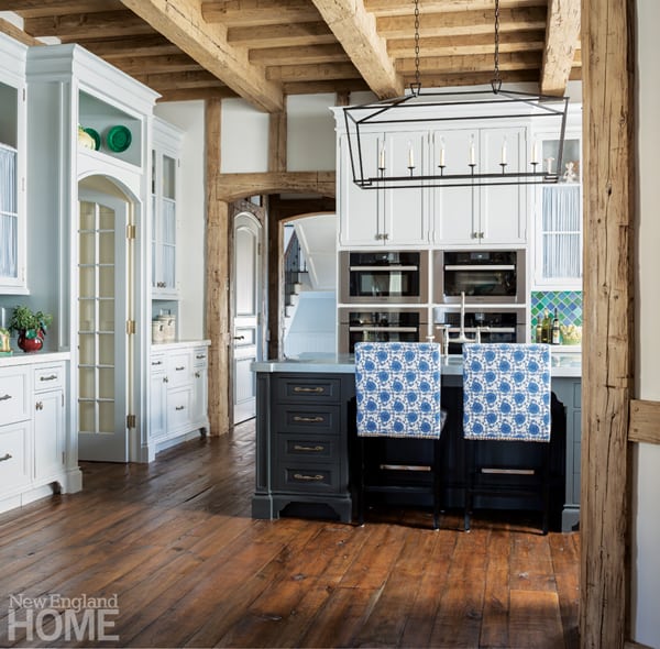
Kitchen design: Sarah Blank, Sarah Blank Design Studio
Architectural design: Elizabeth Rhogami, Douglas VanderHorn Architects
Interior design: Susan Thorn, Susan Thorn Interiors
Builder: Significant Homes
Photography: Neil A. Landino, Jr.
Goin’ Up The Country
Architects frequently speak of “volume,” but when six-foot-five Rafe Churchill stepped into the kitchen of his client’s antique cape, the need for more headroom took on a personal dimension. Dropping the floor eight inches (there were already several level changes in the oft-remodeled house) solved the problem of the kitchen’s low ceiling; to increase floor space, Churchill pushed a wall out six feet to accommodate a bank of windows and a row of soapstone-topped base cabinets. The remodeled kitchen’s soapstone sink, unlacquered brass hardware, walnut-topped island, and simple board backsplash are signatures of Churchill’s sophisticated farmhouse style. In this project, he collaborated with builder R.C. Torre, who handled the shape-shifting, and interior designer Kathryn Fagin, who weighed in on the kitchen’s muted palette and helped guide the clients’ input. “They didn’t want to get too far away from that farmhouse feel,” she explains, but at the same time were looking to introduce a minimalist, almost Scandinavian flavor. The silicone-shade pendants by Muuto that hang over the island were found by the client, whose enthusiasm made the project all the more satisfying. “It’s nice to design a space someone’s really going to live in and love,” Fagin says.
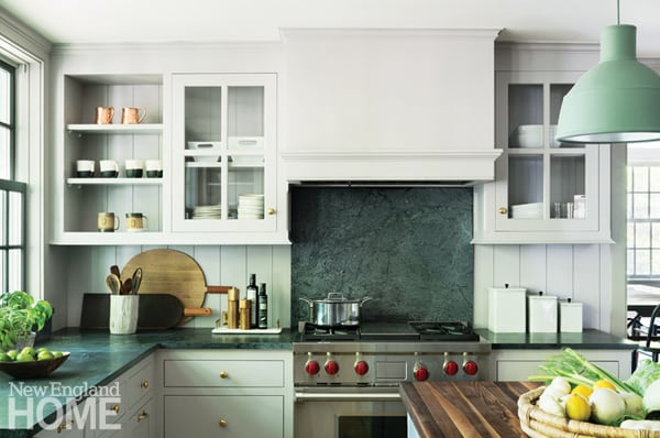

Architectural and interior design: Rafe Churchill and Heide Hendricks, Hendricks Churchill Houses & Interiors
Interior design: Kathryn Fagin, KJ Designs
Builder: R.C. Torre Construction
Photography: Amanda Kirkpatrick
Era of Elegance
In the right hands, an impossible situation can yield remarkable results. On top of its outdated surfaces and slanted ceilings, the long, narrow master bath in what was once a turn-of-the-century Greenwich carriage house had no windows. “On one hand, I’d say that was a limitation,” admits kitchen designer Chuck Wheelock. “But on the other, it creates this really nice introspective space that closes the world out. When you step in there, you can be transported anywhere.” Wheelock and interior designer Kat Rosier encouraged this aura of timelessness by replacing the outdated, built-in whirlpool with a freestanding tub paired with Rohl fixtures whose flat profile bends their classically arched design in a contemporary direction. Phillip Jeffries grasscloth clads the wall in a similarly modern take on an ageless pattern. The long mahogany vanity and attached dressing table organize the space by minimizing clutter, both visually (with its symmetrical sinks and drawers) and practically (with features such as a hidden power outlet drawer). A mirror that stretches nearly end-to-end above the vanity catches sunlight from a skylight and splashes it back on the tub; three sconces mounted on the mirror’s surface provide supplemental light in a space where windows, truth be told, would be a mere distraction.
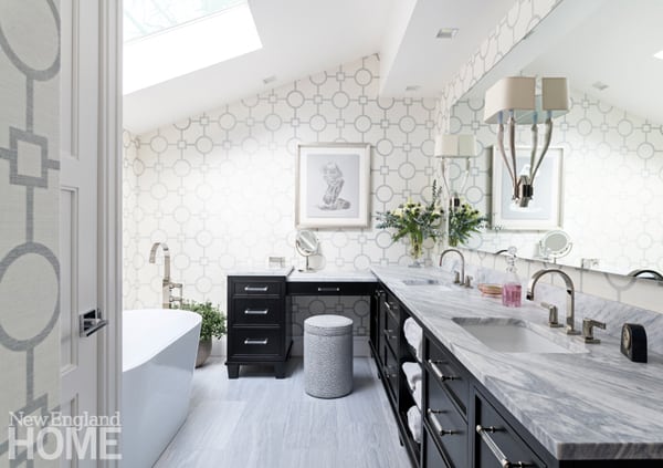
Bath design: Chuck Wheelock, Wheelock Design Associates
Interior design: Kat Rosier, Hom Sanctuary
Photography: Kyle Norton
Fast Forward
The master bath that Brooke Garden’s client showed her was large and well laid out, but its finishes and fixtures screamed 1990s glam-gone-stale. Garden and her partner and daughter, Elise, went to work shining up the space, replacing the dated built-in bath with a sumptuous substitute from Victoria + Albert and surrounding it with a gleaming Glassos tile floor. They shaved down the curbed shower and replaced a clumsy half wall beside the toilet with a sleek glass panel fogged on its lower portion for privacy. The move instantly brightened the space and opened up the sightlines for the marble mosaic they would install on that wall. Between the toilet and shower, a white-lacquered vanity is styled like a dresser and custom built to perfection by Yonkers, New York-based Huane Carpentry. On another wall, a dressing table in the same style is topped with a mirror featuring an embedded TV. Circling above in the form of two planetary rings is a lighting fixture from Shine by S.H.O. “She wanted something bright, white, modern, and feminine,” Garden says. Check, check, and check.
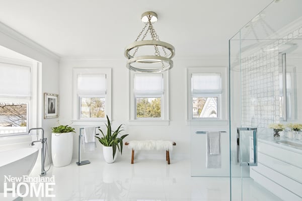
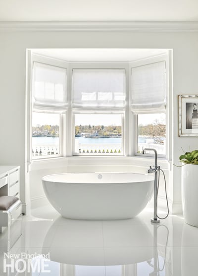
Interior design: Brooke Garden and Elise Garden, Garden Designs
Builder: P.J. Huane, Huane Carpentry
Photography: Scott G. Morris
Share
![NEH-Logo_Black[1] NEH-Logo_Black[1]](https://b2915716.smushcdn.com/2915716/wp-content/uploads/2022/08/NEH-Logo_Black1-300x162.jpg?lossy=1&strip=1&webp=1)


You must be logged in to post a comment.