Special Focus Kitchen and Bath Design 2017
September 5, 2017
Text by Paula M. Bodah
A half-dozen kitchens and baths where form and function happily cohabitate.
History Lesson
The 1920s house—a brick-front Georgian built for Babson College founder Roger Babson—had undergone any number of metamorphoses by the time its current owners took possession. Today’s renovation brought the Wellesley, Massachusetts, house back to its original majesty, although, of course, it now holds every twenty-first-century amenity, including a spacious kitchen that opens to the family room. Designer Karen Newman’s goal was a kitchen that works for a modern family but nods to the architectural history of the house. Reclaimed walnut barn board forms the island, and Newman notes that it has been oiled but not sealed for a sense of age. Records showed that home’s original kitchen had brass hardware, so Newman added brass drawer and cabinet pulls that will develop a patina with use and time. Hidden details, like the walnut that lines every drawer, further the sense of authenticity. Storage options abound, from the tall closed cabinets and the glass-front cabinets, many of which have an extra closed cubby at the top, to the drawers beneath the sitting area’s two window seats. The family’s inherited oriental rugs and simple roman shades in a Ralph Lauren stripe add a warm touch of color.
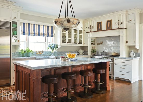
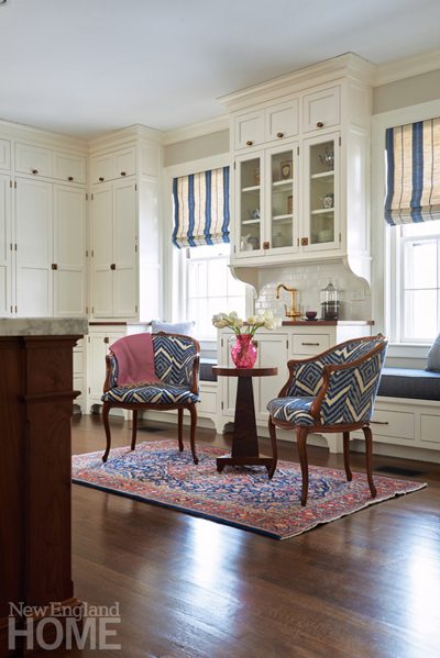
Architecture: Christopher Dallmus, Design Associates
Interior design: Karen Newman, Pentimento Interiors
Builder: Howard Brothers Builders
Photography: John Gruen
Producer: Stacy Kunstel
Open for Business
The kitchen in this Newton, Massachusetts, condominium was ready for a stylish new look. Designer Robin Gannon took things a giant step further, reimagining the space from top to bottom and side to side. One wall came down entirely, boosting flow between the kitchen and the family room. An exterior wall with a predictable window-centered-over-sink configuration now holds twin windows that flank the stainless-steel stove and hood. Textured tile in a neutral color stretches up to the ceiling, and trios of floating walnut shelves at each corner add visual interest. Gannon converted a sitting area into a chic wet bar with storage below and a pair of mirrored cabinets above. The creamy-colored
cabinetry and honed Danby marble counters are warmed by the deep blue-gray of the island, Dash & Albert rugs in a zippy stripe, the wet bar’s wall of hand-painted Ann Sacks tile, and antique brass
hardware. Another touch that’s both good-looking and highly functional is the unique floating walnut table that turns one end of the island into a casual dining spot.
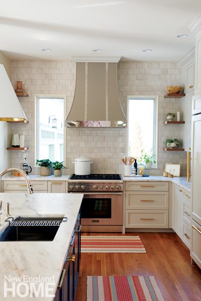
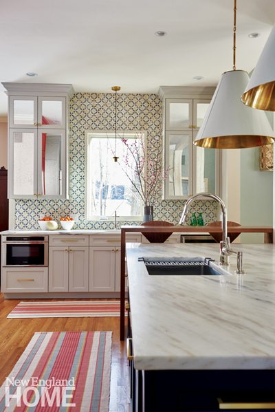
Architectural and interior design: Robin Gannon, Robin Gannon Interiors
Builder: Claude Sangiolo, Casa Sangiolo
Photography: John Gruen
Producer: Stacy Kunstel
Modern Makeover
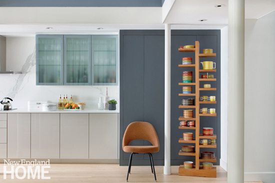
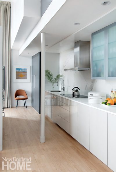
David Hacin and his husband, Tim Grafft, had different reasons for remodeling the kitchen in their Boston condominium. Hacin felt it was time to give the space a look that suited his preference for minimalist, cubist design. Grafft, who is the cook in the house, wanted to ramp up the kitchen’s efficiency and functionality. Working closely with Rosemary Porto of Poggenpohl Boston, the couple were able to fulfill their dual desires. The kitchen is largely open to the main living space, so Hacin brought in the gray, taupe, and white palette from the rest of the home. The main horizontal volume consists of sleek, hardware-free, taupe-colored cabinetry topped with a counter of seamless white Corian. The Corian also runs up the walls and across the ceiling, framing the large-format porcelain tile of the backsplash. Vertical volumes of charcoal gray, a bold counterpoint to the white and taupe, conceal storage, including a system of refrigerated drawers and cabinets next to the wine holder. The gas cooktop was replaced with an induction cooktop, which when not in use can serve as additional counter space.
Architecture and interior design: David Hacin and Matthew Woodward, Hacin + Associates
Kitchen design: Rosemary Porto, Poggenpohl Boston
Builder: Chris Monaco, Monaco Johnson Group
Photography: Sarah Winchester
Producer: Kyle Hoepner
Coastal Chic
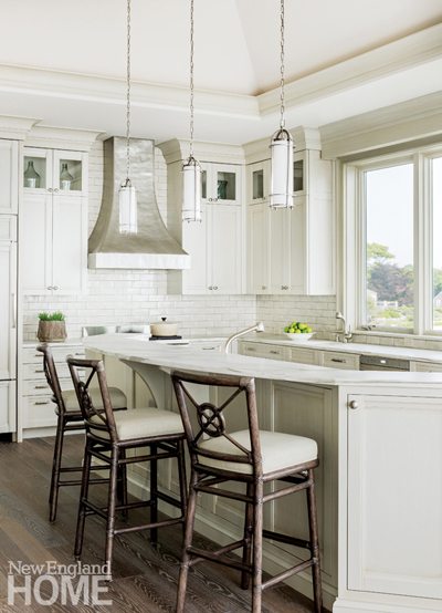
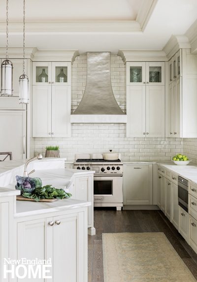
A white kitchen, like this one in the North Shore town of Swampscott, Massachusetts, feels clean, efficient, and restful. Look more closely, though, and you’ll notice the subtle drama achieved by interior designer Anita Clark and kitchen designer Barbara Baratz. Baratz, who was with Venegas and Company at the time and has since gone off on her own, opted for upper cabinets with a substantial molding that echoes Clark’s choice of deep molding on the ceiling. Glass panes at the top of the cabinets keep the feeling light while adding a decorative touch. A hammered metal hood and backsplash of subway tile with a brushed finish supply textural interest. The island’s elevated dining counter serves the dual purpose of offering a better glimpse of the ocean through the broad window and keeping kitchen messes hidden—an important detail given the home’s open floorplan. The airy space is grounded by a floor of white oak stained a gentle gray that evokes a piece of driftwood and honors the home’s waterfront location.
Architecture: James Velleco, Grazado Velleco Architects
Interior architecture and design: Anita Clark, Anita Clark Design
Kitchen design: Barbara Baratz, Barbara Baratz Design
Builder: Bruce Paradise, Paradise Construction
Photography: Michael J. Lee
A Room with a View
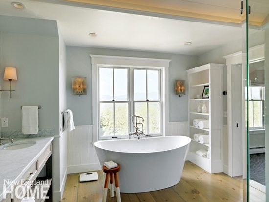
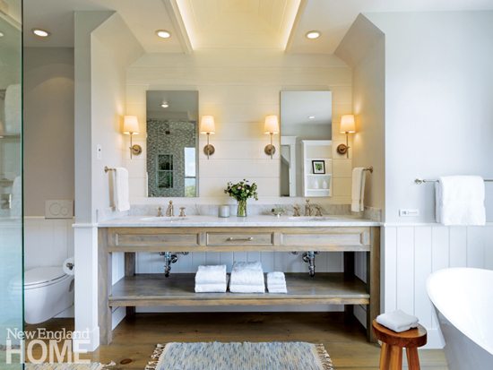
Turning the master bathroom in this home in Stowe, Vermont, into the spa-like retreat it is today was a true exercise in collaboration for architect Milford Cushman, builder Shapleigh Smith, and designer Carol Flanagan. The house has enviable mountain views, but this second-floor bath was located in a low-ceilinged dormer with a window set too low to take advantage of the vistas. The three pros agreed the first order of business was raising the roofline, a change that turned the dark, cramped quarters instantly spacious and light filled. The vanity—whose marble top and open shelving keep it feeling airy—tucks into a niche backed with horizontal cladding. The cove ceiling above holds a hidden strip of light for soft illumination. An open shower, outfitted in glass and ceramic mosaic tile for what Flanagan calls “a bit of bling,” occupies the opposite wall, while the freestanding tub sits in front of the large new window with its perfectly centered mountain view. The final touch that gives the space its serene look and feel, is the soothing palette of pale gray and soft white.
Architectural design: Milford Cushman, Cushman Design Group
Interior design: Carol Flanagan, Carol Flanagan Interior Design
Builder: Shapleigh Smith, Patterson & Smith Construction
Photography: Susan Teare
Spa Treatment
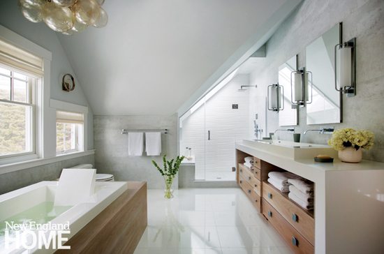
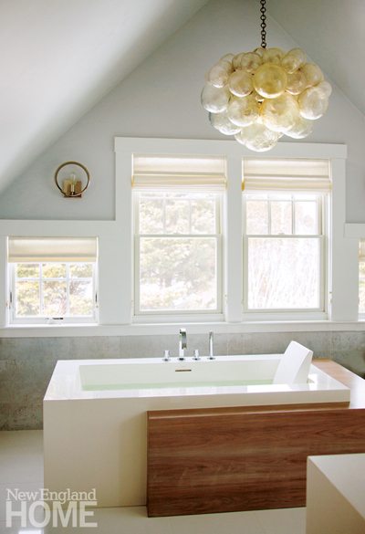
From the outside, the home is a classic Shingle-style dwelling that fits right in with its Cape Cod neighbors. Inside, as the master bath illustrates, things take a more transitional turn. To create this tranquil space, designers Liane Thomas and Liz Stiving-Nichols removed several partition walls, giving them an unbroken expanse that enhances the room’s flow. Pale gray walls—some painted and others clad in oversize porcelain tiles, provide the soothing backdrop for a contemporary freestanding Toto tub with a walnut surround. An adjacent Caesarstone vanity has a long trough sink and a combination of open shelving and walnut drawers. A spacious shower with an accent wall of textured white tile tucks in under the sloping ceiling. Accessory pieces offer a bit of modern drama; floating Robern mirrored medicine cabinets are offset by contemporary sconces from Circa Lighting, and above the tub hangs a whimsical chandelier of resin bubbles from Oly Studio. The tub stretches before a bank of four windows looking out over a bucolic view of a wooded yard.
Architecture: Karen B. Kempton
Interior design: Liz Stiving-Nichols and Liane Thomas, Martha’s Vineyard Interior Design
Builder: Eastward Companies
Photography: Eric Roth
Share
![NEH-Logo_Black[1] NEH-Logo_Black[1]](https://b2915716.smushcdn.com/2915716/wp-content/uploads/2022/08/NEH-Logo_Black1-300x162.jpg?lossy=1&strip=1&webp=1)





You must be logged in to post a comment.