A Sophisticated Family Home in Hingham
May 8, 2017
A couple’s plan to renovate their suburban Boston house takes a surprising turn when they discover the perfect place for the next chapter of their lives.
Text by Maria LaPiana Photography by Laura Moss Produced by Kyle Hoepner
Every renovation has a backstory. This one isn’t all that uncommon: couple has a house, couple outgrows the house, couple decides to renovate. What makes the story interesting is a quirky flashback, and a plot twist. Spoiler alert: it has a happy ending.
It was 2012, and time to make a change. The couple lived in a home they had bought when they were newly married, in the Boston suburb of Hingham. After ten years, the family—now with three children and a dog—had outgrown the house. They assembled a team they trusted to fix it: architect Mark Cutone of Nantucket and builder Bob Winterson of Medford (because they’d worked with them both in the past), and a wild card: designers Jim Gauthier and Susan Stacy of Gauthier-Stacy of Boston.
Why them? Because of a memory the wife couldn’t erase.
“I remember walking into a friend’s house years ago, and I was just so impressed,” she says. “It was fresh, different. I loved it. I told my friend, ‘Give it up. Who did this?’ It turns out it was Jim, and I never forgot it.”
Back to the renovation: Cutone and Gauthier walked the house with the homeowners for more than three hours (the couple had a rather long wish list). Afterward, measuring his words, Gauthier told them he could do some of what they wanted, but it wasn’t going to get them where they hoped to be. “The flow just wasn’t good. It would be like putting together a crazy puzzle for it to work,” he says.
Cutone agreed. He told the clients that he, too, could do some of what they were asking, but that it would likely price them out of the house.
Weeks went by.
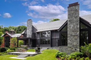
Then, in an unexpected turn of events, a friend tipped off the wife to a home for sale. The location was ideal: a large corner lot, a block from the center of town, six blocks from the water. A Colonial of uncertain ancestry, the house “had an old-world feel,” says Gauthier. “It was neat—big and beautiful.”
Says Cutone, “The house just clicked more, on many levels, and we knew the results would be much better here.”
The family was sold: they decided to switch gears entirely and move.
The house was in good condition, but it still needed work: a new kitchen, mudroom, office, updated bathrooms, and a separate family room for the kids.
Gauthier-Stacy designed all the interiors, from structural changes to choosing accent pillows. In the process, they retained much of the millwork and many architectural details, especially in the front entry, library, living room, and the “half-round” room at the side of the house.
Function and flow were the first order of business, Gauthier says. The everyday entry from the side porch was critical. To ease the transition from outdoors to indoors, Gauthier designed an informal foyer grounded with a reclaimed brick floor. It opens to a highly practical mudroom with a walk-in closet and a powder room. “It’s not abrupt,” says the wife of the new foyer. “It’s a different way to enter the space and it works beautifully.”
Gauthier and his clients did away with the formal dining room, which had occupied the half-round. “We took the prettiest room in the house and switched it from dining room to sitting room,” the wife says.
The new dining area, adjacent to the kitchen, is more versatile, and makes a design statement of its own. “We were going for a sophisticated Elle Decor look,” says the wife. Although she and her husband wanted classic elements, they wanted the unexpected, too. “We were looking for something you didn’t see coming,” the wife explains.
So Gauthier juxtaposed the antique burled-wood dining table the couple already owned with a surprisingly modern fixture overhead. And instead of surrounding the table with chairs only, they added a Bridgewater-style sofa to the mix. “It sits high and hard, and is deep enough for sitting back and reading a newspaper,” says Gauthier.
The classic kitchen is white-on-white accented with shades of gray. Six new double-hung windows bathe the space in light, which is reflected in the wide, marble-topped island. Because there’s a working pantry that houses everything from the microwave to the coffeepot, the counters are kept pleasantly clutter-free.
The couple decided it was worth digging down another six feet to transform the basement into a light-filled lower-level family room for the kids—now one of the most popular rooms in the house. Comfortable kick-back seating, weathered wood, forgiving fabrics, and a mix of materials (including lots of accent pillows in bright colors) give the transitional space a user-friendly vibe.
The home’s overall aesthetic is plush, relaxed, and elegant. That half-round room, now the sitting room, is a perfect example. The window wall is dressed with ripple-fold curtains that open and close easily, allowing for privacy and light control. The palette, like that in most every other room, is a combination of soft neutrals with predominantly blue-on-blue, blue-gray, or silvery-blue accents.
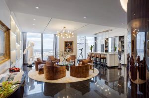
The living room is a study in comfort that doesn’t sacrifice style. “It’s all about balance,” says Gauthier. Carefully curated furnishings include several custom seating groups (the sofas are deep; the fabrics soft to the touch with “a little sheen”), a few antiques, and modern pieces.
“It’s sophisticated but definitely not stuffy,” Gauthier says. “The old house was pretty, but this one is cool and stately.”
It took that pretty house—as it happens, the wrong house—to move the family’s story forward. “My previous home was gorgeous, but it looked like someone a lot older lived there,” says the wife. “This is my house . . . there isn’t one thing about it I would change.”
Project Team Architecture: Mark Cutone, BPC Architecture
Interior design: Jim Gauthier and Susan Stacy, Gauthier-Stacy
Builder: Bob Winterson
Landscape design: Sean Papich Landscape Architecture
Share
![NEH-Logo_Black[1] NEH-Logo_Black[1]](https://nehomemag.com/wp-content/uploads/2022/08/NEH-Logo_Black1-300x162.jpg)


You must be logged in to post a comment.