Something Old…Something New
February 8, 2019
Text by Fred Albert Photography by David Sundberg/Esto

When it comes to building an addition, there are two schools of thought: replicate the existing architecture, or go for something completely different.
Joeb Moore subscribes to the latter approach.
The architect’s addition to a 1920s Tudor-style house in Rye, New York, stands in stark contrast to the original’s Merry Olde England mien. Sleek and boxy, with a flat roof and floor-to-ceiling windows, the addition asserts itself with a bravado that’s both attention-grabbing and shrewdly understated. Tucked behind the Tudor and hidden from the street, the new wing’s squat proportions and charcoal siding pay homage to the old house without upstaging it.
Owner Chris Perriello, a finance professional, and his wife, Dana, a fashion stylist, loved the neighborhood but couldn’t find a house there that suited their contemporary tastes. So they decided to buy a traditional house and transform it through remodeling. “We wanted to try to fit in with the neighborhood,” Chris says, “but make the house a little unique.”
The couple lived in the old dwelling for a year so they could get a sense of what worked and what didn’t. The Tudor’s shortcomings were quickly apparent. The interior was divided into lots of little rooms, with a central staircase that impeded circulation and no communal areas that the Perriellos could share with their children, Olivia and Luke. “They wanted an addition that would give them multiple family spaces,” Moore says.
Working with project architect Doug Patt and contractor Rick Bellefeuille, Moore eliminated the old staircase and installed a stairwell in the 1,500-square-foot addition. The stairs anchor one end of a circulation spine that joins the new and old structures. A new family room and mudroom flank one side of the passageway, while the other opens to a totally redesigned kitchen, giving the Perriellos a free-flowing family space that’s always bustling with activity.
While the old house felt closed off from its surroundings, the addition feels almost evanescent, with glass doors at every turn linking the family room to the deck and backyard beyond. (Even the fireplace is transparent, so the Perriellos can enjoy it while sitting on the back deck.) Sunlight enters from every direction, bouncing off the kitchen’s white-glass backsplash, matching cabinet fronts, and crystallized-glass counters. White oak base cabinets add a warming note and support the back of a banquette that juts into the corridor, anchoring a family breakfast area.
The Tudor’s old chimney was incorporated into the new stairwell, which is illuminated by a two-story window. The architects extended the home’s wood siding across the window, eliminating every other board to produce a series of slats that preserve the view out but obscure the view in. “If that was all glass, everybody moving up and down the stairs would feel very exposed,” explains Moore, who repeated the effect over the windows in the master bath (where shades provide extra privacy).
To help blend old and new, the architects cleaned up the interiors of the Tudor, updating the trim and installing recessed lighting and the same white oak floors that appear in the addition. Walls throughout were painted a single shade of white, and the rooms were decorated in a consistent manner, with neutral modern pieces scaled to fit the smaller rooms in the old part of the house and the larger spaces in the addition.
“They wanted it modern, but also kid-friendly,” says interior designer Diana Byrne, who used vinyl upholstery in the dining areas and topped the kitchen table with Corian for easy cleanup. She avoided antiques and limited accessories to minimize upkeep. “It’s all totally bulletproof,” she says. “You could hose it off if you wanted to. And yet it certainly doesn’t look like a kids’ space.”
With one notable exception, that is. The owners really had no use for the existing sitting room off the living area, so Byrne turned it into what she calls an un-sitting room, with just a shag carpet and a hammock suspended from the ceiling. “This seemed like an opportunity to have fun, and the kids love it,” reports the designer, who once saw eight children piled in at once. Given the home’s mixed pedigree, “it just seemed fitting not to take ourselves too seriously,” she says. “This house is not for everyone. But that’s why I think it works.”
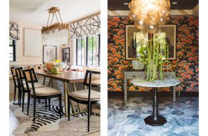
The same playful spirit is evident in the dining room, where a lemon-colored backsplash lends swagger to the bar, and a vacant wall is covered in a dappled abstract wallpaper. The spidery lines of a Serge Mouille lighting fixture protrude from the ceiling, adding a midcentury vibe to the mix.
Another Mouille lamp graces the living room, where it holds court alongside the original stone fireplace. The trio of cowhide rugs splayed beneath a Noguchi coffee table help center the seating group without intruding on the much-used pathway that runs along the edge of the room, connecting the front door and family room.
That front door once opened directly into the living room, so the architects added a new vestibule, crowned with an asymmetrical gable (in homage to the home’s Tudor roots) and sheathed in slatted siding that hints at the design vocabulary in the rear addition. The frosted-glass door glows like a lantern at night under the outstretched boughs of a behemoth American elm—a rare survivor of the Dutch elm disease that ravaged North America during the last century.
The second floor of the addition houses a new master suite, while Luke got a remodeled bedroom on the old second floor and Olivia scored a teen’s dream suite in the former attic. The basement under the addition serves as a playroom for the kids—and a magnet for their friends, who rarely refuse an invitation.
“Our house became one of the houses that kids like to come to, because we have space for them,” Chris says. “And it’s fun.”
Project Team
Architecture: Joeb Moore and Doug Patt, Joeb Moore & Partners Architects
Interior design: Diana Byrne, DB Design
Builder: David Prutting and Rick Bellefeuille, Prutting and Co.
Landscape design: Joeb Moore & Partners
Share
![NEH-Logo_Black[1] NEH-Logo_Black[1]](https://b2915716.smushcdn.com/2915716/wp-content/uploads/2022/08/NEH-Logo_Black1-300x162.jpg?lossy=1&strip=1&webp=1)






You must be logged in to post a comment.