Shingle Style on The Bay
July 16, 2018
The rapport among the clients and the design team yields a Cape Cod home the owners adore and the pros point to with pride.
Text by Paula M. Bodah Photography by Robert Benson Produced by Karin Lidbeck Brent
A decade’s worth of summers had given the couple ample opportunity to reflect on what they loved—and didn’t—about their Cape Cod home. They had grown familiar with every nuance of the site and the house: the best vantage points for taking in the water views, the times of day when the sun shone too brightly for comfortable outdoor sitting, and the ways the layout worked, or didn’t, for them and their three children. So when they decided to replace the structure, they came to the process with a well-thought-out plan.
That plan included enlisting architects Arthur Hanlon and Joseph Goncalves of Shope Reno Wharton, the South Norwalk, Connecticut-based firm whose timeless, Shingle-style houses the couple had long admired.
The two wanted a place that felt like it had been sitting comfortably on its site for years. Inside, they pictured rooms with a sensibility that was a bit more modern, but with a warm, welcoming environment that their kids—now moving into young adulthood—would want to continue coming to, perhaps with their own families one day.
Hanlon acknowledges that his company’s houses appeal initially because of their traditional look, but their true success—the reason the people who live in them delight in them so—lies in their pleasing proportions and the incorporation of contemporary elements. This home’s exterior, for example, offers much that is familiar: a series of gables large and small, dormers peeking from the roof, shingles of warm red cedar, and trim of crisp white. The front facade has a charming, energetic asymmetry, while the rear has a quiet equilibrium.
But look more closely at the windows. The upper windows in front and all those in the back have muntins only at the top. “Muntins are important from a character standpoint,” Hanlon says, “but we kept them above eye level, and that makes the windows appear modern from the inside.”
Gables, dormers, eaves, and porches were all meticulously designed to reduce the scale of the 7,300-square-foot house, Hanlon says. “We spent a lot of time massaging to give the house a really nice proportion. It’s something that doesn’t hit you immediately, but as you live with it, walk around it, you can feel it.”
In what might be called a Shope Reno Wharton signature, the home’s main staircase is situated not in the center of the interior but in its own tower that projects from the front of the house. “We make a big deal out of stair towers,” Hanlon says. “They’re a lot more dynamic than stairs that are internally based. They give people a chance to look out where they came from and look back inside the building, and connect the indoors and outdoors in a way that’s meaningful and thoughtful.”
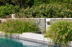
Landscape architect Bruce Besse joined the design team early on, helping to site the house and creating a landscape that morphs gradually from a tidy, somewhat formal plan in the front to a more natural look in back as the land transitions from lawn to beach grass to water’s edge.
Also joining the team from the beginning was the Acton, Massachusetts-based construction company Thoughtforms. One special aspect of the project, says Thoughtforms president Mark Doughty, was the company’s long relationship with the homeowners’ extended family. “It was very nice to work with people where a trusting relationship had already been established,” he says. “We came in on schedule and under budget, which is a testament to the clients, who were great communicators—decisive and engaged—and also great listeners.”
It’s a testament, as well, to the architects, he adds. “Shope Reno Wharton is very good at detailing, drawing, and designing. It takes so much uncertainty out of a project.”
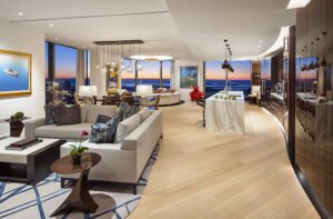
The balance of traditional and contemporary continues indoors, where the team from New York City–based Foley & Cox conceived a design plan with fresh, modern appeal that plays beautifully against classic architectural details like coffered ceilings and understated moldings. Walls throughout are painted a warm white for a clean, casual look that speaks to the waterfront location and serves as a quiet backdrop for the homeowners’ collection of contemporary art.
From the front door, the eye is drawn across the width of a long hallway and through the great room to a stellar view of the water. Rather than defaulting to the expected blue and white color scheme, Cox says, “We have a palette of pale gray with accents of purple. It’s very beachy, but not like we’ve seen before.”
Unique touches give the great room plenty of personality. No run-of-the-mill bookcases flank the fireplace, here. Instead, metal shelves seem to float on a background of high-gloss, powder-coated aluminum in eye-catching black and purple. A sculptural paper Noguchi floor lamp does double duty as a source of light and a work of art.
Everyone worked together on the interior details, Cox says, citing the living room fireplace as a perfect example of a collaboration all the pros and their clients agree was as fun as it was productive. He suggested tweaking the surround’s profile, giving it a more modern look, and using a petrified sea glass for a stunning visual and textural effect. And just as the room’s color scheme is a more daring version of what one would expect in a seaside house, the furniture references classic elements, but to a bolder degree. Witness the overscale weave of the living room’s rattan lounge chairs.
Collaboration was the rule in the kitchen, too, where the clean, bright white of the cabinetry—crafted by Kochman Reidt + Haigh—is complemented by the silvery gray of the appliances, island countertop, and another knockout light fixture. “I think white kitchens will never, ever go away,” Cox says. “They’re classic and timeless.”
The family room has a subtly nautical flair. The barrel-vaulted ceiling parts in the middle to reveal a backlit clerestory from which hangs a cheerful chandelier that looks like a bouquet of balloons. A tightly woven sisal with snappy stripes of tans and bright blue grounds a seating area with a roomy sectional sofa and a handful of comfy woven lounge chairs.
Most of the main house’s five bedrooms are on the second floor, but the gracious master suite occupies a back corner of the first floor and opens onto an idyllic covered porch that looks out to the water.
The homeowners confess they’re hard pressed to name a favorite spot in their new place. Thanks to their own clear vision and a dream team of professionals, they have a home whose every square inch makes them happy.
Project Team
Architecture: Arthur C. Hanlon and Joseph Goncalves, Shope Reno Wharton
Interior design: Mary Foley, Michael Cox, and Zuni Madera, Foley & Cox
Builder: Thoughtforms
Landscape design: Bruce A. Besse Jr., Barnstable Landscape Design
Share
![NEH-Logo_Black[1] NEH-Logo_Black[1]](https://b2915716.smushcdn.com/2915716/wp-content/uploads/2022/08/NEH-Logo_Black1-300x162.jpg?lossy=1&strip=1&webp=1)



You must be logged in to post a comment.