Rooms With A Coastal View
June 14, 2018
A Chatham home with a clever blend of brawn and beauty makes the most of its prominent vantage point with glorious vistas from every window.
Text by Bob Curley Photography by Nat Rea Produced by Karin Lidbeck Brent
When Irwin and Mary Stockel acquired their Chatham property, they playfully told architect John DaSilva to design a house with water views from every room. DaSilva took it as a challenge, not a joke. He designed a house that subtly widens as it goes back to permit peeks at the waves from almost every vantage point, and capped the project by adding a guest house that also has views of Chatham Harbor from nearly every interior space.
“John nailed it,” says Irwin.
Calling this home’s location special is a bit of an understatement: just a few doors down is the venerable Chatham Bars Inn. The Chatham beach, lighthouse, and village are all within walking distance, and across the street is the onetime home of author Joseph Lincoln, a legendary chronicler of Cape Cod life. The 1.3-acre site itself—while not directly on the water—rises up from the shoreline for unobstructed views of the deep, blue-green Atlantic waters surrounding the Middle Cape.
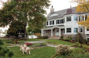
Shortly after acquiring the property, the Stockels abandoned plans to renovate the existing home, choosing to raze the modest ranch and build their dream vacation home from the ground up. The Shingle-style home that emerged from the drafting table cuts an impressive figure, yet manages not to look ponderous despite its 6,300 square feet.
DaSilva describes the appearance as a “hunkered down stockiness,” appropriate both to the home’s prominent vantage point and its defiant stance against the frequent nor’easters that blow across the Cape. “The design makes a large house in a historically important location endearing through the use of scale shifts,” he explains. “Windows, columns, shingle coursing, the weathervane, and trim details are all robust—large in size, but not necessarily large in relation to the overall scale.”
These disparate design elements are carefully counterbalanced to create a sense of symmetry, accounting for the fact that the front entry is not centered—part of a clever design intended to mitigate the horizontal stretch of the house across the lot. DaSilva calls the design a “classical composition without overwhelming formality,” appropriate for “a seaside second home for an active family, while at the same time serious about its iconic role.”
Inside, the home is a study in subtlety. Painted in a brilliant white that reflects incoming sunlight from the copious windows, each room flows effortlessly to the next. A spacious foyer provides doorway-less entry to the dining room, kitchen, and family room beyond—with views from the front of the house to the back—while also accommodating a staircase (flanked by newel posts resembling twin lighthouses) and a center hallway accessing the north end of the home.
“The owners wanted a flowing, open floor plan, but didn’t want it to feel modernist,” says DaSilva. He used a variety of coffered ceiling concepts to create boundaries between rooms—and even transition spaces—without building walls. In some cases, like the handkerchief ceiling in the foyer, the intent is to create a sense of cozy confinement. Upstairs, where ceiling heights are lower, DaSilva used geometry to craft the illusion of greater space.
DaSilva balks at the idea that the home is a blank white canvas, noting that interior angles and the constantly shifting natural light conspire to play an array of grays across the rooms. For interior designer Susanne Lichten Csongor, the neutral palette and the home’s proximity to the sea called for restrained color choices. She used hues of linen, pale blues, and charcoal in the furnishings (largely English country antiques and reproductions), rugs, and window treatments throughout, often repeating colors but adding subtle variations in patterns from one room to the next in what she calls a “linked hierarchy” that makes each space feel distinct. V-groove paneling, nautical prints and oil paintings, and whale and boat accessories serve as reminders of the seaside locale.
Like DaSilva, Csongor had to take the sheer size
of the rooms into account: in what the family calls the playroom, with its eighteen-foot ceilings and tall windows and stone fireplace, for example, she placed an oversized table and French country chairs. “Everyone loves volume, but people feel comfortable in intimate spaces,” she says. “A reclaimed wood ceiling, pendant lights, and large furniture bring down the sense of height so that the room feels cozy while still basking in the light from the Palladian windows.”
The porch flows effortlessly from the family room in the rear of the home. Landscape architect Clara Couric Batchelor built a simple bluestone patio connecting the covered, open-air sitting room to the outdoor dining area. “They wanted the dining area to be really close to the house, and I think the patio nicely integrates the two wings of the home,” she says.
Contrasted with the composed face the home shows to the street, the rear is a riot of angles and shapes—oval, square, and rectangular windows large and small, varied rooflines, and classic Shingle-style square cutouts in exterior walls, all framed with Batchelor’s plantings of ornamental grasses, hydrangeas, and black-eyed Susans. The combination garage/guest house, angled in conformance with the asymmetrical property line to catch the water views, helps frame the rear lawn and in-ground pool.
“The statement of ‘who I am’ happens in the front of the house; ‘how I live my life on a daily basis’ happens in the back,” says DaSilva. “I think the best art and architecture is right at the edge of chaos, but doesn’t tip over it.”
For the Stockels, life at the home they’ve dubbed Warm Welcome is far from chaotic. Most mornings find the couple in the matching Louis XV chairs in their master bedroom sitting area, sipping coffee as the sun rises over the harbor to the east. As a poem by GennaRose Nethercott, commissioned by the architects upon the unveiling of the home, reflects: “You live in a paradox of steady asymmetry/Behold the view to forever.”
Project Team Architecture: Polhemus Savery DaSilva Architects Builders
Interior design: Susanne Lichten Csongor, SLC Interiors
Builder: Polhemus Savery DaSilva Architects Builders
Landscape design: Clara Couric Batchelor, CBA Landscape Architects, and Polhemus Savery DaSilva Architects Builders
Share
![NEH-Logo_Black[1] NEH-Logo_Black[1]](https://b2915716.smushcdn.com/2915716/wp-content/uploads/2022/08/NEH-Logo_Black1-300x162.jpg?lossy=1&strip=1&webp=1)




You must be logged in to post a comment.