Rooms We Love: Petite and Chic
January 9, 2020
Text by Paula M. Bodah
 Easy Elegance
A stately glamour reigns in this Concord, Massachusetts, powder room. Working with his clients remotely, designer Mark Huffman (who credits Boston designer Heather Wells for generously sharing her local subcontractors) set a fanciful backdrop with Madeaux’s Aviary wallpaper in teals, greens, and not-quite-black.The vanity is a nineteenth-century mahogany Georgian chest from England. “We wanted to keep it as pure as possible,” Huffman says, explaining why he skipped a marble top in favor of a protective layer of marine varnish. Turned-mahogany sconces and a wood-framed mirror make pitch-perfect accents.
Interior design: Mark Huffman, Huffman and Huffman
Builder: Platt Builders
Photography: Greg Premru
 Coastal Chic
It would only be natural to expect a nautical feel in a summer house on the Maine coast, but designer Tyler Karu didn’t want to overdo the theme. The graphic pattern of stylized scallop shells and twisted rope of Schumacher’s Coralline wallpaper suggests “beachfront” without being too obvious. A cerused oak vanity in a blue-gray shade that evokes the sea adds a textural element. The unfussy light fixture and a mirror that conjures a porthole enhance rather than compete with the pattern and texture.
Interior design: Tyler Karu, Tyler Karu Design + Interiors
Builder: R. Moody & Sons Construction
Photography: James R. Salomon
 Inside and Out
Farrow & Ball’s climbing Ringwold floral wallpaper brings the outdoors in to a petite powder room in a classic colonial home in Cape Elizabeth, Maine. In keeping with the traditional architecture of the house, designer Leandra Fremont-Smith anchored the space with a walnut vanity topped with Carrara marble. A demure deco-style mirror and simple sconces with shades that sport a subtle gray trim are “sleek and chic, but not overpowering,” she says, letting the wallpaper play the starring role.
Interior design: Leandra Fremont-Smith, Leandra Fremont-Smith Interiors
Photography: Jeff Roberts Imaging
 Past Perfect
A new home built to replace a nineteenth-century seaside house on Cape Cod pays homage to its predecessor in its cabinetry, moldings, and other details. The powder room, which architect Mark Hutker calls “the most mannered room in the home,” is a particularly nostalgic moment. A walnut vanity with a carved marble sink and backsplash recalls a Victorian-era wash bowl, while the custom-colored Lotus wallpaper from Galbraith & Paul evokes the damask tradition, but in a modern iteration.
Architecture and interior design: Hutker Architects
Photography: Michael J. Lee
 Graphic Punch
The minute designer Dee Elms spotted the Cubiste wallpaper from Osborne & Little, she knew it was just the thing to “drive pizzazz and color” into the serviceable but plain guest bath in her clients’ condo in the Boston Seaport District. The vivid paper, with its palette of coral, blackberry, and teal, is inspired by the avant-garde art movement led by Picasso and Braque, Elms says. Paired with the super-simple white-lacquered vanity and mirror, it adds an undeniable “wow” factor to the space.
Interior design: Dee Elms, Elms Interior Design
Photography: Michael J. Lee
 Geometry Lesson
David Hicks’s classic Hexagon wallpaper in a delicious shade of red is the shot of youthful energy designer Kristen Rivoli and her clients—a young family—wanted for the powder room in a traditional Boston brownstone. “Every time I see this paper, it just looks so fun and fresh,” Rivoli says. The Hudson Valley ceiling light and a gold-framed mirror pick up the hints of gold in the paper and, says Rivoli, have simple lines to echo the overall timelessness of the home.
Interior design: Kristen Rivoli, Kristen Rivoli Interior Design
Builder: Payne | Bouchier Fine Builders
Photography: John Gould Bessler
Styling: Karin Lidbeck Brent
 Pure and Simple
The design for the powder room in her own Falmouth, Maine, home began when Tyler Karu spied the Waterworks sink. “It’s so simple and utilitarian; its lines are so clean and its scale so nice,” she says. “I love it.” The chartreuse mosaic tile behind the sink is the result of the happy accident of ordering too much material for the floor. Maison C’s Topanga wallpaper “makes the space sweeter,” Karu says, while uncomplicated chrome accents echo the base of the sink.
Interior design: Tyler Karu, Tyler Karu Design + Interiors
Builder: MGM Builders
Photography: Erin Little
 Personality Plus
What makes the powder room such a perfect place for wallpaper? Designer Robin Gannon notes that most bathrooms offer few opportunities for color and texture. “Typically, everything is a shade of ceramic—black or white or natural tone,” she says. “Wallpaper lets you add personality.” Thibaut’s Pagoda Garden chinoiserie paper in green and robin’s-egg blue adds plenty of that to the formerly all-white powder room in a Concord, Massachusetts, home. In a jaunty final touch, Gannon adorned the shades of the sconces with trim in a pretty spring green.
Interior design: Robin Gannon, Robin Gannon Interiors & Home
Photography: Michael J. Lee
Styling: Karin Lidbeck Brent
Share
![NEH-Logo_Black[1] NEH-Logo_Black[1]](https://b2915716.smushcdn.com/2915716/wp-content/uploads/2022/08/NEH-Logo_Black1-300x162.jpg?lossy=1&strip=1&webp=1)
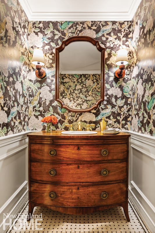 Easy Elegance
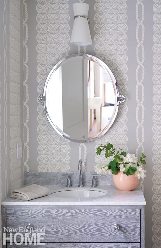 Coastal Chic
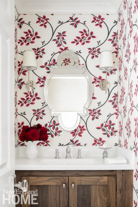 Inside and Out
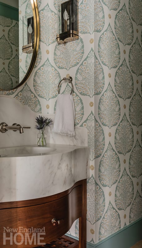 Past Perfect
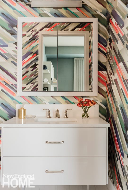 Graphic Punch
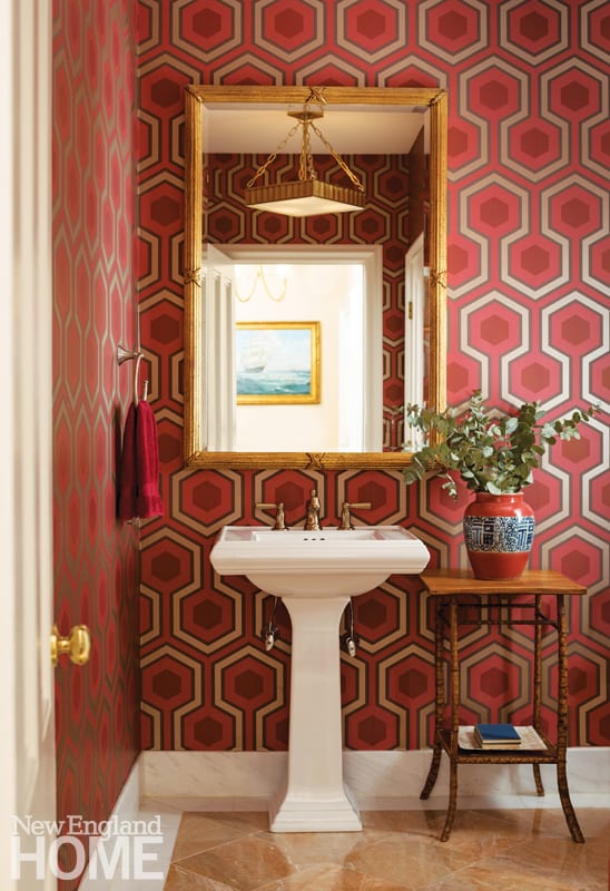 Geometry Lesson
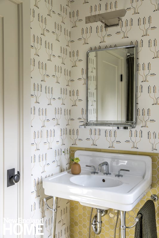 Pure and Simple
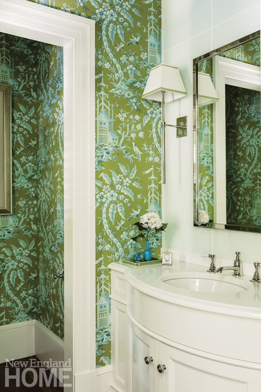 Personality Plus



You must be logged in to post a comment.