Ripple Effect
August 29, 2012
Text by Maria LaPiana Photography by John Gruen Produced by Karin Lidbeck Brent
“All he ever wanted was a house on a lake,” says the wife about her husband. So in the summer of 2009, with three pre-teen daughters who “seemed to all be going in different directions,” the Manhattan couple started looking for a vacation home in the Berkshires. Although lake houses were few and far between, the couple was determined to find a place that would invite family gatherings. They wanted a fun, warm, unfussy home away from home: a weekend destination for friends and family both now and later, when the girls are grown. They hunted endlessly that summer until it came down to two properties: a nice, new waterfront home, or a far less appealing older place in need of serious renovation. What swayed them in the end was the iconic boathouse, with a big stone fireplace and wraparound porch, that came with the fixer-upper. “We weren’t looking for a project,” says the busy mother—but luckily they found a simpatico architect and interior designer who were.
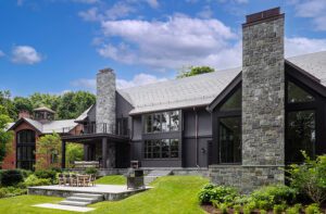
“We call it camp, and just love it here,” says the wife of her family’s enchanting summer home, completed just over a year ago—on that lake, of course—near Great Barrington, Massachusetts. Having decided to raze the original house and build new on its footprint, they hired architect Pamela Sandler of Stockbridge, Massachusetts, who is no stranger to well-composed getaways on tricky lots. The program called for 4,800 square feet of living space on two floors and a finished lower level. The clients asked for an open plan, a generously scaled kitchen for the wife, who loves to cook and entertain, a spacious shared “bunkroom” for the girls, room enough for a ten-foot table in the dining room and windows, windows and more windows. The husband, whose passion for lakes was made plain in the first interview, wanted to maximize views in every possible way. Oh, and he insisted on places that lent themselves to catching forty winks. “Every time he’d look at the working floor plan, he’d push for bigger windows and identify spots where he could nap,” says the wife.
Having worked closely with designer Elena Letteron in the past, Sandler called on her to plan and furnish the interiors. Letteron’s shops, Metropolitain and Germain in Great Barrington, celebrate French style and antiques as well as modern furnishings and accessories. She delights in wedding old and new, so a neutral palette and neoclassic architectural details proved an ideal backdrop for what the homeowners describe as Letteron’s “genius.”
With her magazine pictures in tow, and professionals who “got it,” the wife says the house evolved naturally. “My taste is more classic and traditional than Pam’s or Elena’s,” she says. “I wanted the shiplap, the woodwork and the Shaker-style cabinets. They made it more modern.”
Together, they fashioned a vacation home featuring stylish, family-friendly interiors.
While there were issues aplenty with the existing structure, the most problematic was the fact that it didn’t feel like it belonged on the site. “You’d walk in and not feel at one with nature and the lake,” says Sandler. “You couldn’t see the water correctly or the sky. It had a small, closed-in kitchen and those Palladian half-round windows.”
The new home, which needed to sit sideways on a tight envelope, would be wide open and take full advantage of the views, and yet be composed of spaces that felt warm and intimate. To that end, Sandler, a proponent of the “not-so-big-house” design philosophy, relied on details like beams and coffered ceilings, as well as variations in scale to create cozy places.
The airy, slate-floor entry is punctuated by an open staircase and view of the second-story loft space with cable railing. Just beyond are floor-to-ceiling windows that frame the lake. Shiplap siding covers the walls in the vaulted space, the kind you’d find on the outside of a house. A two-sided fireplace is essentially a stone tower that breaks down the openness to form the living room and kitchen/dining areas. At first glance, it all calls to mind a modern vibe, but soft and warm touches abound.
“We wanted it to be open but, at the same time, not feel so wildly contemporary,” says Sandler. “So we brought in big chunky wood treads and a wooden handrail. We used metal throughout, but sparingly, and also balanced it with lots of light and warm woods.” The golden-hued hickory floors do much to ground the home.
Despite the requirement for places to nap, the homeowners didn’t want the house to feel sleepy. So Letteron brought with her a toolbox of great ideas for adding texture and color. “We wanted to work with fairly classic shapes, then punch it up with new ones,” she says. “We brought in some ethnic textures, like a patchwork dyed rug. Ethnic elements such as the living room chair upholstered in an ikat pattern soften the modern feel.”
While the home is a textbook mix of high-low furnishings (the stools in the kitchen are classic Bertoia from Design Within Reach, while the patio furniture is from Crate & Barrel), all the communal rooms are playful and jazzy with jabs of orange and red. The girls’ bedroom, which was opened up to the rafters to give it a more spacious feel, is especially bright and cheery.
In contrast, the couple’s master suite is earthy, natural and awash in water-like hues. Grasscloth the color of sand covers the walls, a hand-woven rug evokes the blue of sky and water, and the pale upholstery on the Mitchell Gold + Bob Williams bench has a raffia-like texture. A metal four-poster bed injects a contemporary note, while off-white linen drapes adorned with Rogers & Goffigon trim are classically elegant.
The homeowner is quick to give credit to her architect and interior designer for the confluence of good ideas that made her family’s lake house a reality. “They were incredible,” she says. “They are incredible—and I know this because the house is finished, but we still see them. We’ve remained friends. And I think that tells you something.”
Share
![NEH-Logo_Black[1] NEH-Logo_Black[1]](https://b2915716.smushcdn.com/2915716/wp-content/uploads/2022/08/NEH-Logo_Black1-300x162.jpg?lossy=1&strip=1&webp=1)




You must be logged in to post a comment.