Tour a Revitalized Federal-Style Home in Wilton, Connecticut
January 29, 2018
A nineteenth-century Wilton home’s makeover restores its Federal-style provenance.
Text by Bob Curley Photography by John Gould Bessler Produced by Stacy Kunstel
Like a fine wine, some homes mature with age. After nearly two centuries, an in-town residence in Wilton has evolved into a thoroughly modern dwelling while retaining its historic character.
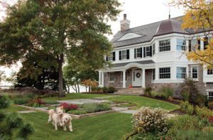
Built in 1826 on a four-acre hillside lot with commanding views, the Federal-style house was significantly expanded and made over as a Colonial Revival in the early twentieth century. By 2013, when a friend suggested that Steve and Tamara Kalin take a look at it, the house was beginning to show its age.
The Connecticut couple, who own a vineyard in California and travel frequently for work, were looking to downsize to an easy-to-maintain home—essentially the opposite of this house’s attributes. But the Kalins could see potential in the weedy but elegantly terraced gardens, in the weather-beaten exterior, and in the interior with its wide-planked floors. “Two of the rooms were in good shape; the rest of the house made you want to cry,” Tamara recalls. “But we immediately fell in love. The fact that you could walk to town was the cherry on top.”
With two of their six children still living at home, diverse interests, and a love of entertaining, the Kalins found ways to utilize every inch of their 6,434-square-foot house. “The project was more about tailoring what was here to fit their needs than expanding the home,” says architect Kevin Quinlan.
Stretching over a three-year period, the renovation included adding a columned wraparound porch under the guidance of structural engineer David Seymour and general contractor Jeff Titus. Quinlan took care to honor the original architectural style of the home by incorporating such details as eyebrow dormers on the front and rear roofs. “When we first came upon the house, it was boxy-looking, with some odd proportions in certain areas and a plain appearance, stripped of any historically relevant detailing,” he says. “The additions and renovations have bestowed the house with beautiful, refined, proportionally pleasing and historically accurate detailing, and it now appears eminently worthy of its spectacular site.”
Cheerful heart-motif shutters found in the barn were recreated and installed on the upstairs windows, and authentic gas lamps at the exterior doors lend an elegant period touch. “We considered ourselves stewards of the property,” Steve explains. “We wanted to keep its character and just update everything.”
Quinlan created a greater sense of symmetry in a structure that had become a bit of a jumble over time, removing a two-story column at one corner of the house and enclosing a balcony to create a pair of walk-in closets for the master bedroom while squaring the exterior proportions of the home.
The original main staircase and a fireplace were dismantled to create a new entry off the porch; from the foyer, “view corridors” look past the relocated stairway into the formal living room to the left and through the kitchen to the former carriage house—now a family room—to the right.
What’s revealed is a house of distinctive spaces conceived by Tamara and interior designer Gilles Clement.
With its inlaid paneling and unfinished open ceiling beams and furnishings, the formal living room effortlessly blends nineteenth- and twentieth-century styles. The black-and-white color scheme and lacquered accents suggest Art Deco, but Clement says his inspiration came from Parisian apartments of the 1970s. “I’ve never believed that the architectural style of a home has to dictate the interior design,” he says. “The design should represent who you are, not what you are.”
In a city like Clement’s native Paris, for example, it’s not uncommon to live in a building far older than this one, but that doesn’t compel homeowners to emphasize Baroque or Neoclassical flourishes. “It’s a given in Europe to mix periods and styles,” the designer says.
Architect Michael Smith brought his woodworking skills to the project, designing and crafting exterior detailing on the porch as well as the interior trim and the kitchen cabinetry. “The most interesting—and challenging—part of the job was to reconcile the existing older construction with the new spaces in a way that was consistent, made sense, and kept the integrity and simplicity of the original house,” he says. “The old home featured low ceilings, while some of the newer spaces have high, vaulted ceilings. The result is a really interesting play between old and new.”
The family room—the only new construction—is one of those high-ceilinged areas, a relaxed and playful space that includes a bonus loft that serves as a reading nook. As with most spaces in the home, it can accommodate large numbers of people, from the couple’s children to a gathering of their own friends.
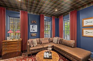
In another house, a masculine room with bookshelves painted deep teal, leather furniture, and gold drapes might properly be called a study or library, but in this case, a hidden wet bar in the corner explains the Kalins’ preferred moniker: the “cocktail room.” Clement employed gold accents, in the drapes and in the paint at the back of the bookshelves, to soften the transition to the adjoining living room.
Shades of white and gray predominate throughout the house, but splashes of orange add spark, from the toss pillows in several rooms to the eye-popping walls of Tamara’s second-floor office. In the kitchen, an appliance enclosure Smith designed and built to resemble an antique ice chest similarly enlivens the muted palette.
A sleeping porch off the master bedroom was enclosed and repurposed as a sitting room with the addition of a hipped roof with a beamed tray ceiling, which continues into the master bathroom, where a soaking tub provides a relaxed perspective on the manicured yard and gardens through a pair of oversize windows.
The grounds were cleared to reveal the original stonework terraces, and Tamara enlisted the help of the Wilton Garden Club to restore the formal gardens and lawns to the rear of the house. A new pool blends easily into the landscape, with a bluestone patio that flows around one of the property’s ancient trees and makes a favorite spot for sipping wine with friends on warm summer evenings.
For Tamara, the home’s strength is its effect on her mood. “There’s a space, inside and out, that matches my mental state or can change it,” she says. “For example, the library is a reminder that I can be serious, and my orange office reminds me to never take myself too seriously.”
Project Team
Architecture: Kevin Quinlan, Kevin Quinlan Architecture, and Michael Smith, Michael Smith Architects
Interior design: Gilles Clement, Gilles Clement Designs
Builder: Jeff Titus, Titus Built
This article appeared in the Winter 2018 issue of New England Home Connecticut with the headline: A Fine Vintage.
Share
![NEH-Logo_Black[1] NEH-Logo_Black[1]](https://b2915716.smushcdn.com/2915716/wp-content/uploads/2022/08/NEH-Logo_Black1-300x162.jpg?lossy=1&strip=1&webp=1)




You must be logged in to post a comment.