Q & A with John Stefanon
May 12, 2015
By Paula M. Bodah
John Stefanon, of JFS Design Studio, had a deep understanding of what Stacey and Marc Nevins were looking for when they appealed to him for help in redesigning their Chestnut Hill home. The couple craved a polished, sophisticated look, but with two young sons they needed a house that could stand up to the demands of a family. John lives just down the street and has a family of his own; in fact, it was Stacey’s visit to his house that convinced her he was the designer she and Marc needed. As we showed in our March-April issue, John gave the Nevins the elegance the adults wanted and the family-friendliness the kids needed. Here he gives us some additional insight into how he did it.
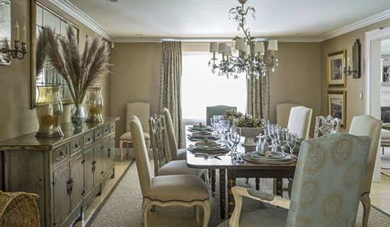
Grasscloth is showing up often these days. Why do you think it’s so appealing? Why did you choose it for the dining room?
It’s always interesting to see a client’s reaction when I say I’m going to use grasscloth. Some people have no idea what it is, while others think it’s the grasscloth from their grandparents’ house in the 1950s, which had a heavy weave, irregular texture and pattern, and unnatural colors. Today’s grasscloth manufacturers produce a beautiful product with a more natural and uniform weave.
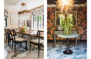
I’m drawn to grasscloth for its serenity. Something about the texture also reminds me of my youth—running through fields with a handmade kite, or sliding down hillsides on a banana leaf at my grandparents farm outside of Rio. There is a familiar and beautiful expressiveness to the material that brings smiles to people’s faces when they walk in a room covered in grasscloth. For me it is a very soothing texture. I prefer subtle weaves that are quieter in pattern, but draw you closer to explore the beauty simplicity of its texture. The Kneedler Fauchère grasscloth I used in the Nevins’s dining room has a very harmonious overall texture reminiscent of Japanese tatamis. It gave the room an elegant background to balance the more opulent components of the space.
Photography by Richard Mandelkorn
This home has a very quiet, pale palette, yet it’s hardly feels anemic or reticent. How did you give the space such “wow” with so little color?
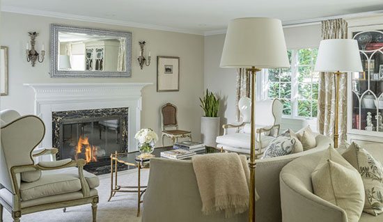
The pale palette of the living room was complimentary to the homeowners—meaning it looks good on them. It’s always important for me to have the clients look their best in the space and not have the space overpower them.
The “Wow” comes from the room’s interesting layout complemented with unique furnishings. Color doesn’t always bring “Wow” to a space—in fact, it can often overpower and be overused. Here, the elegance is conveyed by the neutrality of the palette accented with interesting metallics and soft tones of color, accompanied by objects d’art relevant to the Nevins’s lifestyle.
You had to design this house to please the parents yet be livable for a family with young boys. How do you combine gorgeous and practical?
Designing a home for a family with two young boys requires the constant balance of beauty and practicality. But, while I believe in resilient materials, I also believe in empowering children to appreciate and understand the value of their environments. The beauty of family is the history they create together. No one wants to live in an institution; we want comfortable soothing, and exciting spaces we can love, use, and appreciate. All while creating our own unique history.
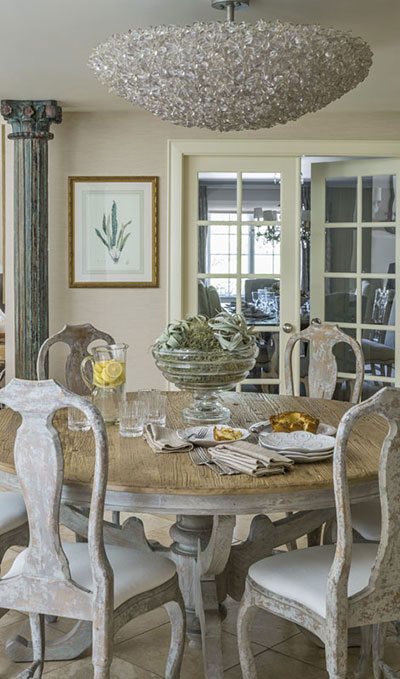
In the breakfast room for example, I selected the round table for its rustic, weathered top. There was an absolute beauty to the one-of-a-kind texture, but there would also be no worries if the kids were to get extra messy having fun at the table.
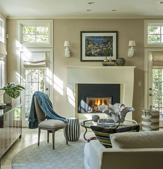
The family room sofa, covered in white outdoor fabric, makes an artistic statement and is a bold presence, but has the practicality of being able to be wiped clean if someone spills on it.
After the home was furnished, the clients called me to tell me their kids were appreciative of, and attentive to, the new look of their home. It was a pleasant surprise, and made the overall project a complete success in my mind.
Share
![NEH-Logo_Black[1] NEH-Logo_Black[1]](https://b2915716.smushcdn.com/2915716/wp-content/uploads/2022/08/NEH-Logo_Black1-300x162.jpg?lossy=1&strip=1&webp=1)
