Q & A with Interior Designer Eric Roseff
January 14, 2015
By Paula M. Bodah
Boston interior designer Eric Roseff’s favorite projects are those that let him expand his own design horizons, and he loves the variety his clients bring. Projects he has worked on run the gamut from a Nantucket beach house to a Manhattan penthouse to a ranch home in Idaho. Featured in our January-February issue is the Boston condo Eric designed using a color scheme that focus almost exclusively on shades of gray. Here, he talks about the unique challenges of that project.
This home is a study in black, white, and gray. Did you find it a challenge to adhere to such a narrow palette?
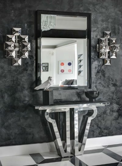
Adhering to a narrow color palette can be extremely challenging. There are so many valuations of grays, blacks, and whites, and it takes a lot of time and a well-trained eye to know how these will all work together—or not—especially with regard to lighting, both natural and artificial. I used different finishes, sheens, and textures throughout this multi-layered interior. For example, the black Venetian plaster walls in the entry foyer, executed by Pietra Viva, have an amazing reflection and incredible depth. The polished sconces and console table truly pop right off of those glorious walls!
Photography by Bruce Buck
Because this is a man’s home, you were aiming for masculinity, but wanted a sense of elegance, too. What elements come together to achieve that balance?
I definitely wanted a sense of elegant masculinity throughout the space. This is a man’s home, and the client is very evolved, well traveled, and truly appreciates beauty. It is always important to temper the masculine with a touch of femininity, and vice versa…it’s the yin and the yang. This is evident in the living room, for example. The furniture pieces themselves are quite varied. The back-to-back sofas have a very strong profile, while the Kite chair is quite light and sculptural. The Holly Hunt slipper chairs also have a strong presence, which we balanced with a beautiful fabric, centering a single floral motif on the chair backs.

The bath may be one of the most unusual we’ve ever show in our magazine. What inspired it? What challenges did this space pose?
The master bath is so special, and so exquisite. I wish everyone could see it in person! The inspiration came from a piece of stone I saw at Allstone. I loved the coloration and the beauty of the natural linear pattern. I could visual immediately the impact the stone would have if we emphasized the verticality. Allstone was able to secure and supply an entire block of the stone from Italy, which was then sliced into full slabs. This ensured perfect book-matching. By using the same stone on the floor—in a different scale and laying it in a herringbone pattern—an entirely new element was added to the space. The challenges of this bathroom were intense, beginning with just getting the big slabs
physically into the space. The installation was a real challenge, and Cumar Marble & Granitedid a phenomenal job.

Share
![NEH-Logo_Black[1] NEH-Logo_Black[1]](https://b2915716.smushcdn.com/2915716/wp-content/uploads/2022/08/NEH-Logo_Black1-300x162.jpg?lossy=1&strip=1&webp=1)
