Q & A with Designer Katie Rosenfeld
April 23, 2014
By Paula M. Bodah
“Fearless” may be the best way to describe the way Katie Rosenfeld approaches design. The Wellesley, Massachusetts, house designed by Katie and featured in our March-April issue is a case in point. When the homeowner came across a Houzz photo of a room designed by Katie, she knew immediately that this was the designer for her. “I loved every picture in her portfolio,” the homeowner says. “Her sense of color, the way she mixes traditional furnishings with bright colors, the mix of patterns…”
We asked Katie to give us a bit of insight into how she works.
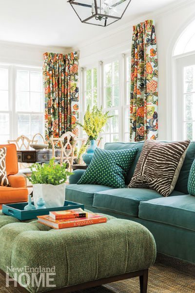
Photography by Michael J. Lee
The room in this photo has floral curtains, pieces of upholstered furniture in three different colors and textures, and throw pillows with a zebra strip and a dot pattern. What’s the secret to making so many colors, patterns, and textures look so fabulous?
There is no secret! I just go full force, not halfway. I say go big or go home. Don’t try to match; in fact, please don’t match. That’s what makes it interesting. Pattern on pattern really works when it’s done with confidence. You need to forget about rules and forget about matching. If you do that, then anything goes.
What’s your current can’t-live-without color, and how do you like to use it?
Mine is green. I use it as a neutral, with everything, and I introduce it everywhere. Green in the form of apple, kiwi, olive, chartreuse—it’s all over my home and with a zillion other colors like orange, purple, and turquoise. But ask me again next month. My answer may change. For my clients, I would say blue. It is everyone’s favorite and on everyone’s list. Navy is big with my younger clients; they all want it in their homes.
You’re drawn to pieces with a distinctly Asian influence. What is it about that particular style that intrigues you when it comes to interior design?
I love the way Asian furniture, patterns, and accessories work with any design genre. I love that they evoke history, but are at the same time timeless, modern, and relatable to everyone. I grew up surrounded by amazing old Asian elements; my dad lived in Japan and my mom was a decorator who also loved chinois. Chinioserie always works, but if overdone, can look cheap or kitschy. The key is using it in the right dose in the right places and not over-using it.
Do you have a current favorite source for fabrics?
Right now I am working on a beach house on Cape Cod where we will be using linen textiles from Studio 534and a lot from Great Barrington, Massachusetts, designer Peter Fasano. I love that Anglo-Indie thing in a New England coastal setting.
What strategies do you use to get inside the heads of your clients so that their home ends up being truly theirs and not a reflection of you?
If I told you that, I would have to kill you! No, seriously, every designer must be a sales person and creative psychologist. This is something that, if we do our jobs correctly, happens organically, or at least it should.
Share
![NEH-Logo_Black[1] NEH-Logo_Black[1]](https://b2915716.smushcdn.com/2915716/wp-content/uploads/2022/08/NEH-Logo_Black1-300x162.jpg?lossy=1&strip=1&webp=1)
