Private Showing
August 25, 2015
Clever design gives a Rhode Island house on a challenging site a surprising sense of seclusion.
Text by Lisa E. Harrison Photography by Warren Jagger
Every site, no matter how seemingly perfect, comes with a unique set of challenges. Great architects relish these challenges and over-come them.
In the case of this scenic spot, little more than a spray of saltwater away from the beach on Rhode Island’s Aquidneck Island, there were two major ones. The first was the existing structure. The new owner, a young man who lives and works in the Boston area, originally planned to renovate his new weekend retreat. However, after a sit-down with architect Jim Estes of Estes/Twombly Architects in Newport, it became clear that a teardown and fresh start would be the more prudent path.
The second challenge wasn’t as cut and dried. “It’s a tough site,” says Estes. “The buildable area is sandwiched between a seasonal stream and wetlands area and a busy road. It’s a wonderful piece of land, but we had to put the house closer to the road than we would have liked.”
In many ways this informed the design of the 2,800-square-foot house and its surroundings. Estes’s challenge was twofold: to create privacy and to block sound from passing traffic. To do this he created layers, using both natural and architectural elements. His “first line of defense,” as he calls it, was a rebuilt stone wall that borders the road and bounces sound away from the property. A privet hedge planted just behind the stone wall furthers the sense of seclusion and dampens noise.
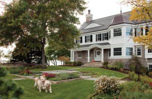
But the truly clever solution, or layer, comes in the form of an extended flat facade on the street-facing side of the house. To the left of the entryway sits a two-car garage; to the right, a screened porch and trellis mimics the aluminum-framed design of the garage. The end result is that the facade essentially “walls off” the living quarters and yard.
This notion of layering is something that Estes brings inside as well. The first floor comprises three main areas: the entry/stairway, the dining room/kitchen, and the living room. As each space flows to the next (the architect uses exposed black steel ceiling beams to define the areas), the house opens up. The living room then opens to the outdoors beyond via a glass wall of windows and doors. This vibe is in keeping with the owner’s wish to have an open floor plan, conducive to entertaining, yet still to have rooms that are clearly delineated—nooks where people can be away from a group but remain part of the action.
“Different layers and different degrees of transparency—that’s what we’re playing with here,” says Estes. Note how the boards are spaced on the front stairs, creating a dynamic relationship between open and closed. “Playing with different amounts of opening in the board coursing reinforces the theme of layering started at the street,” he points out.
Estes continues this motif on the stair to the master suite and the stair to the tower; by alternating between painted poplar and translucent panels, he ups the privacy quotient while still allowing light to shine through. He used the same translucent material that’s on the garage and creened porch, providing a nice continuity between the interior and exterior.
Just as the house flows nicely from outdoors to in, it also complements its surroundings, in terms of both scale and design. “I didn’t want a really large house or a huge third story,” explains the owner. Estes’s answer to this was an ingenious third-floor tower—a special room accessible only from the master suite. Wrapped in windows, it offers beach views and a unique space to read a book or enjoy a cocktail, without adding unnecessary square-footage.
Likewise, while the house certainly makes a statement, it adheres to the vernacular of the region. “What I really like about Jim’s work is that they look like New England homes, but they’re modern,” says the owner. On the exterior, Estes used white cedar shingles and local fieldstone for the stone walls, terrace, and chimney (built by talented stone workers Kevin Baker and Mike Plume) to give the property a sense of place.
All that’s left is to enjoy said place with activities like paddle boarding, sailing, and walking dogs on the beach. Easy to do, now that one more challenge has been solved: the owner—who used to weekend on Nantucket—no longer has to contend with running to catch ferries or flights.
Share
![NEH-Logo_Black[1] NEH-Logo_Black[1]](https://b2915716.smushcdn.com/2915716/wp-content/uploads/2022/08/NEH-Logo_Black1-300x162.jpg?lossy=1&strip=1&webp=1)







You must be logged in to post a comment.