Personality Plus
March 3, 2016
A Boston townhouse is bright, lively, and playful—just like the young family that calls it home.
Text by Robert Keiner Photography by Michael J. Lee Produced by Kyle Hoepner
Designer Carl D’Aquino smiles as he remembers how his clients, both Boston professionals, briefed him on their hopes for the redesign of their newly acquired Back Bay townhouse.“They wanted something joyful, comfortable, youthful, colorful, and stylish,” he recalls. “And most of all, they asked for something different. They did not want the traditional, restored Boston townhouse. They told me they wanted to smile every time they opened the front door.”
The four-story townhouse was built around 1870 and converted into apartments in the early 1960s. To accommodate its new owners and their three young children, it was recently completely gutted, reconfigured, and rebuilt. Stairways were altered, walls and hallways were removed, support beams were installed, and a new top-floor family room and patio were added. As Middleton, Massachusetts-based contractor Paul Jackson explains, “We took the home back to its bare walls and rebuilt it.”
Everyone involved in the redesign of this 7,500-square-foot house stresses that it was a uniquely collaborative effort. D’Aquino and architect Francine Monaco, partners in the Manhattan firm D’Aquino Monaco, worked closely with the homeowner and a team of subcontractors from the very beginning. “Because so many elements of architecture are design-focused, having an architect and designer working together is critical,” explains the homeowner.
To help communicate her vision, the homeowner brought a “binder of ideas” to the designers and asked that they incorporate some special pieces, such as a collection of glazed ceramics that includes sculptural works by Ruth Douzinas, to give the design a personal touch. Other items, such as the couple’s Oriental carpets, also provided inspiration to the design team.
Although renovations and reconfigurations over the years had stripped the interior of much of its architectural interest, both D’Aquino and Monaco included an appreciation for history in their design. Says Monaco, “Our approach to the design of the house was with a contemporary sensibility, but not without regard for the rich history of the Boston townhouse typology.” Features such as patterned ceilings, textured walls, and handcrafted ironwork show the designer and architect’s admiration for traditional detailing.
That admiration, a sort of nod to the past, is evident right from the entry. D’Aquino kept some of the vestibule’s original oak wainscoting, but added a contemporary hammered-metal console, a French mirror, and a mother-of-pearl tiled wall. “We wanted to retain some of the formality—the idea of being received—here,” he explains.
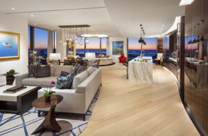
Beyond the entry, the house is a symphony of color and light. High ceilings, generous bay windows, creamy Venetian-plaster walls, stained white-oak floors, and an open plan give each of the home’s floors a feeling of spaciousness.
The living room’s custom-made multicolored carpet sets the tone for the entire house. It contains every color the designers used throughout. “Like other elements on this floor, such as the stairway runners and the metal railings, the carpet draws, or pulls, you through the house,” D’Aquino says. “I like to use color as a way to invite you into the house.”
One of the homeowner’s requests was for a large, comfortable eat-in kitchen (“where we can all hang out,” she says) with a breakfast room and a fireplace. She got all that and more. The new light-filled, first-floor kitchen runs the entire width of the townhouse and boasts a circular alcove window that’s the perfect shape for a custom breakfast table.
“It’s unusual to have enough width in a brownstone to have room for cabinets, an island, a table, and a fireplace,” says Rosemary Porto, senior designer at Poggenpohl Boston. “It feels like the comfortable kitchen of a much bigger house.”
Details matter to D’Aquino and his design associate Fani Budic. Design elements echo through the house and help create a totally organic scheme. The Moroccan tiles that cover the kitchen’s new chimney breast are repeated in the backsplash on the opposite wall. The breakfast alcove’s built-in bookcase recalls the cerused finish of the kitchen cabinets. Custom metalwork is everywhere, from the entrance vestibule’s console to the coffee table bases in the living room to the stair railings that wrap, uninterrupted, through all four stories of the home.
Even hallways are impeccably designed. Says Budic, “Halls and stairs are not just mere passing spaces but are able to hold their own with a unique character and function.” For example, the colors of the carpet runners on the upper landings are coordinated to the color schemes of the bedrooms they lead to. The master bedroom has a soft gray-blue design palette, so the landing carpet outside it is blue. “We are pulling you through the house, but we are also teasing you,” explains D’Aquino. “The carpet colors give you a hint of what is to come in the next room or on the next floor.”
Because the three children are so young, the homeowners wanted their bedrooms to be on the same floor as the master suite. In the hallway outside the kids’ rooms is a reading nook that is backed by a collage of wallpapers. “These are all strips of the same wallpapers we used in the children’s bedrooms,” says Greg Kahler, of PHD: Paper Hanging and Design, in Lynn, Massachusetts. “I think it’s a really playful way of saying, ‘This is our space.’”
If the family has a favorite spot, it has to be the new family room. The breezy room, which has broad sliders that open to a spacious outdoor patio, boasts a piano, work desks for the parents and the children, comfy furniture, a flat-screen television, lots of bookcases, and, best of all, a sculptural swing. The homeowners asked for a joyful, youthful design, and this room delivers. D’Aquino calls the swing “a floating daybed,” and reports that the family loves clambering into it. “It’s just fun.”
Do the homeowners agree? The wife says, “I wanted a home that felt happy, calm, beautiful, elegant, and fun all at the same time. That was what we got. My sister described our home in a way I really like. She called it the perfect balance of glamour and Zen.”•
Design and interior architecture: Carl D’Aquino, Francine Monaco, and Fani Budic, D’Aquino Monaco
Builder: Paul Jackson, Jackson General Carpentry
Share
![NEH-Logo_Black[1] NEH-Logo_Black[1]](https://nehomemag.com/wp-content/uploads/2022/08/NEH-Logo_Black1-300x162.jpg)


You must be logged in to post a comment.