Old at Heart
October 27, 2015
Attention to the details gives a brand-new house a sense of history and a comfortably lived-in feel.
Text by Paula M. Bodah Photography by Michael Partenio Produced by Stacy Kunstel
Some people can’t imagine living in anything but an old house. The thought that generations of families have climbed the same stairs, rocked babies to sleep in the same bedrooms, and celebrated Thanksgiving in the same dining room warms them to the soul. Others want a spanking-new house whose clean surfaces and bare rooms sit waiting to be transformed into a unique expression of its occupants.
Most people have a clear preference for one or the other, and the woman who shares this Greenwich house with her husband and three children would have put herself in the old-house camp until recently. She had grown up in such a home, and when she and her husband first moved to Greenwich, they chose to buy an old carriage house. As she took her regular walks through her neighborhood, however, she found herself watching the construction of a new house with interest. With its wide front door shaded by a portico, matching bays flanking the entry, and twin chimneys rising from a dormered roof, it had the pleasing proportions and the classic symmetry of the Georgian style.
When she noticed the finished house had stood empty for several years, she asked her real estate agent about it. It was on the market, she learned, but her agent didn’t expect her to like it, given her history of living in old homes. Still, she wanted to take a look inside. “The scale of the rooms and the layout of the house were excellent,” she says. “I thought that you could make it pretty cool with minimal changes.”
And so she and her husband became the owners of a brand-new house.
Working with builder Larry Kendall, of ACI General Contracting, the couple changed some of the exterior details to play up the home’s graceful qualities. A new front door painted a warm orange replaced a dark, windowless door. The new door has a dozen paned windows, and Kendall added narrow windows to either side and above to help funnel light into the foyer. The thick columns supporting the portico were swapped out for a more slender version, and the heavy railing above was replaced with a lighter, Chippendale-inspired one. Small upper windows were elongated and adorned with new shutters.
Meanwhile, Doyle Herman Design Associates reworked the backyard pool area, scaling back the cement surround, eliminating a heavy fence, and adding grass, perennial beds, and a fire pit.
Indoors, the attention to detail continued, as Kendall replaced narrow moldings with wider ones that lend a sense of grandeur to the high-ceilinged rooms. Fireplace mantels were all deemed too tall and heavy, so they were replaced with lower mantels that incorporated more refined, graceful lines. Finally, the golden-brown floors were warmed up with a darker stain.
The house was new, but the homeowners felt no need to fill the rooms with new things. To help her create the backdrop to her beloved possessions, the wife called on an old friend. She and designer Peter J. Sinnott IV, of Home Works, had known each other since their high school days in Rye, New York.
Sinnott embraced his friend’s insistence on filling her house with the things she already owned and loved. “I tell clients, ‘Shop within your own home,’” he says. “You already know the proportion and scale and comfort level of those things. It’s fun for the client, and the home doesn’t end up looking like everything came from a showroom.”
Sinnott created a color palette dominated by neutrals accented by high-gloss white trim and the occasional punch of bright color. The new front door opens to a spacious foyer where that punch of color comes in the form of the golden-orange Phillip Jeffries paper that covers the walls on either side of the door. An octagonal table that sat in the owners’ old living room makes a focal point for the foyer.
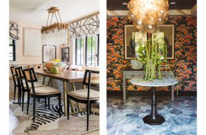
In classic Georgian fashion, the foyer leads to a center hall that in turns leads to a rear foyer, offering a clear sightline from the front door to the rear door and the terrace beyond. The rear foyer takes a dramatic turn with walls covered in paper that sports a lush pattern of fantastical birds and flora. A peacock-blue ceiling enhances the effect. “It was a way to bring some of the outside color in,” Sinnott explains. “It’s dramatic, but not overwhelming, and creates a wonderful transition between indoors and out.”
Walls in two shades of gray get the living room off to a quiet start, and accents of orange add warmth and energy. “I love orange,” the wife says. “It looks good in the day and great at night.” A pair of midcentury chairs came over from the old house, their red fabric replaced with neutral upholstery.
The dining room, too, reads as neutral on first glance. But a closer look at the Phillip Jeffries wall covering reveals subtle shots of oranges and greens. A loveseat the color of freshly mowed grass tucks into the bay window, and toss pillows in a paisley print of oranges and purples add another bright touch. A large mirror from the owners’ previous bedroom now graces the dining room, reflecting the sparkle of the chandelier the homeowners discovered several years ago in a Darien antique shop.
The wife’s favorite color even shows up in the kitchen, where the recessed panels of the coffered ceiling are painted orange. “I always paint ceilings,” Sinnott says. “I consider them a fifth wall.”
Upstairs, Kendall took what the wife calls “a football field” of a master bedroom and divided it into his-and-hers dressing rooms, a spacious bath, a sitting room, and a cozier bedroom with a fireplace and a sweet window seat. Sinnott painted the walls and ceiling a serene gray with a purplish cast and outfitted the windows and furniture in soft blues and purples.
“Spec house,” it turns out, doesn’t have to mean characterless. With attention to the details and a fresh look at old possessions, this new home has the soul of an old house. •
Project Team
Interior designer: Peter J. Sinnott IV, Home Works
Builder: Larry Kendall, ACI General Contracting
Landscape architect: Kathryn Herman, Doyle -Herman Design Associates
Share
![NEH-Logo_Black[1] NEH-Logo_Black[1]](https://b2915716.smushcdn.com/2915716/wp-content/uploads/2022/08/NEH-Logo_Black1-300x162.jpg?lossy=1&strip=1&webp=1)









You must be logged in to post a comment.