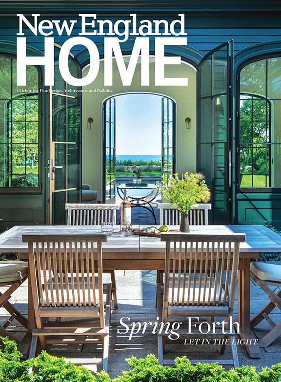
Ocean Breezy
July 9, 2015
A thoughtful renovation gives a charming 1930s cottage on the Rhode Island coast a fresh, airy new look.
Text by Stacy Kunstel Photography by Tria Giovan Produced by Stacy Kunstel
In a respectful renovation, the bones of a house inspire, rather than conspire against, the architect. In the case of this coastal Rhode Island home, the quality of the original architecture was a clear plus in turning the quiet 1930s cottage into the waterfront refuge it is now. Sheltered on the front and one side by a thicket of native bayberry, arrowwood, and shadbush, the house lies almost hidden from the road.
And, as the only dwelling in the neighborhood that’s positioned on the water side of the street, it offers views of white-capped waves and craggy rocks from just about every window. The new owners saw both the original charm and the vast potential of the old cottage, and turned to a group of talented professionals who would be sensitive to both house and site.
The couple were hardly new to the renovation process; this is the twenty-third project they’ve undertaken together. “We really enjoy taking old buildings with issues and renovating them to make them more modern in their amenities, practical in their layouts, and historically correct,” says the husband.
Architect George Penniman, who had collaborated with the couple on a previous project, agreed with his clients’ assessment of the cottage. “We were really able to save the original house in its scale and character and to create a series of elegant spaces within it,” he says.
Penniman moved the house fifteen feet back from the water, giving it a new foundation and rotating it slightly to increase the already substantial views. Working with builder Stephen Morgan, he created a new wing that connects to the house at a 90-degree angle. The addition, which holds a mudroom, sitting room, studio area, garage, and a second-floor guest room, helps to create a courtyard in front of the house. “Steve was so good about working with the existing structure,” says Penniman. “He understands the way older houses are built. It’s not a reproduction. He worked with existing architecture to look authentic.”
A narrow drive defines the approach to the house and meanders toward a raised-bed vegetable garden before entering the courtyard. Landscape architect Anne Penniman approached the site with as much care as her architect husband. “Preservation of the house was so important to us,” she says. In placing the pool, for example, Anne chose a spot behind the new garage. Sheltered by the thicket, as well as by blueberry bushes and other shrubs, the area made a perfect spot. “It has a great view, but it’s also protected,” she says. “We wanted to protect the privacy and sanctity of the house.”
She protected the view, too. Instead of a cumbersome fence, she employed an ancient technique called a ha-ha wall. “Around the elevation of the pool, we sank a trough and retaining wall four feet into the ground,” she explains. “It’s a way of keeping the pastoral view with an invisible wall.”
George added a number of small exterior updates to the house, creating a canopy over the front door, tweaking the roofline over one of the downstairs rooms, and expanding the breezeways that wrap around the house. “I really just riffed on the original exterior details,” he says. “It was about the desire to design with restraint and to enhance an existing environment.”
Inside, the architect massaged the floor plan into a more livable space, while interior designer Nancy Taylor wove a cohesive look throughout the home. She began by adding wainscoting and trim of Australian cypress, and switching out existing interior doors with new ones of Australian cypress. “The original house had been trimmed with pine,” Taylor says. “The Australian cypress is very dense, much harder than pine. It makes such a strong statement. We left it in a natural finish. It’s just fitting for a home at the shore. It’s a material that is durable and conveys warmth and casualness.”
The homeowners already had a cherished collection of favorite furnishings, accessories, and art they wanted to keep. “Concerning our crazy furnishings, we are constantly looking for wonderful eye candy, be it in ceramics, textiles, paintings or photography, sculpture, or furniture,” says the husband. “We buy things we encounter in our travels that have intrinsic artistic merit—in our taste—with no concern about whether they will blend in well with the rest of the decor. Usually we buy without concern for where the piece will go. Good pieces always relate well together, even if all are very different from each other.”
Taylor adeptly created a monochromatic theme, employing neutral colors and emphasizing texture more than pattern. In the living room, where ocean views fill the windows, a pair of custom sofas covered in a white fabric with a basket-weave texture face one another on a richly colored rug of midnight blues and beiges.
In the adjacent morning room, a smaller sitting area that faces the rising sun, clean-lined white wingback chairs in a cream-colored fabric are paired with a crewel-patterned sofa and a richly detailed antique rug. Soft sheers filter the light streaming through the windows.
Taylor relished the challenge of devising a plan that incorporated the homeowners’ finds. “The wife has exquisite taste and brought her own personality to the project, and the husband selected antique rugs, photography, and art,” she says. “It was such collaboration. Their contributions made it a better project.”
Throughout the house, architect and designer introduced unique elements. George carved out spaces such as window seats, which Taylor filled with sumptuous linens and pillows. An area under the stairs just
off the dining room became a crystal-filled bar. “There were hints of nooks and crannies that we elaborated on,” says George. “The quirkiness is what makes it special.”
The SieMatic-designed kitchen is a chef’s dream, with granite counters and butcher-block accents. From the kitchen, double doors open onto a screened porch with another dining area and an endless view.
Upstairs, George expanded the master bedroom to include a dressing room and a sitting area with a fireplace. A small balcony catches the morning light. Simple linens, a rag rug, and bold art above the fireplace make it a cozy retreat. “There’s a wonderful quality to everything in the house, but it doesn’t scream for attention” says Taylor.
George sums things up this way: “The best projects are always the result of a thorough collaboration. In this case, it was between very engaged owners, architect, landscape architect, interior designer, builder, and craftspeople.”
Starting with good bones and a memorable view doesn’t hurt either. Scaling back, keeping it simple, and honoring past good work is sometimes all it takes.
Project Team
Architecture: George Penniman, George Penniman Architects
Interior design: Nancy Taylor, Taylor Interior Design
Landscape design: Anne Penniman, Anne Penniman Associates
Builder: Stephen D. Morgan, Housewright
Share
![NEH-Logo_Black[1] NEH-Logo_Black[1]](https://b2915716.smushcdn.com/2915716/wp-content/uploads/2022/08/NEH-Logo_Black1-300x162.jpg?lossy=1&strip=1&webp=1)


You must be logged in to post a comment.