Nurtured by Nature
November 7, 2012
A contemporary house in the suburbs of Boston is both a testament to human ingenuity and a celebration of the natural world.
Text by Erin Marvin Photography by Robert Benson Produced by Stacy Kunstel
Every scientific experiment begins with a question, an attempt to cull answers from the unknown. Hypotheses are made, constraints considered, tests of validity run—and at any time, unexpected factors can alter the outcome for surprising results.
When it came to designing a home for two scientists and their children on an environmentally sensitive spot in a Boston suburb, architect Alan Joslin was faced with a question: can a 10,000-square-foot house made of stone, wood, metal and glass sit lightly on the landscape?
During the two-year design process, Joslin worked closely with the homeowners to craft a manmade structure that pays homage to Mother Nature. The owners’ deep love of the outdoors, their vast collection of Chinese scholar rocks, a penchant for contemporary aesthetics and the need for the house to be equally suited to family life and formal entertaining all influenced the design. The site itself presented its share of challenges: a stone wall, a grove of ornamental trees, a wooden Chinese pavilion and a 100-foot-tall Cedar of Lebanon would all need to be preserved and integrated with the new structure.
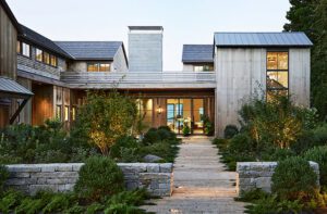
The architect, a principal at Cambridge, Massachusetts–based Epstein Joslin Architects, took his design cues from the landscape features. The existing stone wall became the front elevation with the house set behind it and low to the ground. Roof lines play off the surrounding topography; one of the primary long slopes of the roof runs parallel to the front wall of the property, and Joslin used that soft angle as a starting point for a series of shifts in the roof planes. “I love how the house empathizes with its setting,” he says. “To be able to live close to the beauty of nature is something we really care about.”
The connection to the natural world continues inside, where plentiful windows let light spill into every corner, and walls, floors and ceilings of wood and stone surround contemporary furnishings in a predominantly earth-toned palette. Joslin used floor materials to delineate different areas: French limestone sits underfoot in main-level public spaces like the living room and kitchen, while the lower level sports concrete floors and wood anchors bedrooms, offices and guest quarters.
Pocono fieldstone walls, echoing the site’s stone walls and underscoring the owners’ fascination with stone, contrast with oak and walnut accents. “We distributed those woods in different proportions throughout the house,” Joslin explains. “There’s more oak in the family rooms because it’s lighter, and in the formal areas there is more walnut. It’s almost like turning a lever between light and dark in the different environments.”
Rather than vast panes of plain glass, windows bear a contemporary pattern of mullions. Bay windows jut from upper-floor bedrooms, while horizontal band windows denote the family room and office space. Vertical floor-to-ceiling windows correspond to formal rooms. “That set up a palette of variety, so in one part of the house the way you’re provided views is different than in another part of the house,” says Joslin. “It’s consistent with how we chose the materials.”
Sustainability systems keep the carbon footprint minimal without detracting from the overall aesthetic—there are no unwieldy solar panels, but rather a thin photovoltaic film that sits between seams of the copper roof. Glass tubes with high-performance heat collection—so well integrated you never notice them—run along windows of the atrium and become a screen for skylights, allowing soft, filtered light into the house while collecting heat for hot water. All of the windows are well insulated, and there’s a geothermal well, an underground water retention system, maximized natural ventilation and Energy Star appliances.
Three levels rise from basement to tree line; the lowest is dedicated to recreation with a game room, media room, pantry and wine cellar. Guests arrive under a porte cochere at the first level and enter an open atrium where a custom staircase of colored glass and steel rises to the second floor. A complementary screen masks views to what lies above and, at entrance level, a similar screen offers brief glimpses into the dining room, where a selection of Thomas Nozkowski artwork and a colored glass chandelier give the space a gallery-like feel. Interior designer Andra Birkerts of Wellesley, Massachusetts, chose a terra-cotta color to accent the wood-paneled wall, adding warmth to the room and softening the edges of the exposed beam ceiling and stone wall accents. Other public areas on the first floor include the kitchen, breakfast room, library and family and living rooms. In the latter, determining the placement of the sectional proved to be something of a challenge. The owners wanted all furniture to face the outside, where formal gardens, terraces, manicured lawn and large, carefully placed scholar rocks enhance the environment, but Birkerts felt it was important to create intimate areas for conversation. “The definition of the room comes through that sectional, and it creates a fairly cozy space within a very large room with hard surfaces,” says the designer. “The scholar rocks were clearly very important elements of the design, but I always tend to keep the human side of the way people inhabit their spaces as a priority.”
Twin leather chairs across from the sofa grant visual access to the gorgeous views of nature and art beyond.
The top floor hosts rooms that invite slumber for family and guests along with a nanny suite and studies for both husband and wife. The overall aesthetic throughout is simple and refined but comfortable, with durable fabrics and warm, family-friendly accents. Patterns are drawn from the views outside, and an emphasis remains on natural materials both inside and out. “As one strolls through the house it’s filled with these rich vistas and variation,” says Joslin. “It’s like moving through this varied sculpture, and you’re not bored in any place because you’re constantly confronting different and unique conditions.”
The beauty of science—and of the art of design—is that there’s always another question to pose, a boundary to push, an idea to embrace.
Interior designer: Andra Birkerts, Andra Birkerts Interior Design
Landscape design: Stephen Stimson Associates
Builder: Kistler and Knapp Builders
Share
![NEH-Logo_Black[1] NEH-Logo_Black[1]](https://b2915716.smushcdn.com/2915716/wp-content/uploads/2022/08/NEH-Logo_Black1-300x162.jpg?lossy=1&strip=1&webp=1)



You must be logged in to post a comment.