Notes from the Field: The Art of Styling Bookshelves
January 27, 2014
By Karin Lidbeck Brent
Bookshelves add depth and interest to a room, while creating space for displaying those things we love: art objects, sculptures, curiosities, and…books! There’s an art to arranging bookshelves, though, much like creating a painting: composition and symmetry are key.
Interior designer Lisa Hilderbrand of Welhil Interiors in Norwalk, Connecticut, uses her bookshelves to create artful compositions to display her favorite things. She balances her books with objects while treating each cube much like the spaces in a painting. As a final touch, Lisa adds small objects and personal accents from her life. Looking at the result feels like discovering unusual items in a curiosity shop.
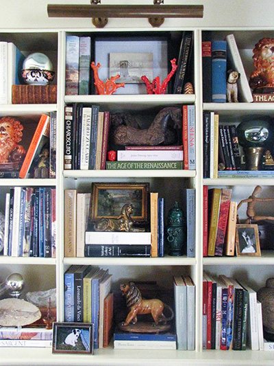
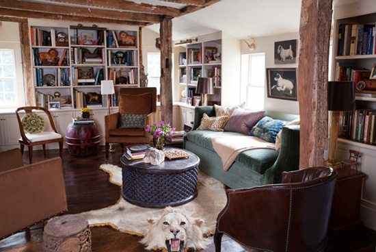
Lisa suggests “mixing up the size, orientation, and shapes for visual interest.”
Amy Beth Cupp Dragoo grounds her stunning library (as seen in the Winter 2014 issue of New England Home Connecticut, out now) with a books-only approach. She pulls all of the spines out to the edge of the shelf so they appear the same depth. Amy notes that she “plays with the orientation of the books to create architectural and graphic interest. The center books are laid horizontally while the outer books are vertical, creating a visual symmetry.”
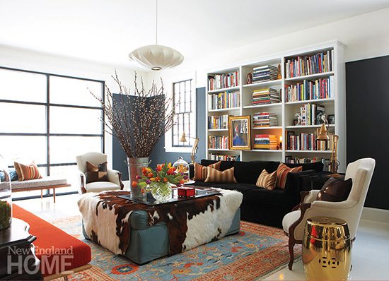
Photo by Michael Partenio.
Interior designer Nicole Fuller created this gallery of artful objects for a client’s guest bedroom. I love how the custom shelves float over and around the beds. Minimal styling with pretty objects of varying shapes and heights adds to the light, airy atmosphere.
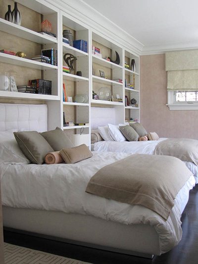
Photo by Karin Lidbeck Brent.
In the home of architect Jill Neubauer, a playful and casual approach intersperses freestanding paintings, books, and objects side by side for visual interest.
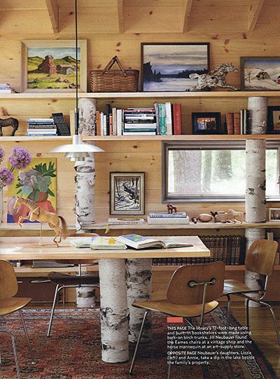
Image from Country Living magazine.
Paulette and John Peden, founders of Connecticut’s Dawn Hill Antiques, show us how they display their train collection for maximum impact. This shelving display has an effect like three-dimensional wallpaper! (You can see more of Paulette and John’s house and collections here.)
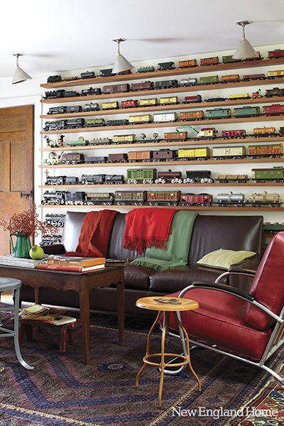
Photo by Laura Moss.
Styling books and art together is a natural for Woodbury, Connecticut, designer Carole Winer-Sorensen. She mixes the two by hanging framed art in front of her shelves to add a layer of visual depth.
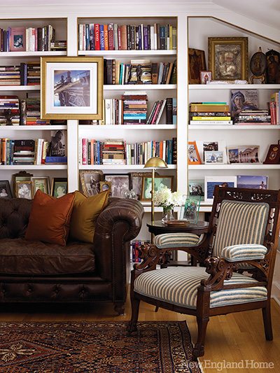
Photo by Miki Duisterhof. Click to see more.
Susanna Salk uses color as part of her composition, letting the bright hues pop by leaving open space on the shelves.
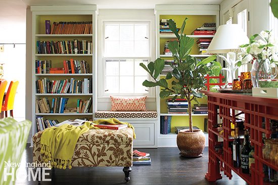
Photo by Michael Partenio. See more of Susanna’s house here.
Personally, I love the challenge of styling bookshelves. It’s fun, like playing with building blocks! I find my library is the perfect place to share family history by layering in old photos that I cherish.
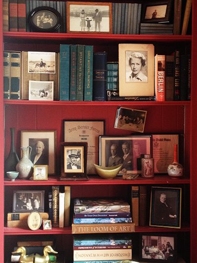
Photo by Karin Lidbeck Brent
Whatever your personal style, perhaps you’ll feel inspired when challenged by your next bookshelf organizing endeavor!
Share
![NEH-Logo_Black[1] NEH-Logo_Black[1]](https://b2915716.smushcdn.com/2915716/wp-content/uploads/2022/08/NEH-Logo_Black1-300x162.jpg?lossy=1&strip=1&webp=1)
