Notes from the Field: Graphic Standard
February 13, 2012
By Cheryl Katz
It’s not clear why, at a particular time, for a particular reason, a particular thing becomes part of the design zeitgeist. Why, for instance, are there moments when it seems like everything is covered in seashells or distressed linen or mirror? And why, at those times, do those things look so good?
Currently, neatly folded on my desk is a piece of fabric that looks, in design speak, just right. It’s an unexpected treasure–about five yards’ worth–this swath of fabric. Stephen Sprouse created the fabric, one of five designs he did for KnollTextiles, shortly before his untimely death in 2004 at age fifty. Now one may ask, and rightly so, how can something designed almost a decade ago be the perfect sign of the times?
I’m going out on a limb when I posit that, at this moment–an election year fraught with references to wars, troop withdrawals, an Arab Spring and “the 1%‖Sprouse’s Graffiti Camo, olive drab camouflage emboldened by the Declaration of Independence in Sprouse’s idiosyncratic scrawl in neon orange, says it all. Or it might be that the fast and furious dissemination of information is best portrayed by the power of typography. In either case, here, along with the fabric that spawned this rumination, are just a few examples of all the write stuff.
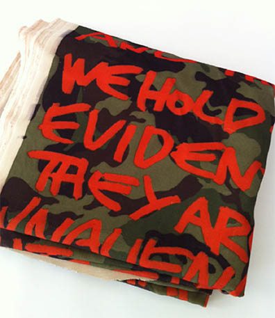
Stephen Sprouse’s Grafitti Camo, circa 2003, for KnollTextiles; photo by Jeffrey Katz
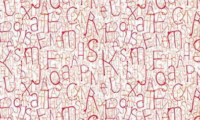
Also from KnollTextiles: Ink, a new wall covering collection by Abbott Miller. “Drip†is a series of organic, interconnected letters created by steering wet ink into letterforms; photo courtesy of KnollTextiles
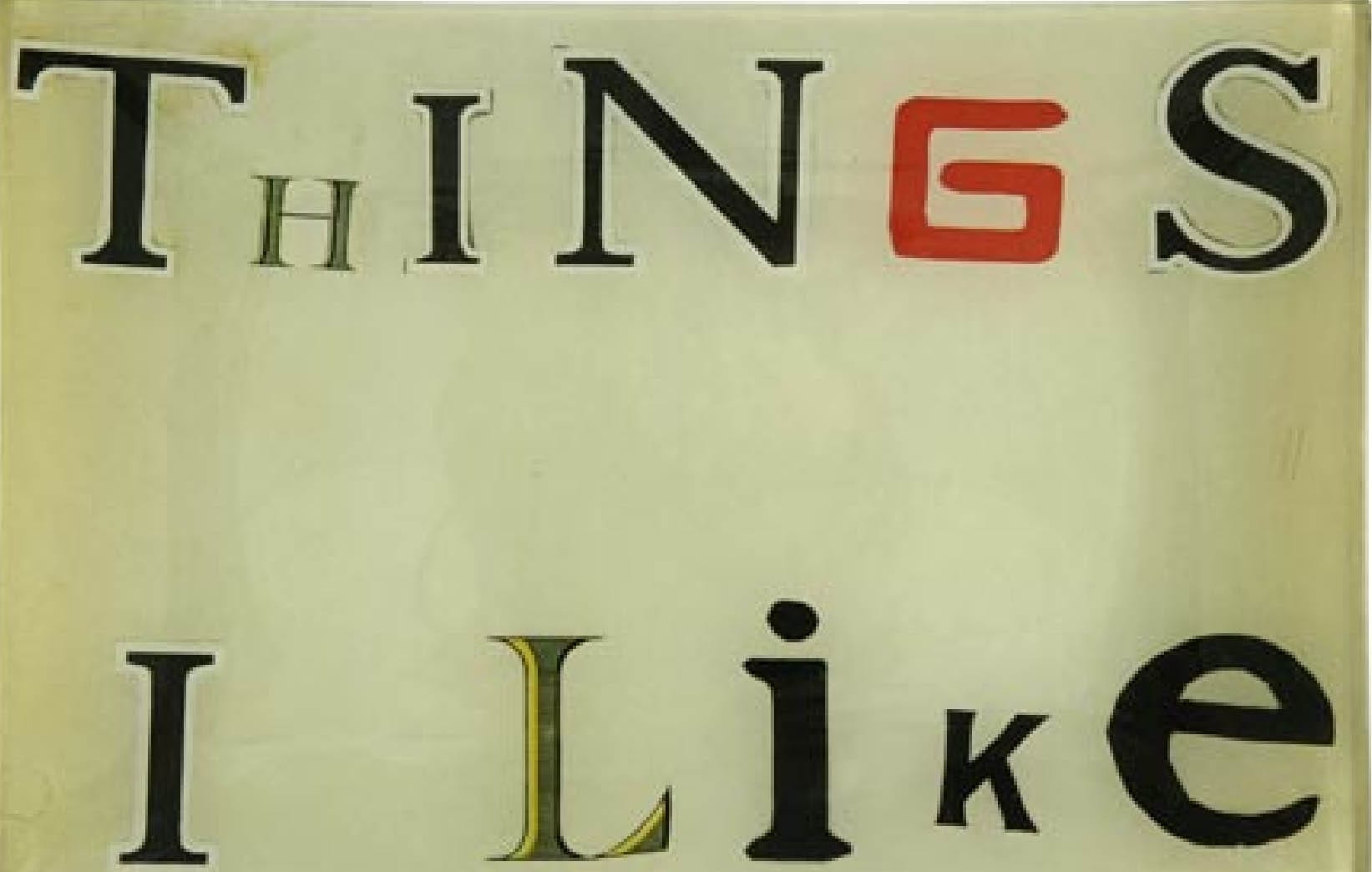
Decoupage tray by John Derian; photo courtesy of John Derian Company
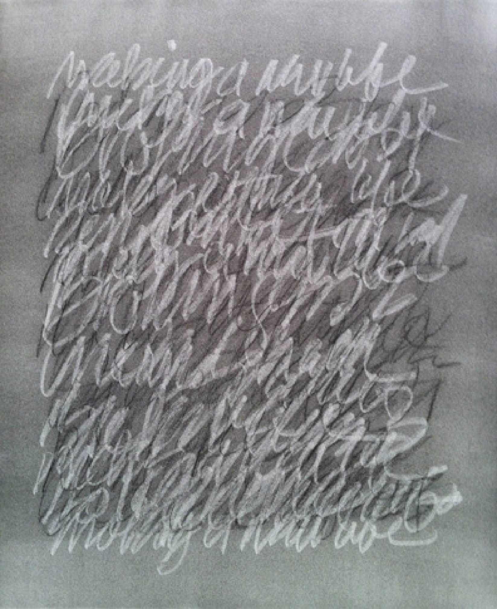
Jeffrey Katz: Talking Picture, graphite and charcoal on paper
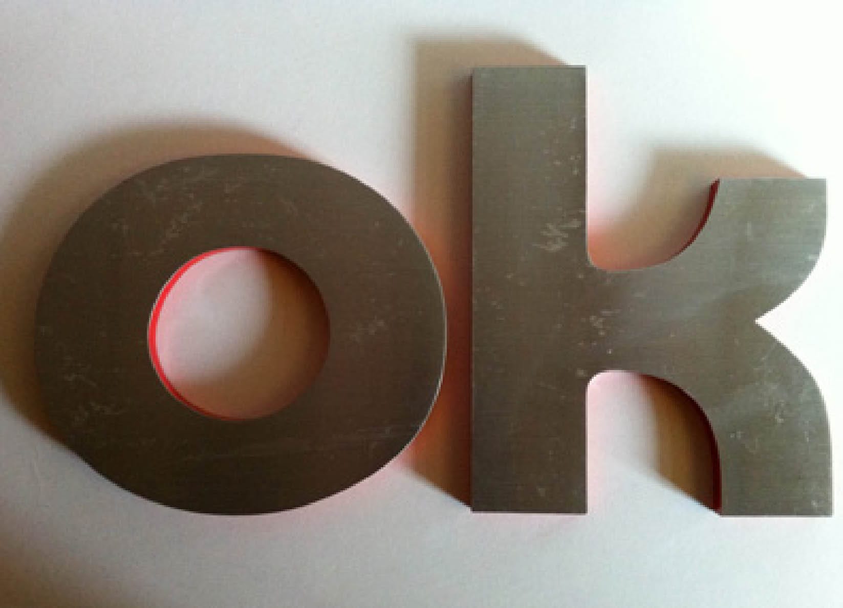
Vintage aluminum letters; photo by Jeffrey Katz
Share
![NEH-Logo_Black[1] NEH-Logo_Black[1]](https://b2915716.smushcdn.com/2915716/wp-content/uploads/2022/08/NEH-Logo_Black1-300x162.jpg?lossy=1&strip=1&webp=1)



You must be logged in to post a comment.