New life for a Shingle-Style Home
April 24, 2024
It took a special couple to recognize a classic Shingle-style home’s past charm and awaken its bright future.
Text by Paula M. Bodah Photography by Greg Premru

We all like to believe we have a soulmate, that one person who sees us for who we really are, appreciates us, and maybe even helps us become a better version of ourselves. Sometimes, it seems, the same holds true for houses and homeowners. It takes the right person to come along and see the inner beauty and magnificent potential in a home.
That’s how it was for this suburban Boston home built back in 1904. Where some prospective buyers might have seen just an old house that needed a fair amount of repair, one couple valued its gracious Victorian past and saw its possibilities as the perfect present-day family dwelling. All they needed was a team of design professionals who shared their imagination and had the expertise to make it happen. They found it in architect Treff LaFleche, builder Jim Youngblood, and interior designer Erin Gates.
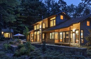
No one would suspect that the house, with its twin gables flanking a cedar-shingled roof, is anything but a well-cared-for early twentieth-century house. In fact, almost the entire left side is brand-new, designed and built to mesh seamlessly with the existing house. The older section underwent extensive renovations. “We dug down, supporting the center and the right-hand gable and put a new foundation under the house,” Youngblood explains.
While the footprint of the older side remained basically the same, everything was taken down to the studs and rebuilt. LaFleche appreciated his clients’ preference for rebuilding rather than starting over. “So much of our heritage is being torn down because the cost of updating can be too great,” he says. “My clients understood the meaning of being good stewards to an old home.”
In the older part of the house, rooms maintain the smaller scale of the original spaces, and architectural details, including the living room’s handsome leaded-glass windows, were restored or replaced with an eye toward authenticity.
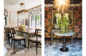
Here, Gates used rich, warm colors and a blend of antiques and transitional pieces to bridge the centuries. “I like the push-pull of the modern and the traditional,” the designer says. “I feel like we struck a perfect balance here.”
The new side of the house leans a bit more twenty-first century, with an open floor plan and a lighter, neutral palette. Architectural details such as coffered ceilings and moldings that carry through from the other side keep the transition smooth. “We tried to expand the house in a way that reflects how it might have been had it been designed back in the beginning of the twentieth century in anticipation of how a twenty-first-century family might use it,” LaFleche says.
Landscape architects Craig Halvorson and Ricardo Austrich achieved the same balance of traditional and contemporary in the yard. Front plantings have a bit more structure and formality, while the backyard is private, relaxed, and ready for play.
As is so often true in matters of the heart, all this old house needed was to be seen through loving eyes.
Project Team
Architecture: LDa Architecture & Interiors
Interior design: Erin Gates Design
Builder: Youngblood Builders
Landscape design: Craig Halvorson Inceptions and BSC Group
Share
![NEH-Logo_Black[1] NEH-Logo_Black[1]](https://b2915716.smushcdn.com/2915716/wp-content/uploads/2022/08/NEH-Logo_Black1-300x162.jpg?lossy=1&strip=1&webp=1)




You must be logged in to post a comment.