Nature Inspired This Cottage Renovation
March 22, 2019
Text by Debra Spark Photography by Peter Vanderwarker
We can never have enough of nature,” Henry David Thoreau wrote in Walden. A truism, even apparently when we are inside. Blessed with a beautiful piece of land, architects and interior designers often say they “want to bring the outside in” or they “don’t want to compete with the views.”
Describing their intent as they collaborated to renovate an early-twentieth-century cottage, the homeowner (who happens to be an interior designer) and her architect, Jim Estes of Estes Twombly Architects, utter these very phrases.
Perhaps that’s inevitable for a house on a bluff overlooking a tidal estuary. But the way the two extend their thoughts helps explain the public/private divide that so distinguishes the design. Thoreau implores us to coexist with the land, and the homeowner was ever aware of the “fragility,” as she puts it, of her site and the humble nature of the “unpretentious farming community” in which she lives. She wanted Estes’s design to allow her to enjoy the river views out her back door, while doing justice to what was beyond her front yard: an old stone wall, fields, and antique houses.
The homeowner bought her cottage and its barn/garage in 2008 when she was living in the Boston area. A year later, she moved full-time to the southern New England location but waited several years to renovate. When she was ready, she turned to colleagues whose work she particularly admired: architect Estes, builder Rick Guidelli of Gilman Guidelli & Bellow, and landscape architect Doug Reed of Reed Hilderbrand.
Estes’s design involved a gut renovation of the cottage, which was previously a one-story, two-bedroom house with a galley kitchen. The garage was knocked down and replaced with a studio with a second-floor guest bedroom.
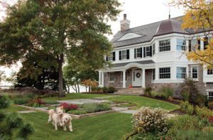
On the street side, the nods to New England vernacular are apparent with traditional roof lines and forms, cedar shingle sheathing, and selectively placed windows. Estes describes the studio and a nearby new shed “as picking up the forms and scale of the main house with a slightly contemporary feel.” A redwood fence visually links the house and studio, while separating private and public domains. Behind the fence, on the river side, a boardwalk joins the structures, and the sensibility of both house and studio is clearly contemporary with abundant large windows, glass doors, and corner glazing.
In the cottage, the multiple downstairs rooms became a single space, and a partial second floor was added for a master bedroom suite. Now, the homeowner enters near the kitchen on the short end of the house and sees the length of the ground floor: a dining room table, the living room beyond, and then a study, which can be closed off with a sliding barn door. The study has an adjacent full bath, and the kitchen has a mud room and pantry hidden behind custom ash doors. Meanwhile, the neighboring studio has a poured concrete floor with hydronic radiant heat and an efficiency kitchen. As with the main house, the studio has a steel and stainless-steel cabling staircase with an ash cap that leads directly into the upstairs bedroom, no door shutting off the space.
The cottage’s interior is simple yet expansive, thanks to cathedral ceilings and large-paned windows that run to the floor in the living room. Simplicity, as the homeowner points out, requires restraint, which evinces itself in minimal moldings, the white palette, an unadorned marble fireplace surround, open marble shelves in lieu of upper kitchen cabinets, and consistent materials. The cathedral ceilings are fir, the floors are wide-board ash, and the bathrooms all have the same porcelain tile. Furnishings are a mix of antiques and contemporary pieces. Two particularly striking purchases are the concrete pendant lamps over the kitchen island and a rattan pendant light from Chile over the dining room table.
The challenge, says landscape architect Reed of his own contribution, was “to reveal and disclose the specialness of this setting.” To this end, an L-shaped hedge interrupted by a redwood gate wraps the front of the house, a parking courtyard provides initial entry to the site, and the fence and gates allow for progressive views.
“The question is not what you look at but what you see,” wrote Thoreau. For this project, the homeowner saw people whose talents she holds dear build a home that she loves. In turn, her collaborators saw a place, as Reed says, that reflects the homeowner’s generous and gregarious nature. “She is a very special person and the house embodies that.”
Share
![NEH-Logo_Black[1] NEH-Logo_Black[1]](https://b2915716.smushcdn.com/2915716/wp-content/uploads/2022/08/NEH-Logo_Black1-300x162.jpg?lossy=1&strip=1&webp=1)



You must be logged in to post a comment.