Modern Movement
July 9, 2015
Classic and contemporary perform a graceful pas de deux in a Martha’s Vineyard home.
Text by Maria LaPiana Photography by Michael Partenio Produced by Stacy Kunstel
The call came from out of the blue. Boston interior designer John Stefanon remembers the conversation well. “The woman told me that she and her husband were building on Martha’s Vineyard and she’d seen my work. She told me that flow, how we move through spaces, was very important to her.” She was a dancer, and, as it happened, Stefanon’s two children had just started ballet. The connection was swift and spiritual, he says; they talked for an hour and a half.
It marked the beginning of a lively collaboration that would include architect Brian Goodridge of Thor Design Studio in Bristol, Rhode Island, and builder Jeff Capello of Concept Building in Wayland, Massachusetts.
“There were lots of passionate decision makers involved in the project,” says Capello, and they debated every detail, “from recessed lighting to tile, glass, and handrails.”
The wife says she’s forever grateful to the team for “endlessly accommodating our wishes, and finding a way to put all our requests into place. They all so generously went above and beyond to tweak and tweak until we got it right!”
The couple, parents of three grown sons, had been coming to the island for years and reasoned it was time to build. They were very exacting, and the design process took nearly two years. The couple knew precisely what they didn’t want, says the wife. “I wanted it to be modern, not like every other blue-and-white beachy home with overstuffed white furniture,” she remembers with a laugh.
Things had to be just so; the entire home was designed according to the principles of feng shui. It had to feel good and, yes, it had to flow.
“I wanted something that looked like me,” she says. “I wanted surprises! I wanted light and air. I wanted it to be happy, relaxing, private, sophisticated—even sexy.”
In many ways the home is iconic Martha’s Vineyard, with its white cedar shingles, a cedar roof, copper standing seam eaves, and accent roofs. But once you step inside, says builder Capello, “you are blown away by the most comfortably hip interior you have ever experienced.”
Stefanon calls the 7,400-square-foot home—with its four bedrooms, six and a half baths, media room, game room, and yoga studio—both classic and classical, and unmistakably modern.
It sits on a secluded lot among native scrub pines in historic Edgartown. “Although not on the water, the site really is spectacular. But it was a bit challenging in that it was pie shaped,” says Goodridge. He positioned the home deep into the site, which allowed for a progression along a meandering driveway that leads up to the front door. There’s that flow again.
Lovely trees frame an elegant facade with a large eyebrow dormer that draws the eye toward the entrance porch and through the home. “From there to the multiple private balconies and decks, the home successfully dissolves the barrier between the interior and exterior,” Goodridge says.
A porte cochere leads to the ample backyard, where the pool and a 500-square-foot pool house offer plenty of space and options for relaxing or entertaining.
The floor plan is classical, says designer Stefanon, with its two-story foyer, gracious winding staircase, and galleries on both levels that connect the two sides of the house. The master suite, with private outside shower and courtyard, sits to the right, while the kitchen, dining area, den, and other public spaces are located to the left.
There’s a guest lounge with an arched opening on the second floor, along with three bedrooms for guests. A game room and a connector to the yoga studio sit above the garage. The upper hallway overlooks the great room.
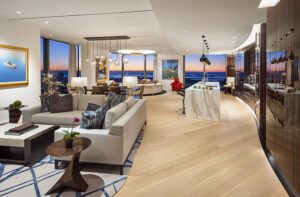
There’s stately symmetry throughout, including many intentional scenes and sightlines. The home is large, but it doesn’t feel that way. “The rooms are intimate, but there’s a thousand square feet of hallway space intertwined,” says the wife. “It feels likes each room melts and naturally moves into another brilliantly. There’s plenty of room for me to dance through it, which I do!”
Stefanon recalls having to nudge her a little at times. “We always had to give her a reminder of the modern. Even if some ideas were off base, at least we were showing how modern can be different. We got her closer to that uneasy edge,” he says.
Like many people, Stefanon says, his client was drawn to antiques. With their history as objects lovingly used in the past, antiques do add warmth to a room, he acknowledges, but he wanted the homeowner to understand, that she could “make her own history” with new pieces.
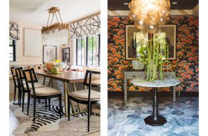
As to colors, they stayed with neutrals, but as the designer pointed out, that doesn’t mean dull. “Neutrals can provide texture,” he says. Although clear, even the bubble chandelier above the dining table provides color as it reflects and refracts light from objects around the room.
The wife chose comfortable, contemporary furnishings with no hard edges. Slipcovered chairs soften the glass-topped dining table. Classical forms, such as a traditional demilune at the end of a hall, and an urn-like base on the entry table, sit easily next to streamlined benches and lighting. The homeowners opted for some surprisingly modern art, and even acquiesced when Stefanon suggested they paint giant black-and-white stripes on the walls of one of the guest rooms.
The kitchen, as is so often the case, is the heart of this home. “Functionality was very important to the homeowners,” says Stefanon. “Convenience was too, so it’s open to the dining room, which is a little more formal than you might expect.”
The custom cabinets are of “heirloom quality,” says the builder—modern, but not stark. Large cone-like pendants hang over a wide island. The room is accessible from multiple points inside and out, by the wife’s passionate directive.
“Everything we did, it really came from her,” says Stefanon, referring to his simpatico client. “Like fashion, good design is always about what looks good on you. After all, you’re going to be in the space. Everything we did here looks great on her.”
She agrees. •
Architecture: Brian Goodridge, Thor Studios
Interior design: John Stefanon, JFS Design Studio
Builder: Jeff Capello, Concept Building
Landscape Architecture: Gregory Lombardi Design
Share
![NEH-Logo_Black[1] NEH-Logo_Black[1]](https://b2915716.smushcdn.com/2915716/wp-content/uploads/2022/08/NEH-Logo_Black1-300x162.jpg?lossy=1&strip=1&webp=1)





You must be logged in to post a comment.