Midcentury Modern in Wellfleet
June 12, 2017
A renovation of both structure and landscape restores the midcentury modernist pedigree of a Wellfleet home.
Text by Louis Postel Photography by Peter Murdock
As earthmovers groaned and power saws whined, one of those giant turtles, the pride of Wellfleet, showed up at the site. It might be fairer to say that the turtle showed up not just at the site but at his site, a kettle pond occupied by his Testudines line since the last Ice Age.
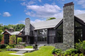
Slowly, he took in the construction like an unsmiling foreman: a red canoe tied to a long dock; ferns, winterberry bushes, and beech trees to be received in amended soil; and up the slope from the pond, a 1,600-square foot house made up of a long, low rectangle appended to an old pitched-roof fishing shack, and a 570-square-foot guesthouse connected via a breezeway to the main building.
Along with other émigré architects of the post-war era—Marcel Breuer, Serge Chermayeff, Walter Gropius, and Eero Saarinen—who summered and built on the Cape, Finnish-born Olav Hammarstrom sought to place his clients ever closer to its salt-sprayed nature. And what better way to accomplish this than with his modernist, stripped-down aesthetic? According to old photos, says landscape architect Keith LeBlanc, “There was even a tree growing through the deck at one time.”
LeBlanc joined Caroline “Coty” Sidnam and Eric Gartner of New York-based SPG Architects and builder Jon Ziperman of Cape Associates to bring Hammarstrom’s idyll on a private pond into the twenty-first century. “The house had deteriorated over the years,” recalls Sidnam. The roof needed replacing, and so did the plumbing and electricity. Ziperman says the project was like an archeological dig. “With gut jobs like this you have to keep peeling back layers and layers, correcting the structure as you go,” he says.
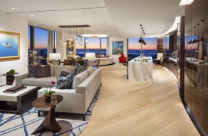
From the breezeway entrance, the main house offers a long east-to-west view, past a bedroom, through the kitchen and living room, all the way to the master bedroom. The open span is broken only by a pair of floating interior cubes, one for the master bath and one for the kitchen, that create visual interest, blocking some sightlines, and revealing others.
These rooms stretch across the long south side of the house, looking out to the pond. To maximize the pleasing vista, Sidnam cleverly installed a hidden, pocketed panel in the rebuilt wall of the kitchen cube. When the panel is open, the view becomes that much longer. When it’s closed, guests can enjoy themselves in the nearby dining area without seeing the evidence of the cook’s toil. The kitchen’s new eco-friendly surfaces—Caesarstone counters, a Corian backsplash, and Nuvacor laminated cabinetry—suit the home’s aesthetic stylistically and philosophically.
Hammarstrom had designed the house in 1955 as a bright and airy addition to a tiny fishing cabin built in the early 1900s. The old cabin-turned-family room had walls of knotty pine that had blackened over time. Sidam replaced the aged wood with walnut finished in a clear matte, and added large panels of clerestory glass where the pitched roof rises above the adjoining flat, modern roof. Light now floods in over a purple B&B Italia sectional sofa and an Eames lounge chair, which echo the Modernist theme of the living room, where other midcentury icons—Arne Jacobsen dining chairs, an Eero Saarinen Womb chair and ottoman, and Knoll seating fabric in sapphire—can be found.
Fifteen thousand years ago, retreating glaciers scooped out the kettle pond, which remains the focus of the property to this day. It was up to landscape designer Keith LeBlanc to make that focus a bit sharper. In place of the rotting railroad ties that delineated various spaces and once acted as retaining walls, LeBlanc employed native plants, trees, and stone to create, in his words, “a dramatic unfolding in reaching the pond.”
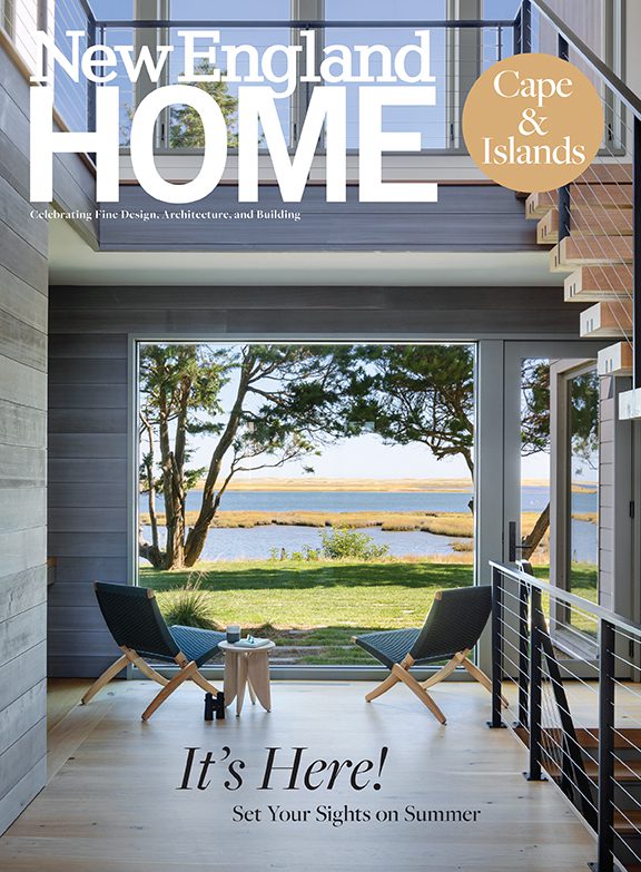
This article originally appeared in the 2017 issue of New England Home Cape & Islands with the headline Pond Perfect.
Share
![NEH-Logo_Black[1] NEH-Logo_Black[1]](https://b2915716.smushcdn.com/2915716/wp-content/uploads/2022/08/NEH-Logo_Black1-300x162.jpg?lossy=1&strip=1&webp=1)



You must be logged in to post a comment.