Master Class: Michael Carter
January 14, 2016
Text by Paula M. Bodah
The work of Michael Carter, principal of the Boston interior design firm Carter & Company, has graced our pages a handful of times over the years. Each of the homes we featured—the first back in 2006 and the most recent just last fall—has Michael’s unerring sense of style and his sophisticated layering of elements for a result that is luxurious and chic but always warm and inviting. And yet, as I noticed as I looked back over his work, each dwelling reflects the personalities and sensibilities of the clients, not the designer. For each project, Michael and his team were inspired to create a beautiful, unique, personal home.
“That’s actually quite true about our work,” Michael said, when I mentioned it to him. “Unlike many design firms that have a signature look, we really strive to give our clients a home that is a genuine (albeit artfully edited) expression of their own taste.”
Michael says the three living rooms shown here are perfect examples of that philosophy in action.
In preparation for his work on the house in East Coast Chic, in our November-December 2015 issue, Michael flew out to California to see his clients’ West Coast home. “They had great art—all contemporary,” he says. “And yet they did not want their Boston townhouse to say ‘California.’ Instead they wanted something that had a style rooted in historic Boston and its Old World influences. So we really went to work to create the perfect blend of modern art, mixed with antiques—clean, tailored upholstery with elegant fabrics.” An abstract painting by Edward Lentsch, transitional furniture upholstered in quiet neutrals, and an antique desk tucked against a bay window yield a chic and sophisticated result. “The clients loved it!”
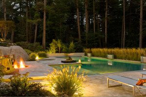
The owners of a vacation home on Lake Winnipesaukee, featured in our November-December 2012 issue, were very sophisticated, Michael explains. “They had a gorgeous, incredibly well-designed home in New Jersey and they were savvy enough to know that the old, cliché woodsy colors associated with log cabins would just not do (okay—this was no average cabin in the woods!). So the pine-greens and burgundies were out, and instead we established a palette more in keeping with their taste—pale blues, grays, chocolate browns, and white. We gave a nod to the home’s locale with the furnishings, but we sought out and found extraordinary pieces such as iron chandeliers and Adirondack -influenced pieces using sources like Formations, Melrose House, and Charles Spada’s Boston showroom Antiques on 5. The result is still definitely ‘lodge like,’ but not at all the expected version.”
Back in September-October 2006 (before we had a website where we could archive our content) we ran a piece called “A Taste of the Tropics.” Michael’s clients had lived in Bermuda, he says, “and they had a wonderful, innate sense of color—fun and vibrant.” They weren’t shy about using bold color in their Back Bay Boston penthouse. “But they were also from an old established family, with lots of wonderful antiques that had been passed down,” the designer adds. “It was a delight to meld a classically inspired space using their heirloom furnishings with walls, fabrics, and objects that were as strong as tomato reds, pinks, lime greens, and cobalt blues to give the home its own distinct personality.”
![]()
Photograph by Sam Gray
Share


