Lovely and Livable
January 26, 2016
A Fairfield home is colorful, homey, and imbued with personality. All that, and it’s beautiful, too.
Text by Lisa E. Harrison Photography by Michael Partenio Produced by Stacy Kunstel
With a husband, three kids aged nine to fifteen, two dogs, and a penchant for entertaining, she wasn’t underestimating the need for a house that could withstand some fun.
To get the look she wanted, she enlisted Dina Spaidal and Deb Nicoud of Fairfield-based Nicoud and Spaidal Interiors. As a neighbor of Spaidal’s, she and the designer had struck up a friendship. “I was one of Dina’s early clients ten years ago,” she says. “We work beautifully together.” In fact, she sought Spaidal’s opinion on the new property in Greenfield Hill—a mere two miles from the old neighborhood—before the deal was inked.
The verdict was favorable. A big yard, more privacy, a beautiful pool, and, of course, the star: a traditional center-hall colonial with good bones. The layout was seamless, too, which meant walls wouldn’t have to go up or come down. The real challenge? Bringing 7,000 square feet down to a comfortable, livable scale, while simultaneously creating a space that would suit the couple’s slightly divergent aesthetics. “The husband is more traditional than the wife,” notes Spaidal. “She’s more transitional. We wanted to strike a balance, so they would both be happy and comfortable.”
“They know who I am,” agrees the wife. “I’m not as conservative as Fairfield County. I was open to a lot of ideas.” So with her blessing to push boundaries a bit, the two designers set to work.
The first item on the punch list was to replace all the doors (the originals were of a mahogany that gave a church-like vibe, remembers Nicoud) and gut the kitchen and six bathrooms.
The former is a showstopper, a large, often-used room for a family that loves to cook. It was important to design a space equally conducive to sautéing and socializing. “The kitchen is large and long, so we wanted a focal point at each end to delineate the cooking and eating ends,” says Spaidal.
To mark the cooking end, there’s an extended backsplash of gray-and-white Carrara and Thassos marble, while, directly opposite, the dining nook has an apple-green grasscloth accent wall. For the oversize center island, which seats five, the designers opted for the same Calacatta marble as the countertops, though they went with a two-inch-thick slab on the island for emphasis.
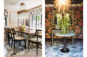
Just off the kitchen via French doors, the dining room strikes a nice balance between elegance and comfort. “We didn’t want it to be too formal,” says Nicoud, “because they actually use it.” To create that balance they paired a farm table with a more formal chandelier; and subtle, sheer leopard-print drapes with a rich velvet trim. They enlisted a decorative painter to give the walls a linen-like appearance. “It looks like wallpaper,” says Nicoud. “When everyone walks in, they touch the walls.” Because it’s an investment, it was important to choose a color—in this case a warm flaxen hue—the homeowners would appreciate for a while. “We didn’t want it to be the color of the day,” says Nicoud.
Creating an interior that would transcend a label or decade was important to the owner. “I didn’t want it to be circa a certain year,” she says. “I wanted it to be timeless, but also able to be updated easily with new accessories.”
With this in mind, the designers were liberal with their use of color. In the dining room, pops of cranberry and turquoise mingle with a neutral palette.
The same holds true in the living room, where the duo introduced yellow swivel chairs and custom blue-velvet chairs against a soft blue backdrop. To tie it all together, Nicoud designed a cheerful rug with an abstract pattern of blue and green on cream. “It was a bit of a leap of faith,” she admits, but it wound up being a huge hit.
Color is also the star in the family room, a favorite hangout with a commanding stone fireplace and cathedral ceilings. Because the space is highly visible, including from the front door, Nicoud and Spaidal decided to incorporate traditional blue and white in a fresh way. To ratchet up the contemporary appeal, they mixed bold patterns and included doses of red.
Upstairs, the designers may have toned back the color scheme in favor of soothing “greige”—a peaceful gray-and-beige hybrid—but they didn’t skimp on cool touches. The tile mosaic on the floor of the master bath conjures a garden path. No small feat to organize, the designers crafted a template. Then the manufacturer sent labeled sheets that were arranged like a jigsaw puzzle—“an installer’s nightmare,” jokes Nicoud. The end result is a stunning stage for the soaking tub.
Big or small, it’s details like this that set the house apart. “You know what makes a home unique? It’s the last 20 percent,” says the owner. “The artwork, the pillows, the accessories.”
Personal touches abound. There’s the blue toss pillow on the family room sofa that bears the silhouettes of the owners’ dogs. Art by area artists graces the walls (both the painting above the mantel in the family room and the triptych in the living room are by Darien artist Andrea Bonfils). And, of course, there are the framed works by the three children in the family.
This notion of a place with personality is exactly in keeping with what the owner desired: a house that people live in. “I wanted a house that reflected who we are as a family,” she says. “And it ended up being beautiful enough to be in a magazine.”
A win-win, for sure.•
Interior designers: Dina Spaidal and Deb Nicoud, Nicoud and Spaidal Interiors
Builder: Thor Vanderblue, Nordic Solutions
Share
![NEH-Logo_Black[1] NEH-Logo_Black[1]](https://b2915716.smushcdn.com/2915716/wp-content/uploads/2022/08/NEH-Logo_Black1-300x162.jpg?lossy=1&strip=1&webp=1)



You must be logged in to post a comment.